

Explore trending content on Musk Viewer
النصر
• 939615 Tweets
Washington Post
• 319409 Tweets
Durk
• 232551 Tweets
Virginia
• 200507 Tweets
Bezos
• 159844 Tweets
Beyoncé
• 130997 Tweets
WaPo
• 95554 Tweets
LA Times
• 83546 Tweets
Edwin Santos
• 70249 Tweets
Forest
• 69447 Tweets
Democracy Dies in Darkness
• 63120 Tweets
Boulos
• 57556 Tweets
Zendaya
• 51986 Tweets
#荒野7周年空前の超感謝祭
• 46365 Tweets
#史上初金車確定無料ガチャ
• 46286 Tweets
Marçal
• 44440 Tweets
Chicó
• 39435 Tweets
連載マンガ
• 37768 Tweets
#الاهلي_الاخدود
• 32187 Tweets
レジェンド車両
• 27549 Tweets
全員最大金枠アイテム5つ
• 27485 Tweets
Anitta
• 25088 Tweets
Tether
• 24245 Tweets
بن زكري
• 20373 Tweets
Amazon Prime
• 20113 Tweets
Leicester
• 19673 Tweets
Albon
• 17864 Tweets
SÃO PAULO IS COMING
• 16451 Tweets
Phil Lesh
• 16245 Tweets
ANIM NA TAONG SAMAHAN
• 13409 Tweets
DJ Clark Kent
• 12361 Tweets
Dudu
• 10043 Tweets


Pinned Tweet

Tweet of the Century... I'm not joking
I am of the opinion we "generally" do a GOOD job with research and forecasting
Getting the public to understand (and act upon) it is the tougher problem
And it doesn't help we live in our stovepiped, ivory towers
GET OUT AND COMMUNICATE!

The disparity that scientists face includes the fact that not many people can communicate scientific research in a way that is translatable to people with no background of the field.
Bridging the gap between atmo science and the gen public is inherently important.
2
4
49
7
1
45

Here is the ENTIRE US Drought Monitor history, going back to the year 2000
@DroughtGov
@DroughtCenter
31
474
1K

Didn’t realize
@StephenAtHome
did this for every state. Pretty cool
Here’s NC. “Get off your Asheville and go vote!”
#betterknowaballot

21
109
510
Today is the first day of climatological life announcements.
I’ve officially accepted an offer to join the
@NOAA
workforce, specifically with
@NOAANCEIclimate
. I start in mid-October.
A short thread, because why not?
1/x

67
7
388
Stations in the US and Canada that have tied or broken a daily max temperature record since June 1st, 2021
@mattlanza
#StateOfClimate

13
207
322
Here is the precipitation departure from normal for 2021 so far, using a “percent of” climatology approach
#StateOfClimate
10
75
247
Preliminary estimates from NOAA's MRMS for the 4-day period between the PRE and
#Helene
.
A good chunk of Western North Carolina (over 2500 square miles) experienced a 1in1000 year event
#StateOfTheFlood
#NCwx
#SCwx
#TNwx
#VAwx
@NWSGSP
@NWSMorristown
@NWSBlacksburg

8
101
243
I've posted this before, but it's always fun watching.
USDM drought categories from Jan 2000 to Jan 2023.
#Drought
@DroughtCenter
5
59
223

Inspired by
@ed_hawkins
’
#ShowYourStripes
initiative. I have built an
@ArcGISOnline
map showing temperature (and precipitation) stripes for... wait for it...
Every single county in the Contiguous United States.


9
92
187
6 yr old did not want me to leave for
#AMS2023
.
I convinced him to let me bring his friend along and experience a new adventure all week.
So
@paddingtonbear
and I will be walking around taking photos and videos.
And if you hear someone talk like Strong Bad… that’s the bear!

13
2
185


My graphics made it to
@ABCWorldNews
tonight, and they correctly sourced it!!!
#ClimateNormals


6
4
169
Bummed you didn't get snow today?
Sad the winter season hasn't been what you expected?
Well, WHAT IF 2023 WAS ALL SNOW!?!
Using data from NCEI, and assuming a 10:1 Ratio, here's what 2023 could have looked like if all the precipitation fell as snow.
#snOMG
#StateOfClimate
17
24
164


Been supplementing some school with my 4yr old, since he hasn’t been to daycare since March.
This weeks theme is Geography, and naturally had to show him this.
@yakkopinky

2
11
131


12
41
128
Chick Fil A is overrated and their chicken is not that very good.
Fight me

8 mile line to get average food at
@ChickfilA
or walk right up and get a gyro from
@eatgarbanzo
. The choice is simple.

10
0
32
40
0
114
I am (slowly) pushing out state and country boundaries superimposed on the
#climatestripes
at the link below.
Will get to as many as I can
#ShowYourStripes
#MetsUnite


13
38
115
Year is halfway done. Here's what precipitation departures look like for most of the 2022 year so far.
Two things to note in the last month
1) SW Monsoon
2) Drying in the Southeast
#StateOfClimate
2
48
116
THEY DID A HURRICANE HUNTER EPISODE OF
@Octonauts
!!! Dropsonde and all!
@NOAA
@NOAA_HurrHunter
@TheAstroNick


8
3
116
WANNA MAKE YOUR OWN WEATHERGAMI!?!?
Now you can! Just utilize this python script and/or jupyter notebook here:
Have fun!
#WeatherGami

0
21
116
UNPOPULAR OPINION: I am not looking forward to virtual conferences, and am not really that motivated to submit an abstract anywhere.
12
1
109
Preliminary rainfall estimates from NOAA's MRMS puts about half a million folks in Florida (850 square miles) in a 1-100 year Flood event from
#Milton
.
Some areas even experienced a 1-200 year event.
#FLwx
@NWSTampaBay
@NWSMelbourne
@NWSMiami
#StateOfTheFlood

3
53
116

I know people are focused on FL, as they should. But I'm worried about Western NC
Yes, I live there, but floods, especially TC induced, are some of our worse events, and it adversely affects rural, lower socioeconomic families more. People still recovering from Fred in '21
#NCwx


9
27
111
2018 is halfway over. Here is what the daily average temperature departures look like for CONUS. Source: PRISM
#StateofClimate

3
56
107
2017 in one image. Daily maximum departures from 1981-2010 climatology. Source PRISM
#StateofClimate

10
45
104
I forget that we have a tool at NCEI (although clunky at times) that can visualize data pretty easily, and it has the ability to get the data straight from the AWS cloud!
Here's Hurricane Michael making landfall on October 10th 2018.
12
11
101
Brace yourselves…..
Daily gridded products from
@NOAANCEIclimate
going back to 1951 are coming….
#GreatScott


12
14
99
Here’s a weird take on meteorology degree / classes
Yes, the math is important, especially to understand the fluid atmosphere
But I think knowledge of geography and GIS is 100% more important
Being able to take the math and apply it to a 500mb map? Thats a meteorologist!

5
4
97


@SusannaLHarris
Someone once said their career goal was to be “second author” on every paper they worked on.
3
1
91
Hot off the press at
#AMS2020
@NOAANCEIclimate
Global Temperature Departures are updated through 2019.
Here’s the Climate Stripe.
#ShowYourStripes
#StateOfClimate
@windbarb
@BernadetteWoods
@JacquelynGill
@themadstone
@ZLabe

4
44
86
To gear up for this year's
#ShowYourStripes
initiative, I made this page where anyone can get their state's stripe with the state boundaries superimposed on it.


9
35
84
For those still wanting high quality
#GIS
graphics provided by
@Climatologist49
…
…don’t worry
#wxtwitter
, I got you covered!

10
6
83

Hey
@waitwait
and
@petersagal
, sorry to be “that person” but I believe I was the contestant Christine Baranski played for.
She only got 1 right, but Bill said she was a winner.
Soooooo……do I get that sweet sweet prize that people in the 1980s loved?
2
0
84

I'm happy to announce I'm starting a NOAA Lantern with the
@NWS
for the next few months, helping to provide climate data and services to a few forecast offices out west, towards a
#ClimateReadyNation
Mini thread. 🧵
3
0
81
Today's
#GIS
map, in lieu of one by
@climatologist49
.
I'll keep doing this (with my authentic
#stampofapproval
) until
@Twitter
and
@TwitterSupport
brings him back.
Today's topic is on point for the
#broomstickchallenge

5
6
80

How 2023 has stacked up so far when aggregating daily precipitation to their 1991-2020 climatology (as a percent of normal).
#StateOfClimate
2
23
79

I’m proud to announce the
@AMSEarlyCareer
board has elected Becky DePodwin (
@wx_becks
) to be the Boards Chair-Elect for the 2019 year.
We will work together next year on
@ametsoc
activities for young professionals, and in 2020 Boston, she will become Board Chair.
Congrats!!!
3
2
78
If you're in Baltimore for
#AMS2024
, you are going to get a LOT of info from AMS, so this one may slip through the cracks.
The Baltimore Downtown Partnership offers escorts around the area if you don't want to walk alone.
This was a big ask of some of us after DEN last year.

1
26
76


I wrote a thing.
But more importantly, I can finally unveil:
THE RESEARCH HILL I’VE DECIDED TO DIE ON.
A Thread (1/x)
5
11
77
Running through 2022 precipitation and comparing it to the 1991-2020 normal. Plotted is percent of normal, rather than straight departure. Captures the SW drought and monsoon really well.
#StateOfClimate
0
20
71


We just got the word that
@NOAANCEI
has a new director, and it's the one and only
@DekeArndt
!
Congrats! Excited to push the "Climate and _____" narrative forward!
6
7
72


I have two degrees in meteorology, yet do 0% forecasting.
My response to “What’s the weather for tomorrow” is usually ¯\_(ツ)_/¯

Happy Friday!
This blog post, titled "The Value of a Meteorology Degree Goes Far Beyond “Forecaster”" contains great insight into different ways a meteorology degree can be used!
Check it out & let us know what you think!
3
14
31
3
7
70
13
2
69


The true MVP of
#AMS2024
.
Thank you
@PrattStAleHouse
for hosting 7,000 weather nerds this week. And thank you for helping us host
#WxTwitter
on Monday!
Pretty sure I came here at least once every day.

3
1
62
The only thing you need to discuss at the dinner table this holiday season.
3
7
63
“I don’t like to post model maps way out and confuse the public, but I’m going to do it anyway”
—
#WxTwitter
, probably
2
5
62

Kind of geeking out that
@Ginger_Zee
was geeking out to the maps I made for the new normals.

.
@Ginger_Zee
has the latest on new climate data for the U.S. from
@NOAA
.
"This data is like our new census poll. This is how we base everything so this is a big day."
5
17
46
3
4
62

I'm worried that as Baby Boomers retire, the data scientists are being replaced by people just out of college who have yet to develop a thorough understanding of Fortran 77, GRIB and BUFR, and receive only about two-and-a-half weeks of training.
6
1
62
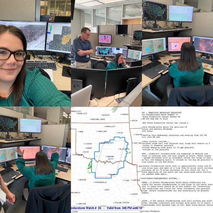
This mornings
@NWSSPC
convective outlook, overlaid with counties having a high vulnerability, according to
@CDCEnvironment
's Social Vulnerability Index.
High SVI = Harder to recover from severe events, such as weather.

0
23
62


Here's the
@NWSSPC
outlook for tomorrow, alongside the CDC Social Vulnerability Index. Census tracts in dark blue are highly vulnerable and may have a hard time recovering.
@NWSNorman
@NWSTulsa
@NWSDodgeCity
@NWSWichita
@NWSTopeka
@NWSHastings
@NWSOmaha
#OKwx
#KSwx
#NEwx


1
22
58
