

zbeyens
@zbeyens
Followers
2K
Following
1K
Media
87
Statuses
499
ai editor
Brussels
Joined June 2010
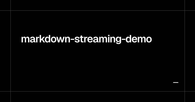
We've upgraded this playground to support MDX streaming into a rich-text editor.

I find the way LLM apps treat markdown streaming so infuriating. So much jank for no good reason. I even made a playground to show you what I mean (below)
2
1
19
@timneutkens Another one: useLayoutParams. Get unified route params for layout components. https://t.co/9geB2EgIsW

gist.github.com
Typed hooks for [email protected]. GitHub Gist: instantly share code, notes, and snippets.
0
0
0
cc @timneutkens, I assume useParams generics could not be changed because it would be a breaking change, but it would be nice if it matched server params in v16. To complete the loop, is there any plan for typed searchParams/useSearchParams per page (e.g. maybe requiring
2
0
0


You can also import different shadcn registries to get specialised UI components, animations, etc. Common ones like shadcn form, tailark, platejs, etc. I've added step-by-step instruction & vite template in @aibuilderclub_ Meanwhile this upcoming week workshop will be around
0
1
15
5
0
1

## Project Status: Pre-MVP **Current Stage**: Pre-MVP (highest velocity to ship) ### DO Care About (Production-Ready Foundation) - **Security**: Authentication, authorization, session management - **Data Validation**: Zod schemas for all inputs - **Error Handling**:
0
0
0

brew install jq brew install terminal-notifier https://t.co/m5nJmyNsEF
gist.github.com
Claude Code Notifications. GitHub Gist: instantly share code, notes, and snippets.
0
0
2

Same goes for AI: walls of text from chatbots are trending toward zero value, all noise.

my secret to writing good docs is "never put two paragraphs in a row"
0
0
7

All my commands auto-update and include my project tree into the context.


You can now run bash commands before processing the slash command task in Claude Code Lots of ideas for this 👀

1
0
4

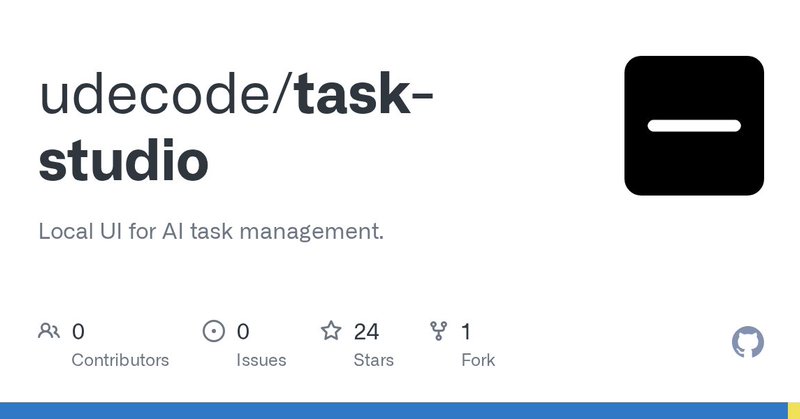
Open-source, built on @ln_dev7's beautiful Circle template. https://t.co/ZvZ9Xyldgg
github.com
Local UI for AI task management. Contribute to udecode/task-studio development by creating an account on GitHub.
1
0
6