

Transit Maps
@transitmap
Followers
23,478
Following
463
Media
1,866
Statuses
14,991
A celebration of transit maps and diagrams from around the world. RTs are always appreciated! Prints for sale at:
Portland, OR
Joined October 2011
Don't wanna be here?
Send us removal request.
Explore trending content on Musk Viewer
バニーの日
• 150716 Tweets
Shanik
• 67198 Tweets
日経平均
• 53255 Tweets
Arap
• 49842 Tweets
ヒロアカ
• 44325 Tweets
アザラシ幼稚園
• 35915 Tweets
NISA
• 33606 Tweets
Hayırlı Cumalar
• 30399 Tweets
STEP DOWN FASCIST HASINA
• 28816 Tweets
パンツの日
• 27510 Tweets
PearThin
• 20364 Tweets
Sian
• 20115 Tweets
Anayasa Mahkemesi
• 19542 Tweets
PRABOWOtahu YangTERBAIK
• 19477 Tweets
YESkeren BANGETkerjanya
• 18729 Tweets
長岡花火
• 18575 Tweets
#instagramdown
• 14365 Tweets
株価暴落
• 13819 Tweets
#erişim
• 12290 Tweets


Pinned Tweet

New post – what I'm up to, and the future of the blog:

1
4
33
I think I'm in love: a stunning isochrone map of travel times from Paris by rail in 1882 (making this a very early example of the genre).


52
2K
4K
This Wikipedia route diagram of the Alishan Forest Railway in Taiwan shows ALL the spirals.

12
159
2K
You can buy a print of that Bowie GIF that's been everywhere from the ACTUAL ARTIST here:

15
1K
1K
Today in hot takes that are so incredibly wrong as to be almost unbelievable, I present "LA wasn't built around rail".


@RobD2020
@maxdubler
LA wasn’t built around rail so it will never be economical to build rail. It will always be a money losing system that drains society of resources.
I’m referring to political decisions related to infrastructure projects (not regulations) like “we are going to buy all American”
98
1
15
6
140
1K
Well, this is just about the most gorgeous and evocative electric rail poster I've ever seen. From c. 1920, I believe.

12
162
1K
However, this has to a contender for the strangest rail transport to have ever existed. Incline railroads in Cincinnati that carried *entire streetcars* on them as part of the streetcar's regular route. Roll on, roll off!


23
283
1K
VICTORY! Your 2018 Transit Maps World Cup winner is...
SANTIAGO!
Santiago: 2,912 votes of 4,045 votes cast (72%)
Moscow: 1,133 votes (28%)
#wctransitmaps_result

56
488
740
Well, that's embarrassing.
Which leads me to my semi-regular reminder that this map could look like this instead if they just put some effort into things.

8
74
539
Well, this just happened. 20,000 Twitter followers is something I never thought this humble little niche blog would achieve – I'm thankful and grateful for each and every one of you!

7
11
505
Dear lord, these old posters for the Liverpool Overhead Railway are just gorgeous.


10
119
415
Unofficial Map: A gorgeous map of the German Intercity Rail Network, 2020 by u/theflyingindonesian (4.5 stars)
-

10
88
354
An odd detail from the new Seoul Metro Map: if trains go around this loop in the direction of the arrow, don't they get stuck going around it forever?
#oops

17
20
354
I'm only reporting the facts here, people.


3
0
307
Speaking of the North Shore Line between Chicago and Milwaukee, can we just stop and look at the glorious "Electroliner" trainsets they ran? Probably the best-looking interurban train ever.

9
64
302
Well blow me down with a feather... it worked! I present to you a map of Denver's (alternative future) rail network made entirely with circle arcs. Not a single straight line anywhere on the map.
Explanatory thread follows below:

21
41
300
A wonderful cutaway drawing of the tracks beneath the surface at Grand Central Terminal, c. 1912. The MetLife Building stands here now.

8
55
286
Oh, I'm so in love with this abstract 1937 poster for Japanese Government Railways.

6
51
256

@the_transit_guy
Spokane, WA punches way above its weight (and they have a truly excellent transit map as well).

3
8
256
I've posted this one before, but it really is the most gorgeous thing.

6
46
244
Look at this! An official pilot program of potential new subway maps in New York features a VERY familiar looking diagram. Is it time for a change?

14
36
233
Speaking of US highway shields, here's something just for fun. If you can't tell which state is which, the numbers mean something...

25
106
227
I just came across this extraordinary graphic from 1855 via
@LOCmaps
and I think it's worth sharing in detail. So get a better look here -- -- and follow along as I break this thing down.
<thread>

7
92
229
Finally got around to updating my Amtrak as Subway Map to be fully up-to-date... had to recheck every route just to be sure I didn't miss anything. Here's a zoomable version of it:

7
24
230
I just love the colour palette on this 1950s Commonwealth Railways poster from Australia. (And there's a little map too, just to keep things on-topic for me!)

4
41
229
Regular as clockwork. Every two years the Internet "rediscovers" this
@markovenden
map, misinterprets it as some sort of future reality and collectively loses its mind.
17
40
223
Absolutely delicious 1935 illustrated map of Atchison, Topeka & Santa Fe lines in California.

7
70
216
If WMATA can put out a map showing a completed Silver Line, then so can I! Here's my decidedly different approach to mapping the network.

13
24
212
When researching old streetcar lines, sometimes you come across something so valuable that it makes you a little bit giddy with excitement. This 1911 map of Portland is one such map (a thread):

3
21
208
Absolutely loving this map showing the number of passengers travelling by rail in France in 1889.
Source:

4
59
208
Here's what you've all been waiting for: the draw for the 2018 World Cup of Transit Maps! Spread the word: the first match starts on Wednesday, April 4.
For full details, check out this post on the blog:
#wctransitmaps

13
113
199
In all seriousness, how do I go about sending a print of my Amtrak map to President
@JoeBiden
? Do I just address it to the White House? I've even customised it for him!

5
16
187
At last! It's the inaugural
#wctransitmaps
final! Please RT for maximum visibility!
Which city has the better designed transit map, Moscow or Santiago?
Please vote for the MAP, not loyalty to a city.
(Comparison image and link to full maps threaded below)
#wctransitmaps_poll
Moscow Metro Map
1126
Santiago Metro Map
2919
67
315
180
Someone just pointed out to me the subtitle for the much-delayed new Berlin airport on that German Intercity rail map is "irgendwann", which basically translates as a sarcastic "whenever". Too funny!

1
38
176
I know I keep talking about this map, and I'm sorry – but just look at how goddamn beautiful this print is, guys!!!

11
8
164
Okay, this is just getting surreal. A four minute news report on the
#wctransitmaps
final? And people wonder why Santiago won...


13
54
159
I always wonder if metro systems will run out of interesting "M" logos. Apparently not. Love this.


1
28
155
Fascinating 1870 map of Belgium showing a schematic arrangement of lines between cities, but it's *not* a railway map. Rather, it shows telegraph lines (which often ran alongside rail lines and had offices located in the stations along the way).

5
45
149
Not a transit map, but this 1960 diagram/infographic of freight tonnage on the Mississippi River is simply superb. Who needs colour?


4
52
146
VICTORY! It will be a Santiago/Moscow Final next Tuesday after Santiago easily defeated Boston. Boston will play London for 3rd place on Monday.
Santiago: 1,557 votes out of 1,971 votes cast (79%)
Boston: 414 votes (21%)
#wctransitmaps_result

15
117
149
I will never get over how downtown Philadelphia once had streetcar lines along Every. Single. Street. in the downtown area.

@transitmap
this is a goldmine... check out all these maps from a 1902 edition of the "Street Railway Journal"

2
14
109
1
11
146
I'm definitely enjoying this series of regional maps that
@amtrak
is using at the moment. Nice textures, colours and details.


6
35
140
I THINK I'M FINISHED. I've listened to all of your feedback and have tweaked my New York Tube map to a point where I'm happy with it.
✅ PATH
✅ JFK AirTrain
✅ Stations w/ directly adjacent LIRR & MNR connections noted with red letters, similar to BR symbol on Tube map

17
29
137
So where did my love of transit maps come from? Couldn’t possibly say.
(A small selection of books from my dad’s bookshelf.)

5
7
135
It's finally here after a lot of teasing! My 2020 revision of my International E-Road Network Diagram.
–

11
29
137
You're trolling, but let's make this a learnable moment, shall we? It's not a map, it's a diagram. And as such, considerable liberties with geography have been taken. Here's a map of SW England overlaid on Andrew's diagram with real (blue) & diagram (pink) locations marked... 🧵


@transitmap
@MrMappy
It’s a map of the UK, would you like to see the location of each town and city moved from map to map? Get a life
0
0
0
2
0
134
RIP Nicholas Peter Booth (28 January 1945–22 November 2021). The best dad (and grandpa!) I could ever have hoped for. We will miss you.

16
1
133
The Central is red
The Piccadilly is blue
But every goddamn Overground Line
Is the same orange hue.
2
18
130
While we're talking great New York cutaway diagrams, how about this beauty by Harry Pettit, c. 1912? It shows what looks like a never-realised and extremely grand replacement for the Park Row Terminal at the base of the Brooklyn Bridge.

4
20
129
@QuarioQ
This image would seem to suggest otherwise. A lot of it it is in tunnels, but there's a lot of spiraling going on to gain/lose elevation.

2
3
128
VICTORY! Santiago sets up a
#wctransitmaps
Quarter Final clash with Seoul after an astounding win over Vancouver. Huge numbers in this match with almost 3,000 votes placed!
Santiago: 2,108 votes out of 2,928 votes cast (72%)
Vancouver: 820 votes (28%)
#wctransitmaps_result

10
63
126
Printing my 2011 French TGV map as a special order for a customer. I've never actually printed this myself before now, and while I'd do some things differently if I remade this map now, dang if it doesn't look great in print.


5
22
122
My favourite part is when they tell us the map was digitized poorly in 1998 and that's why it's still poorly digitized in 2019. No one can be bothered to fix the base map?

5
17
119
Map-maker nerd alert! The WMATA map PDF currently on their website hasn't been flattened, so you can see ALL the layers from their working Adobe Illustrator file, including one that gives numbers to all of the stations.

6
11
121
Oh, this is phenomenal work from the always superb
@JugCerovic
. A clear, modern map that also pays homage to the style of map popularized by Hatsusaburō Yoshida in the early C20th. The second image shows much the same view of Takamatsu from a 1927 map.


1
42
124
New on the blog! A wonderful cutaway diagram of the Châtelet–Les Halles Metro/RER station complex, Paris, 1980s:

6
25
123
Yes, I've seen this NY Times subway infographic piece. It's... odd. Seems to excuse bad design with some magical hand waves and expect us to believe this is really the best map that could be made.
3
33
119
Map of a (proposed?) subway terminal directly underneath Cleveland's Public Square from 1919. The design is really quite splendidly beautiful.
Source:

5
38
123
Woo hoo! Here's my Amtrak as Subway Map as a full double-page spread in
@Amtrak
's own magazine, "The National". So happy right now!

9
21
121
That a diagrammatic representation of services on a geographical background makes parts of the map almost impossible to decipher?

Looking at this major passenger rail map of the world from Reddit, what stands out to you?

386
435
4K
3
6
119
When my wife asked me what we were going to do in Tokyo, I said I was just going to ride the subway all day. Neither of us are entirely sure if I was joking or not.
5
2
120

Just came across this extraordinary strip map from 1918 showing all the rail lines down the *entire length* of Market Street, San Francisco. Some sample images shown, but you really should check out the full map here:


3
21
120
Almost unbelievably, this will be the rail rapid transit map in the nation's capital tomorrow.
#wmata

10
168
113

This is possibly the weirdest projection I have ever seen.


6
22
109
I approve this use of Lego.


2
13
112
@transbay
If a driver turns their wheels into the intersection and passive-aggressively inches their way forward... I WALK SLOWER.
6
2
110
I think I really need to have a page on the blog that debunks all the crazy theories people have about this
@markovenden
book cover so that I can just point people to it whenever this comes back around every few months.

I remember someone posting this in like 2020 as an utopia & tons of people being amazed at its futurism.
Y'all, there's less stops in South America as a whole (18 mi km²) than in Germany (350k km²) and these colonialist asses can't even imagine facilities in *utopian* Africa.

171
94
2K
7
6
112
The Mount Adams streetcar incline depicted (roughly) on a 1938 map of Cincinnati. The incline literally transported streetcars up the steep hill, as seen in the photo from c. 1905.


4
42
109
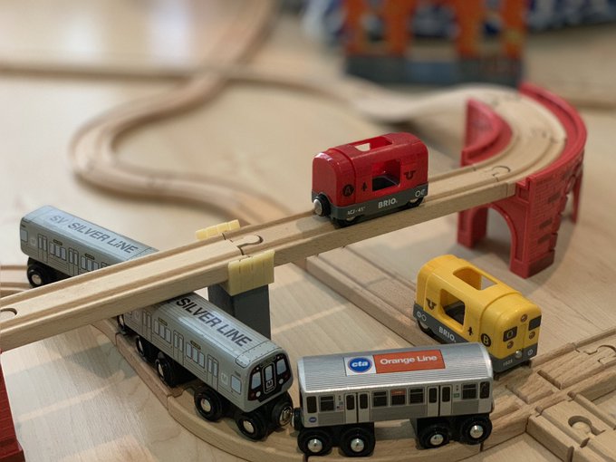
THIS. IS. AWESOME.

This weekend my 5yo and I fulfilled my years-long dream of recreating the
#wmata
metro map in wooden railway tracks
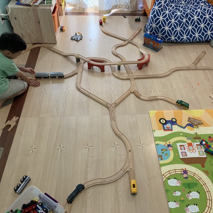
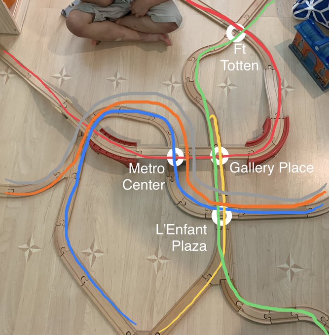
31
216
1K
1
17
111
Finally found a true-colour version of the infamous 1989 East Berlin rail map. Much better than oversaturated one I featured back in 2012.

7
51
112
I've had to keep this under my hat since January, but release day is here at last! A collaboration with
@FieldNotesBrand
for their latest Quarterly Release - the "Mile Marker" edition. Map by yours truly!

1
23
108
Proof of concept. Generating CMYK halftones in Photoshop, then nudging the channels *slightly* out of alignment to simulate the mis-registration of inks. (I think
@pinakographos
gave me this idea.)

7
7
111
An interesting approach! And here's what the Borealis looks like on my Amtrak-as-Subway-Diagram... yep, that's 16 [sixteen!] routes into/out of Chicago now!


4
17
111
This 1927 map of the Seto Inland Sea by master cartographer Hatsusaburō Yoshida is pretty much my favourite thing ever. (Detail of Osaka).


2
45
109
There’s a tram up the end of my street! This is the Tokyo Sakura Tram (also known as the Toden Arakawa Line) and it’s super cute. There was a heritage tram going the other direction, but I didn’t get a good shot of it.

5
11
108
Can I get enough of Art Deco streamliner trains? I really don't think so. (Southern Pacific, 1937)

3
23
103
Man, the 1970s! When you could use a wacky ornamental display font (Milton Glaser's "Babyteeth", possibly the Letraset rubdown text version) on your Very Serious Government Report™ and everyone was cool with it.


3
12
106
THREAD: Okay, so I coloured up that proposed Cleveland rapid transit station underneath Public Square so we can work out what the heck is going on.

6
21
106
Must see! A simply incredible railway trackage map of France. ALL OF IT.
4
41
106
Hey everyone – serious tweet. My dad back in Australia is gravely ill and I'm heading out in a couple of days to be with my family back home. The blog will probably be quiet while I'm away and the store will be temporarily shut as well.
14
1
104
Dear lord.
2
16
104
And from the same statistical atlas as the map of France, here's 1889 Paris – with passenger numbers for trams, the circle rail line, the mainline terminal stations and boats – which carried a huge number of people in this pre-Métro city.
Source:

0
52
100
"One does not simply catch the Piccadilly Line to Mordor."

@Mr_AllenT
Here is the Map of Middle Earth (very approximative... Hehehe...) in the style of London Subway Map!
Prompt in ALT,
#DALLE3

0
4
29
2
10
102
Not map related, but I went hot air ballooning over the weekend and I'm pretty pleased with how these "world from above" photos came out.


5
7
99
When you're after an authentic 1970s aesthetic in a transit map, don't forget the super-tight letter spacing! (This example emulates the letter spacing on the 1972 Vignelli New York Subway diagram.)

5
13
97
Because it's what I do when I'm unhappy with a Sydney Trains map, here's my reworked version of what a map *could* look like when the Sydney Metro is fully open. Notes and thoughts in the following thread.

9
18
96
Charming transit vignettes from a 1952 map of SF. Old 3rd/Townsend SP terminal; cable car turntable; southern Twin Peaks streetcar portal.


2
37
98
Match 24 of the
#wctransitmaps
- the last Round of 16 match - is here. RT for more votes!
ROUND OF 16 – BLUE LINE MATCH 6
----
Which city has the better designed transit map, Vancouver or Santiago?
(Comparison image and links to full maps threaded below)
#wctransitmaps_poll
Vancouver SkyTrain
830
Santiago Metro
2098
75
121
91
Two options that I think have better information hierarchy than
@SoundTransit
's proposed Link destination boards:

11
47
95
Lots of people pointing me to the SFGATE article comparing BART to other world transit systems. I don't get the point of overlaying not-to-scale schematics over a geographical base map... it doesn't prove anything. I mean, Moscow's Metro does not look like this in real life.

9
11
95
This 1936 illustrated map of California is one of my favorites in the "Transit Maps" collection – it's this detailed for the entire state!

1
8
97
New Project: New York Subway Map in the Style of the London Underground Map! Yes, it's FINALLY really done.

6
29
93
Oh, it's always fun to print a BIG map – using the full 44" width of the Epson P9000 here!

4
2
94
I'm always a little perplexed by transit agencies who talk about running reduced service "in honor of" Memorial Day. How exactly is that honoring anyone? "In observance of" is a much better way of phrasing it.
3
7
94
Before and after. This map for a proposed Boston North South Rail link concept has bugged me for years (see review here: ). When it resurfaced recently via
@railmaps
, I suddenly knew what I'd do to fix it.
Thread continues....


20
7
94

The final word on my dad - we laid him to rest in a wonderful celebration of his life yesterday. Today, a lunch in his honour with family and then I fly back home to Portland on Sunday. Thanks for all your well wishes and support.
4
2
92