
Neil Kaye
@neilrkaye
Followers
17K
Following
3K
Statuses
2K
Climate data scientist @metoffice specialising in generating interactive websites and bespoke #dataviz. #climate #maps #GIS #mapping #Rstats Views are my own
Joined March 2017
Global monthly temperature between 1851 and 2020 compared to average for 1850-1900. This uses the latest version of HadCRUT5 showing many recent months more than 1.5°C above pre-industrial values. #dataviz #globalwarming #climatechange

68
730
1K
It may not feel like it but average temperatures at this time of year in the UK are similar to the middle of May. Here is a #dataviz showing periods of equal average temperatures.
9
39
287
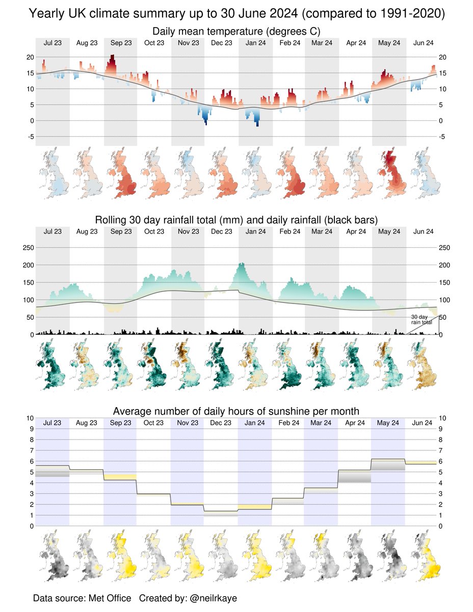
Here in the UK, September has been slightly cooler than average. It was very wet and dull in England and drier and sunnier in Scotland. Near the middle of the month it got very cool for that time of year. #dataviz

0
3
5
It's the equinox on Sunday, here is an animation showing the path of the sun on the equinox and the solstices #dataviz
2
136
405
If it feels like it is a bit cold at the moment here in the UK, this #dataviz shows that yesterday was the coldest day for the first half of September (1st to 15th) since 1998. I don't think today is going to be much warmer!

1
12
33
I have joined blue sky at: Not sure if twitter will stop this post appearing!
1
0
3
RT @neilrkaye: The UK summer has been cool compared to ones from the last 10 years, but it would have been the warmest summer in the 1960s,…
0
41
0
The UK summer has been cool compared to ones from the last 10 years, but it would have been the warmest summer in the 1960s, the third warmest in the 1970s and the 4th warmest of the 1980s. This #dataviz shows the summer versus other summers since 1884. #globalwarming

8
41
126
Here in the UK, the summer has been cooler than we have had recently (coolest since 2015). Rainfall and sunshine have been close to average. August was very wet in West Scotland. Here is a #dataviz of the weather/climate summary for the past year. #globalwarming #climatechange

3
4
28
Here in the UK, July was a bit cooler than average, a bit duller and with average rainfall. Here is a #dataviz of the summary of the weather/climate for the last year #climatechange #globalwarming

2
6
20
For England (CET) it has been the second coldest first half of summer in the last 30 years.

5
13
41
Here in the UK, June was slightly cooler than average, a little bit sunnier and quite a bit drier. Here is a summary of the weather and climate for the last year. #dataviz #climatechange #globalwarming
0
8
31
This table shows the top 10 warmest months and seasons over the UK since 1884. Highlighted are the years since 2000, all the warmest years have been this century. #climatechange #globalwarming #dataviz

1
9
14
RT @neilrkaye: Here in the UK, it was the warmest May on record and also the warmest spring. March and April ensured it was the 6th wettest…
0
21
0
@VictimOfMaths Nice plot. Perhaps you could annotate the numbers for the parties, e.g. Labour 250 -> 400 or whatever the number is, I'm not going to count the dots ;-)
0
0
0
Here in the UK, it was the warmest May on record and also the warmest spring. March and April ensured it was the 6th wettest spring, it was a dull season though with less than normal sunshine. Here is the UK climate/weather summary for the past year #climatechange #globalwarming.

2
21
53
RT @neilrkaye: Although this month may not have seemed that warm, it is on course to be the warmest May on record. This #dataviz shows that…
0
13
0
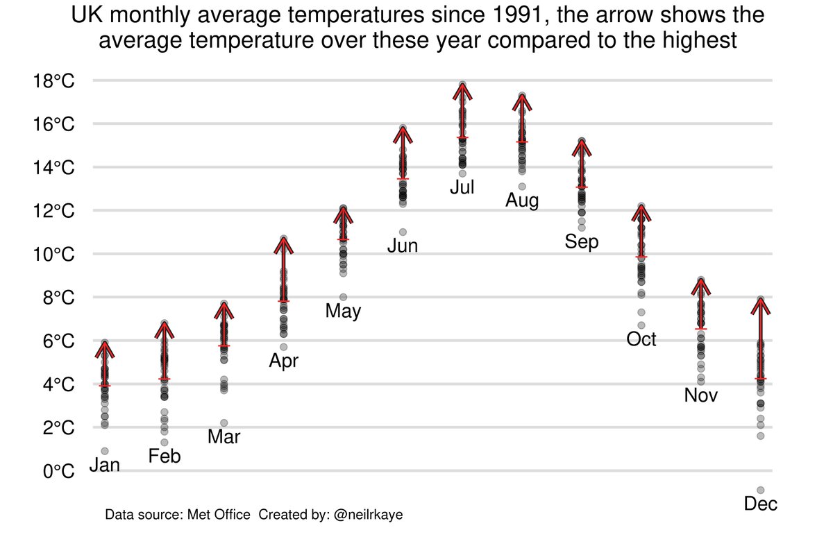
Although this month may not have seemed that warm, it is on course to be the warmest May on record. This #dataviz shows that it is the easiest record to break as it is only 1.4°C between the 1991-2023 average and the highest May temperature. #climatechange #globalwarming
3
13
24
RT @neilrkaye: Here in the UK April was wet and dull, it was warm in the first half and cold in the second half. This #dataviz shows a clim…
0
9
0
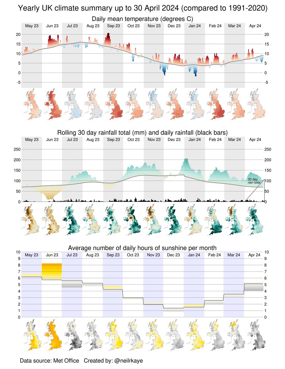
Here in the UK April was wet and dull, it was warm in the first half and cold in the second half. This #dataviz shows a climate/weather summary for the past year. #globalwarming #climatechange
0
9
24
