Design Everywhere
@dsgnevrywhr
Followers
7,573
Following
6
Media
415
Statuses
508
A digital platform showcasing real-life creative works of designers, both up-and-coming and established, from all around the world.
Join our Club
Joined November 2020
Don't wanna be here?
Send us removal request.
Explore trending content on Musk Viewer
Olympics
• 2016771 Tweets
オリンピック
• 486359 Tweets
フランス
• 226862 Tweets
Christians
• 217145 Tweets
#LaCasaDeLosFamososMx
• 117957 Tweets
花火大会
• 107669 Tweets
Gala
• 98071 Tweets
高校野球
• 55825 Tweets
世界遺産
• 46682 Tweets
Agustín
• 41224 Tweets
佐渡金山
• 35825 Tweets
DDAY YOU BETTA CATCH UP
• 35513 Tweets
バレーボール
• 31118 Tweets
अब्दुल कलाम
• 29863 Tweets
佐渡島の金山
• 26405 Tweets
登録決定
• 22407 Tweets
BOSSNOEUL BEWITCHED
• 22005 Tweets
पूर्व राष्ट्रपति
• 21776 Tweets
D-DAY JULIExSTELL
• 19919 Tweets
リーリヤ
• 17146 Tweets
#APJAbdulKalam
• 17076 Tweets
ONE WORLD ONE SKY
• 14049 Tweets
男子バレー
• 13354 Tweets
世界文化遺産
• 12346 Tweets
syrup16g
• 11914 Tweets
大阪桐蔭
• 11761 Tweets
BILLYBABE FITOXY DAY
• 11643 Tweets
ぬーどるストッパーの陣
• 10598 Tweets
木更津総合
• 10580 Tweets
守備妨害
• 10252 Tweets


Pinned Tweet

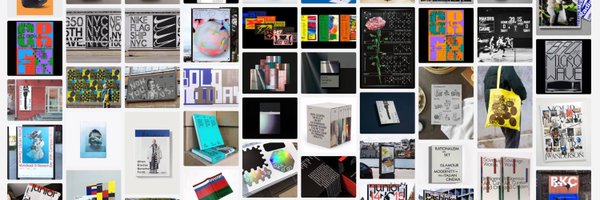
Sydney-based design consultancy M35 collaborated with the Nike global team to redesign the visual identity of
#Nike
Free, a minimalist running shoe designed to replicate the experience of running barefoot.
■ WK-041: Nike Free
→


1
60
658


Designer Harry Wright has recently refreshed his website with some new projects.
4
267
2K


Studio Werk recently worked on some graphics for
@Nike
's customization design service, 'Nike By You', at the Nike Orchard Road flagship store in Singapore.
2
195
2K
Studio Bbareunson designed the key visuals for CraftSeoul 2024, an exhibition representing a new era of craft-based culture in Seoul.
2
242
2K
Packaging still life by Stockholm-based designer Marco Taccola.

3
115
1K


Creative director
@kunelgaur
’s type explorations for the Typogram® series form an ongoing body of work rooted in functional design and architecture. They utilise typographic forms as a canvas, drawing inspiration from the dynamic visual culture of the streets.
4
107
1K


Studio Airport designed the moving poster for the SlapFunk Records weekenders in their beloved clubs, Lofi and BRET Amsterdam.
2
143
1K


Creative studio Viuda Studio’s graphic identity for Adiós Studios.
5
81
1K
TERRA is a pocket-sized compass designed with the science of AI and the wisdom of mindfulness, allowing you to wander without getting lost.


11
125
1K


Creative studio Rob & Robin's illustration for The
@NewYorker
for an article about collaborative productivity.
11
124
1K
Non-Objective's series of covers for Studio 96, a weekly mix show hosted by Nocturnal Wax.
0
67
870
Designer Hvnter's branding concepts for the fictional clothing brand ©MOMENTUM Clothing.
1
66
852


Acid Grotesk is a typeface embodying Acid House Barcelona's essence. Named after the transgressive music genre, it captures the hub's fluid, energetic, and hybrid nature.
6
55
719
A collection of posters created by Taipei-based graphic designer Yi Hua Lin draws inspiration from Taiwan's mountains and seas.
1
109
624


Paprika's branding for La Ferme du Loup showcases their expertise in maple wine production and commitment to forest conservation, featuring a playful wolf motif in the logo and initialism.
0
38
570
Design studio XYZ Lab’s visual identity design for the 2nd Stay Art Festival.
0
47
558
Porto-based graphic designer Oscar Maia designed skateboard decks and merchandise for the local brand Clandestina Skateboards, released back in mid-2021.


6
34
529
HOUTH design studio's series of risograph posters for the Flo Flow Flower project was inspired by their joy of caring for plants.
1
50
533
Creative director Giulia Boggio worked on some test uses of foundry ’s typefaces for their launch.
0
42
518
Graphic design studio Reesaw Studio’s identity and package design for 02 Fresh Drinks.
1
47
508
COOOT. Studio developed a brand identity for the coffee brand EZA Coffee, emphasising fashion at its core.
1
41
505


Creative studio FCKLCK designed the packaging for MOKSI, a Belgian brand offering daily skin and body essentials for individuals undergoing cancer treatments.
2
47
474


Sydney-based brand and design practice Accompany’s brand identity for Round and Round, a digital platform that provides Sydney residents know-how and local connections to go circular and further a more sustainable Sydney.
5
37
468
Inspired by the Singapore’s culture and imagery, designer Jaehoon Choi created graphic works for '
@Nike
By You’ at Nike Orchard Road flagship store in Singapore.
2
42
460
HOWFUL introduced and designed The Paper Clock, a Riso printed poster clock, during their last Riso printing workshop.
1
55
435


Graphic designer Chase Shewbridge’s creative direction and design for
@nike
x Usal “Earth/Tones”.
1
35
424
Graphic and motion designer
@_hesselucas
created a motion design for a lecture titled 'Energy in Motion' held in Hamburg. The lecture focused on his work and principles of motion.
4
49
414
Design studio MOTOMOTO Inc. crafted the cardboard box packaging design for Lumine Agri Marche.
2
42
413
Graphic designer Ross Paul McEwan recently designed record graphics for Ute, an Oslo-based record label and event series.
1
43
400
Compound is a ZINE created by
@nuhsikasas
to coincide with the current exhibition "3ジン" held at
@aohatabooks
.
0
46
356
Rukh is a sharp and contemporary display typeface that embodies tension through two contrasting states; elegance and boldness. Designed by Kaam Kaaj Studio and Bouk Ra.
1
36
348
Designer Kang Li Peng created the packaging and brand identity for Percent Craft, a high-quality craft beer brand named to reflect the pursuit of perfection, symbolized by the effort to achieve a score of 100.
2
24
314
Digital type foundry Fonts From Folch collaborated with experimental studio Franc Studio to showcase their typeface, Acid Grotesk, as part of an ongoing series of collaborative projects.
0
28
310
Design consultancy
@bakoom_studio
created a graphic campaign for Mixtur, a festival of newly created music and sound arts in Barcelona.
3
28
308
Art director and graphic designer Anton Synytsia’s poster for TYME and Brutalism at Lobe Block.

2
28
296
Creative agency Bon Temps’ brand identity for Madrid-based production studio Espacio Nueva Carolina.
0
29
294
Graphic design studio HDU²³ Lab’s poster design for a pop-up store by WallpaperSTORE* at JC Plaza.
0
17
294
Abnormal is a modular display font that follows a 3:2 aspect ratio and incorporates design elements like lines and rounded corners, created by Marco Taccola.
1
29
290


U-P’s branding and graphic design for REBEL REBEL, a casual eatery, wine bar and bottle shop in New Acton, Canberra.
With subtle nods to David Bowie, the identity aims to subvert the typical fine dining milieu and to evoke the playful irreverence of punk and post-punk attitudes.
1
36
281
Creative studio Gina Guasch Team created the template design for Public Records, a multifaceted space for culture and community in Brooklyn.
1
19
286
Designer
@AeniKaiser
teamed up with Jonas Holfeld on the web design for Riddle, a new series of events for electronic music and sound art.
1
29
284
Studio Tillack Knöll designed the identity and poster for "Der Aufstand in Person," a poignant exhibition where protagonists share their stories of symbolic resistance and bring them into the public space.
0
31
280
A diary of every single piece of media I consumed in a week is a zine logging every bit of media Kari Trail consumed from January 31 to February 5: music, movies, books, letters, articles, shows, social media, etc.
0
37
280
Reflecting on another year as we're just 2 days away from the end of 2023!
In 2023, we:
• Launched our website
• Introduced Club membership
• Curated perks for Club members
• Featured 112 projects to date
Thank you 2023!
1
23
269
Design studio
@StudioFeixen
designed an interactive poster for Oto Nové Swiss, enabling users to explore, play with, and even compose their own music.
2
43
265
Design studio Santanasantana designed the graphic identity and art direction for Lava Circular, an interdisciplinary cultural circuit held on the island of El Hierro.
1
24
260
Graphic designer Eunsun Park’s brand identity and showroom visual direction for ISaid.
2
27
262
Seoul-based graphic design practice Studio Werk’s graphic identity for
@Samsung
's latest flagship devices launch event in South Korea.
■ WK-061: Samsung Galaxy S23 "Explore the New"
→
0
34
253
Blavet Studio's new identity for the vegan wine brand CAPRICHO BY PARATÓ draws inspiration from light, reflections, and colors.
1
33
252
Save these mockups for your next project👇
→
→
→
→
→
→
→
1
22
249
Multidisciplinary creative company
@instrument
’s recent work for
@Nike
Year in Review, a personalised experience for its members to celebrate what they’ve achieved and set intentions for growth in the year ahead.
1
14
246
OT Bulb is a newly released typeface by Off Type Foundry, inspired by old billboards, light leaks, and vintage punch printers.
5
34
249


Sascha Lobe and his team created a Bodoni-inspired desk for their
@pentagram
London office to celebrate their Bodoni installation at the Biblioteca Palatina in 2019.

0
23
221
Branding, copywriting, packaging, and art direction for the Modern Australian Gin brand BRIGHTER LATER by The Company You Keep.
1
22
222
FFF Age Tool is a new custom typeface by Folch for SAPIENS.
Drawing inspiration from the natural process of deterioration, this font captures the complexities and subtleties of nature. Age Tool offers five unique styles, each representing a different stage of wear.
0
25
221
Studio Taşch created a motion poster for its Poster Series Vol. 5.
0
25
208
Creative design studio Noknow Lab was responsible for developing the brand identity for a' coffee, a coffee brand.
0
17
202


Independent creative studio SAYSOOO’s visual identity and packaging design for HeyBetter, a lifestyle brand for children.
1
15
180
Design studio Normal Logic worked on the album design for South Korean Musician Daniel Kang.
0
13
181
Studio
@_hesselucas
' animated film poster created as a fictive example for their two-day graphic and motion workshop, "Animated Film Poster."
0
16
180


Graphic designer Han Lu’s visual identity system for nurans, a pet brand dedicated to enhancing pet immunity through scientific research and high-quality product development.
0
11
175
Folch Studio recently designed the website for Tomorrow, a production company based in Los Angeles.
0
18
175
Multi-disciplinary design studio ATIO Studio's visual identity and packaging design for Ethera CBD.
1
15
173
Los Angeles-based design studio Perron-Roettinger designed the visual identity for
@semiglobal
2021, featuring a custom typeface created exclusively for the festival.


2
15
169
Graphic designer Jun collaborated with Yumi Lee to create the identity and website design for Fall Min, a photography studio founded by photographer and art director, Gaeul Min.
0
14
160

RIMBOMBO is a photographic exhibition realised by the students of the Free University of Bozen-Bolzano in collaboration with the Museo storico del Trentino at la bOOkique.
0
19
161
Futur Neue’s screen print poster for Echo Brut 01 Font Exhibition.

0
9
158
Astrae Studio's identity for Institute of Sport, a social sports club founded by
@on_running
and the Copenhagen-based concept store Grocery.
0
11
157
Brand-building agency
@AfterHoursStud1
was tasked with crafting the identity for coffee roaster SPOT. The goal was to capture SPOT's playful spirit while also conveying that their coffee is of top-notch quality.
0
18
153


Book spine experiments by Stockholm-based creative director
@_Kurppa
of the design agency
@KurppaHosk
.

2
9
149
Graphic design studio MOTOMOTO inc. has created the visual identity and packaging for the coffee brand DO. The designs are intended to convey a sense of lively energy.
0
13
150
Paris-based designer
@Alexis__Jamet
's poster and identity for the MagMa Festival, a free weekend combining music, visual arts, creators, etc.
2
20
152
Studio Hato created the digital identity and website design for Bloomberg
@NewContemps
2023 at
@CamdenArtCentre
.
0
13
151