BAD DataTakes
@BadDataTakes
Followers
29,876
Following
214
Media
1,662
Statuses
8,950
might get more active: @baddatatakes @mstdn .social Tracking bad use of data; data is plural;
Joined September 2021
Don't wanna be here?
Send us removal request.
Explore trending content on Musk Viewer
I Wanna
• 246604 Tweets
#BLEACH
• 210163 Tweets
Pete Rose
• 159669 Tweets
PlayStation
• 125716 Tweets
#WWERaw
• 111701 Tweets
Lions
• 105351 Tweets
Jimmy Carter
• 50331 Tweets
Seahawks
• 48902 Tweets
Dolphins
• 47278 Tweets
Hall of Fame
• 47183 Tweets
Titans
• 46327 Tweets
Detroit
• 42217 Tweets
Goff
• 35328 Tweets
BAMBAM
• 34487 Tweets
Happy New Month
• 32669 Tweets
Respecting Ancestors
• 28196 Tweets
सोनम वांगचुक
• 25428 Tweets
コーヒーの日
• 23982 Tweets
Amelia Watson
• 22984 Tweets
Christ is King
• 19184 Tweets
都民の日
• 18633 Tweets
Geno
• 15933 Tweets
メガネの日
• 15854 Tweets
TEN FIREWORK IT
• 14287 Tweets
Charlie Hustle
• 13437 Tweets
McDaniel
• 13013 Tweets
Pancasila
• 11039 Tweets


Pinned Tweet

Just a reminder that I did set up a substack as my official backup.

Hi new friends. see this thread for how this account works, how it's somewhat different from
@GraphCrimes
and how it's somewhat different from bad take twitter
0
1
53
1
1
29


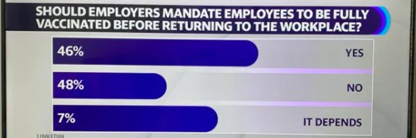
The question wording is "do you agree with the phrase 'it's ok to be white'"
This is a phrase that has been co-oped by racists as a dog whistle for their white nationalism.

22
95
1K


@optimablog
in fairness, the actual numbers DO increase. the numbers were wrong, not the bars
0
2
776


Via
@YVioletGuo

This is the quality of chart you would expect to be published on a dot info domain. Someone paid someone else money for this and thought it was a perfectly fine way to visualize data. I mean, where to begin...

167
138
2K
6
14
686


actually idk, are there only 4 rail employees in the United Kingdom?
12
10
655


An oldie, but a goodie. They fucked up names/colors on the bottom and made it so that for Sanders had different colors for favorable/unfavorable


6
36
582


There are just SO MANY of these takes out there.
Land doesn't vote, ya weirdos

11
13
548


Sometimes stats are made up on the spot. Sometimes they are made up to troll you.

5
10
518
Do not use GPT instead of hiring a lawyer.

8
21
475


@elonmusk
Question for you: did you fire the team that removed tons of bot accounts daily? Because if you did then....uhh you are inflating exactly how you accused twitter of doing.
9
7
362


0
16
351
@elonmusk
Also....the increase in users would have started almost a month before you took over at the end of October

12
1
340
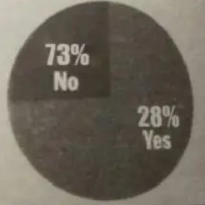
The question asks if you agree with the "phrase". Reading the question my thought was to answer no because I disagree with the phrase how it is usually presented. It's not innocuous. It has socio-contextual meaning that is being washed away by rassmussen and Matt Walsh
3
14
330

Can't believe we have to say this, but this chart being wrong does not validate or invalidate your policy preferences. Those are ALSO bad data takes
1
2
310
There may actually be some interesting things in the dark deep crevices of the report. But calling the US military weak based on vibes is just bad data
3
0
307
@palindromic_bob
@imoveryourcrap
Or the name of this account. Lots of ppl in these here replies are trying to be featured as the days' bad take
0
0
289


My followers should know this already, but the science we have points towards to Huanan Market as the origin of the Pandemic. Every time they bring up an alternative they use bad data, mislead, or lie to do it.

Early COVID cases are pretty clearly clustered around the seafood market

4
18
195
6
40
285

11
2
275
3
0
285
Also pls stop saying this is how women view the height changes in men. The more famous version of this graph is literally the version with a skirt. Why are you weird
3
1
281
From a data perspective it's absolutely a red flag that
@jessesingal
says that the data is not collectable when we already have some data around the exact problem he is talking about.
If I was admitting that my career was based on something backed by zero evidence I would simply not accuse someone else of fomenting a moral panic in the very next tweet.


27
248
2K
3
35
279
I'm going to explain it here. But basically you used an unnecessarily wide Y axis to make it seem like the temperature didn't increase. Why have a -10 and +30 range? It's WAY too wide

7
0
1
5
3
273


Apparently they have it fixed on the website
don't know the precise origin (was this taken on the TV? thats a question for
@DrGBuckingham
) but we see this a lot. Design/production ppl take a chart and go without checking with the data folks first.

6
4
253


Come to this account for bad charts, stay for long twitter threads about extremely small items found in a scientific study
3
2
229

This sucks so much
So much of the fun of Twitter exists because of these little bots that ppl made. So many cool little tools that let you analyze tweets or take screenshots.
This will be the end of them.

Starting February 9, we will no longer support free access to the Twitter API, both v2 and v1.1. A paid basic tier will be available instead 🧵
11K
17K
20K
3
23
235


do you think that my clients would appreciate this format for my reports?

‼️REALLY excited to report my talk "Building a ggplot2 rollercoaster: Creating amazing 3D data visualizations in R" was accepted to rstudio::conf(2022)! Can't wait to see everyone in person and show you how to use
#RStats
to make incredible 3D
#dataviz
!
#rayshader
#rayrender
42
129
1K
4
11
225

@JUNlPER
And YET somehow he took longer to get to the bottom than others. The physics are incredible
1
1
224
Yes, we all object to the chart being used this way.

1
9
216

Can't have red in both Russia AND the countries that have imposed sanctions. Gotta use like green or something to differentiate or don't use the Russian flag

8
5
218

In which elon makes the case that him taking over Twitter caused a massive spike in hate speech


1
14
208


@intothecrevasse
Imagine the "returned at this point on the vhs tape" data we could have had.
0
0
198


Good thread talking about the gas stove issue. At this point it seems likely that gas stoves are increasing asthma risk in children. But there is a good bit of uncertainty around how much. Lots of factors to consider

This new "gas stoves cause 12.7% of childhood asthma" thing is a great example of how we often aren't very good at communicating uncertainty
I don't really agree with these headlines 1/n


24
108
591
4
20
190
@MattZeitlin
One of the highlights of my career was finding an error in McKinsey data that they tried to bury after they pettily criticized my analysis
1
3
187
Just to explain why ai driving is problematic, this is [likely] ai training data

the machine refused to recognize my humanity until i professed to believe that a sign painted to look like a traffic light is indeed a traffic light.

443
5K
36K
7
16
178


1
4
182
@Noahpinion
Did you find any data suggesting that increasing police training actually reduces propensity for violence? Did you check to see if police departments that increase training see reductions in use of force?
3
2
173