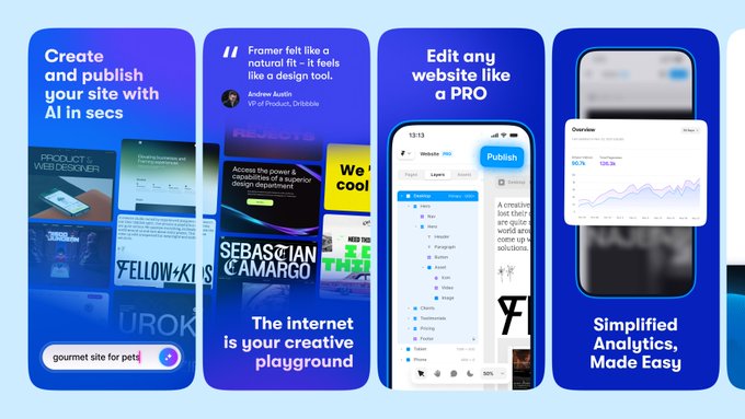
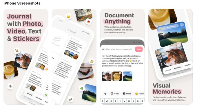
the screenshot first company
@screenshotfirst
Followers
4,544
Following
180
Media
229
Statuses
500
Adding RIZZ with App Store screenshots 🌈 Boosting conversion rates with stunning designs NGL, Purp, Runna, Anima, Playground, Wave AI ✨ DM for inquiries!
Singapore
Joined January 2024
Don't wanna be here?
Send us removal request.
Explore trending content on Musk Viewer
Madison Square Garden
• 669114 Tweets
Arsenal
• 337013 Tweets
Liverpool
• 190203 Tweets
Patriots
• 168078 Tweets
#MexicoGP
• 165071 Tweets
Perez
• 126492 Tweets
Jets
• 119922 Tweets
Eagles
• 116044 Tweets
Charles
• 109562 Tweets
Boulos
• 104108 Tweets
Puerto Rico
• 103627 Tweets
Sainz
• 96879 Tweets
Norris
• 83342 Tweets
Verstappen
• 82357 Tweets
Browns
• 80801 Tweets
Lions
• 79042 Tweets
Checo
• 74993 Tweets
Ferrari
• 74727 Tweets
#OMPSG
• 70476 Tweets
Fortaleza
• 69605 Tweets
Ravens
• 67584 Tweets
Tarcísio
• 67306 Tweets
Nunes
• 61377 Tweets
Franco
• 59042 Tweets
Leclerc
• 49402 Tweets
Bengals
• 47676 Tweets
Jameis
• 45517 Tweets
Bears
• 41063 Tweets
Packers
• 38989 Tweets
Hamilton
• 36711 Tweets
Lawson
• 33512 Tweets
André Fernandes
• 31431 Tweets
Jalen
• 30004 Tweets
Colts
• 28469 Tweets
Dolphins
• 25064 Tweets
Martha
• 21912 Tweets
Caleb
• 19976 Tweets
Tony Hinchcliffe
• 18764 Tweets
Seahawks
• 16428 Tweets
Porto Alegre
• 15647 Tweets
#MexicanGP
• 10499 Tweets
Anthony Richardson
• 10390 Tweets


Pinned Tweet

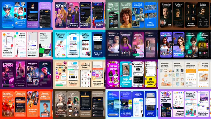
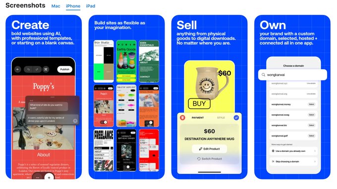
We are The Screenshots First Company!
We specialize in creating captivating visuals and adding rizz that make your app shine in stores.
Clients:
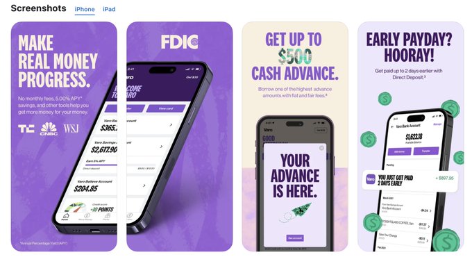
Mesmerize, Purp, DMV genie, Anima AI, Kismia, and counting!
Calling all passionate founders - let's make your app stand out!
6
9
195

Favorite bits from August 🌈
Which set of screenshots is your favorite?


15
32
668
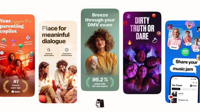
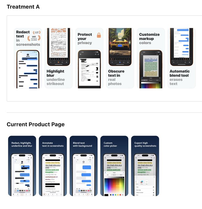
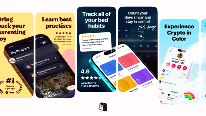
One of the biggest screenshot revamps of this year 🌈
We've partnered with FAMS Parenting App to transform their app and boost their App Store visibility. Our collaboration has led to a brand-new, from-scratch visual identity.
Which screenshot version grabs your attention?

11
24
529
Favorite bits from July 🌈
Which set of screenshots is your favorite?


11
12
464
New concept 🌈
Last summer, we teamed up with
@playground_ai
to revamp their app's store presence for their biggest update yet.
We explored various concepts in search of the perfect visual ideas, and we want to share one of our unused ones!
Thoughts on this concept?

11
18
545
Wow!
You’ve crafted a fantastic app with a great product interface.
To improve, focus on the value proposition you want to convey. It’s not clear what you’re selling right now. Try showcasing some use cases visually through photos or illustrations.
References attached 🌈


3
19
387


Favorite bits from September 🌈
Which set of screenshots is your favorite?


8
11
329
Favorite bits from March 🌈
Which one do you like the most?

10
8
270
You’re doing an important job with this app!
To make your screenshots stand out, consider adding illustrations, bold catchy typo to clearly convey the value proposition, and minimalistic iPhone/watch mockups, as the current ones are a bit distracting.
References attached 🌈


1
11
244
6 Months 🎉
It’s been half a year since we started our small independent design practice.
We’ve already created over 230 design concepts and A/B tested most of them, consistently winning numerous old vs. new tests (and even designed a book cover 🤯)
3
10
245
Favorite bits from May 🌈
Which screenshots do you like the most?


3
12
244
Favorite bits from April 🌈
Which screenshots do you like the most?
4
12
220
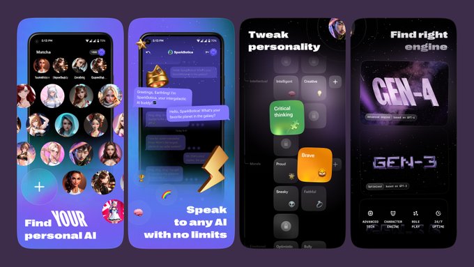
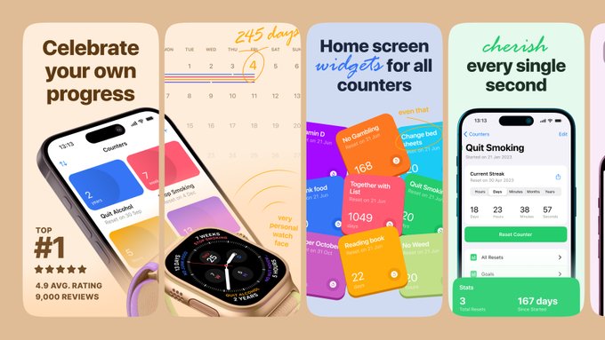
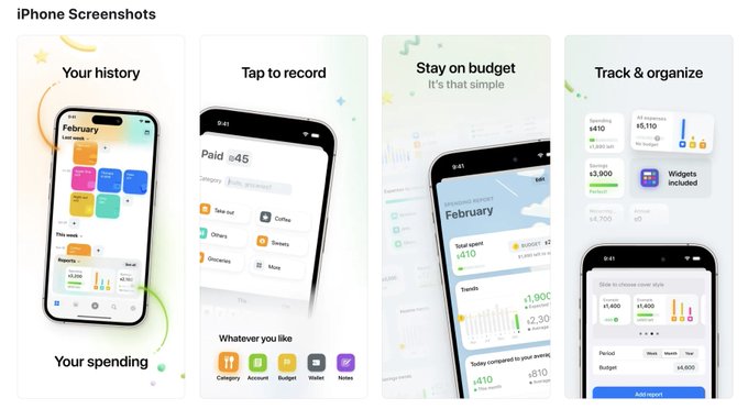
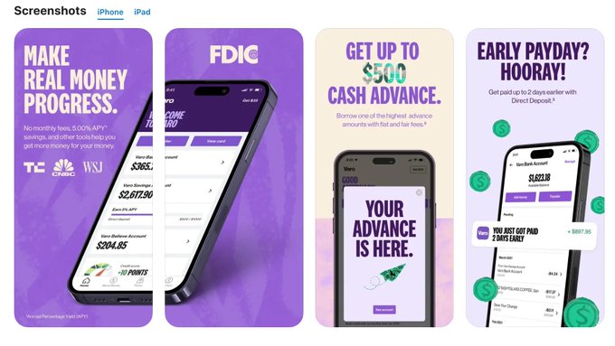
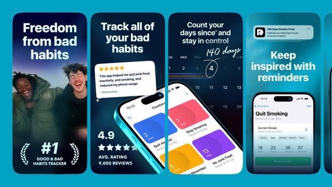
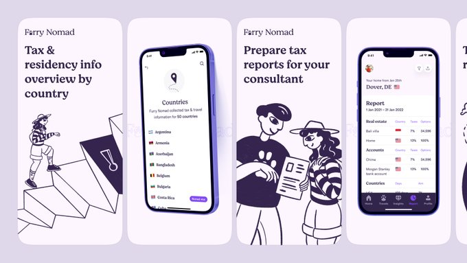
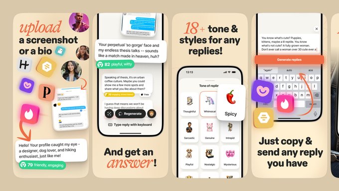
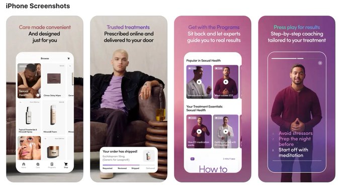
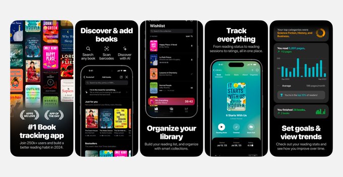
Boost conversion by 20% with the first screenshot.
When designing the first app store screenshot in sequence, ensure it conveys the vibe and clear value proposition of your product.
This is crucial for capturing users' attention and showcasing the essence of an app at a glance.
3
11
214
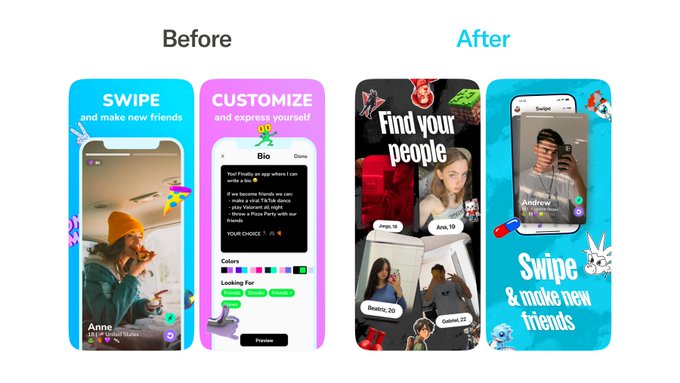
Before → After
design concept of Robinhood Investing screenshots


6
4
168

Lovely app!
You’re doing an amazing job so far. The idea of showing how simple tracking days with skies and clouds is great.
For utility apps like this, consider adding illustrations or photos. This can help convey your app’s value more effectively.
References attached 🌈


2
4
161
Boost Conversions by 20% with First Screenshots
Screenshots don’t have to be boring! Highlight your main feature, not just the app's vibe. If crucial, use two screenshots.
Combine a bold, catchy title with your value prop and product showcase.

3
6
159
New work 🌈
Screenshots concept for Days Since app
Vibrant, sleek, and with a compelling value proposition.
What are your thoughts on this concept?
3
5
159
New work 🌈
This year, we assisted the team at in testing several hypotheses. While not all resulted in a higher conversion rate, we'd like to highlight our favorite concept.
Why do you think this set of screenshots didn't perform well for the app?

3
6
156
We love the style of Prosper's screenshots!
They have a vibey feel, but personally, I think they lack enough accent.
Incorporating some accents and highlighting the value proposition with the main feature more boldly could make a significant improvement!


2
9
145
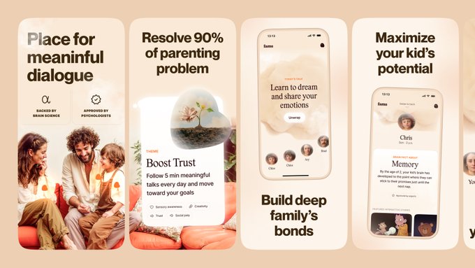
New work 🌈
Screenshots set for Fams app

7
1
136
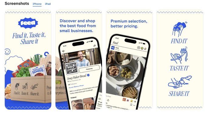
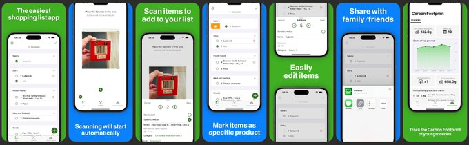
Love the simplicity of your shopping list and its unique Carbon Footprint feature!
To stand out in the utilities market, consider adding vivid food illustrations to grab attention and highlight your unique value from the first screenshot.
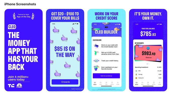
Example:
Cleo, Simple Fasting etc.

1
7
127
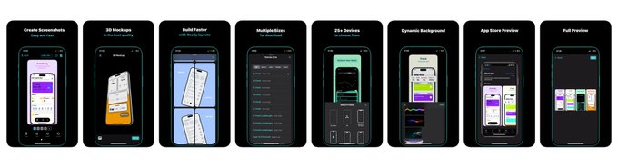
One of our favorite ways to create app store screenshots 💖
Crafting stunning app store visuals is our jam. Our secret weapon? Dynamic, eye-catching illustrations that effortlessly convey your app's vibe and value.
Which screenshot set do you like the most?


4
3
119
Before → After
We’ve partnered with the WhatColor team to revamp their app’s store presence.
We tested several beautiful design concepts and found the one that works much better in terms of conversion rate!
Which screenshot version do you prefer?

3
3
111
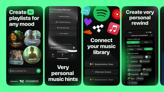
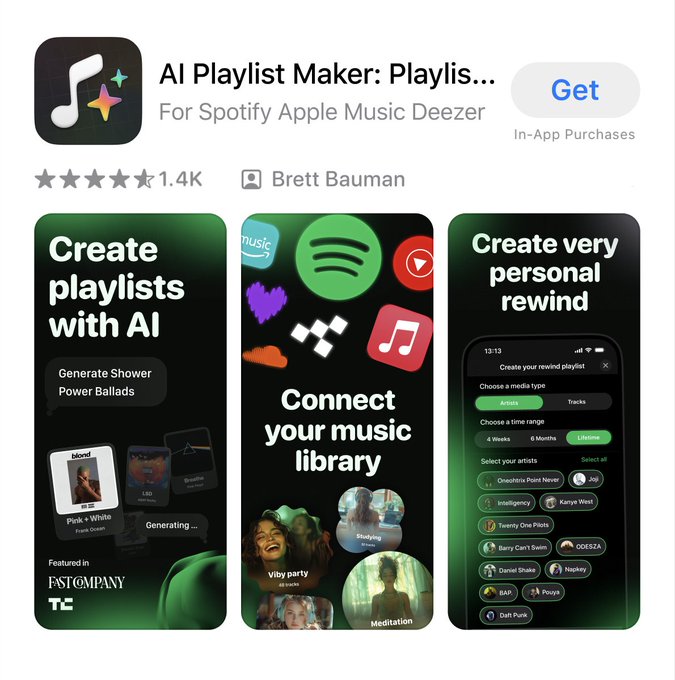
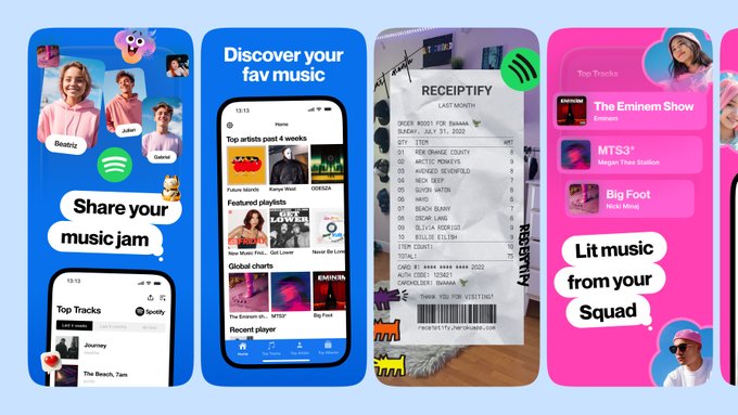
New work for PlaylistAI 🌈
We collaborated with
@brettunhandled
to create fresh new screenshots for his app PlaylistAI

7
6
108
Before → After
Here’s a design concept we tested with the Lovi app team. We’ve explored various illustrations and will share more soon.
What do you think about this concept?

10
1
99
Love the UI!
It feels so simple and great.
Excellent work!
You could enhance your app's appearance in screenshots: choose simple mockups, highlight the UI, and add some stylistic elements.
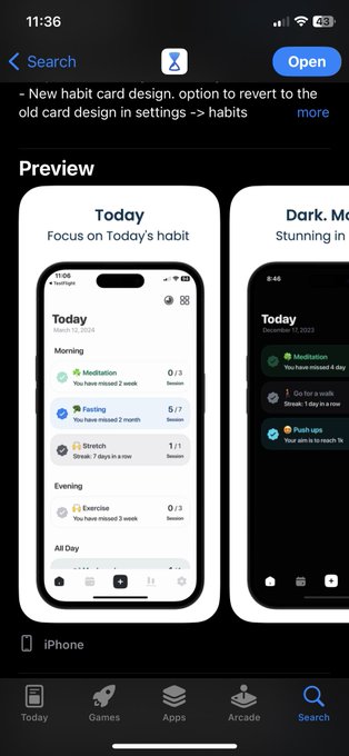
Here are some examples for inspiration:
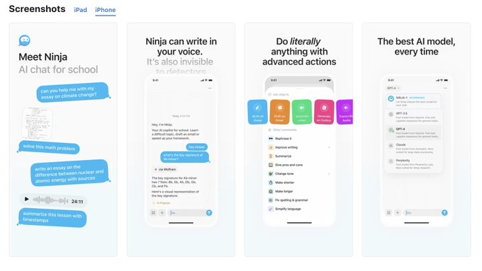
Patterns, Emerald, Grow, Ninja AI

2
7
99
New work 🌈
Screenshots concept for Days Since app

3
4
89
Goalkit's screenshot design is so cool!
Imo, could be improved a bit: reduce number of elements & increase their size, adjust the fade effect for a better feel, and tweak fonts for clearer app proposals.
Dive into more examples for inspiration


2
7
88
From time to time, we brainstorm screenshot concepts for our favorite apps.
Here's a brief overview of the latest concepts we've designed for Amie, Rainbow, Status, and Rabbit.
Which app's screenshots should we explore next? 🌈


5
2
77
Love the app and how simple the screenshots are!
Ideas for the App Store:
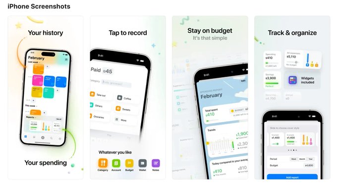
Add viby photos for a better feel, simplify screens further, using minimal iPhone mockups.
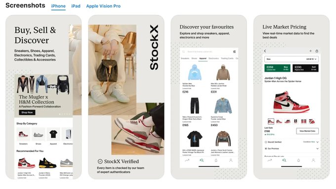
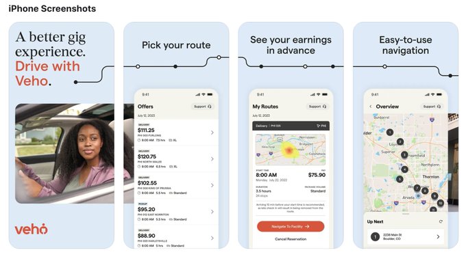
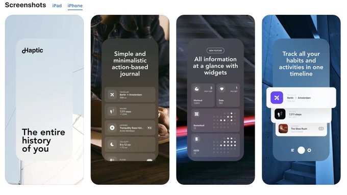
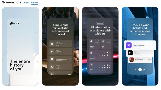
Check out StockX, Veho Driver, Haptic for inspiration

@screenshotfirst
Here is my app store page 👇.
I'm sure you have plenty of expert tips to pimp my screenshots! 🌟
0
0
1
0
4
77
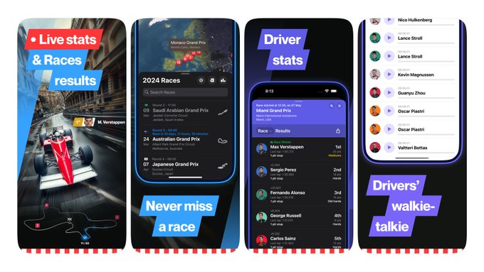
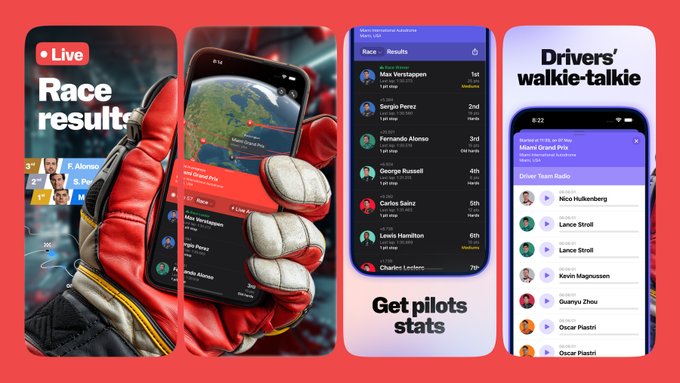
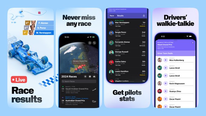
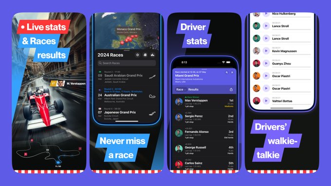
How do we iterate?
Today
@JPEGuin
released new app store screenshots for his app Race Control.
Let's highlight some of the iterations made in search of the perfect visual direction for this stunning app.
Which set do you like the most?
7
2
74
Love your that simplicity; consider highlighting this in screenshots.
Less social proof; it’s premature and doesn’t build trust. Focus on showcasing the product UI instead.
Reduce text in UI shots, enlarge them to emphasize ease of sharing thoughts.
See references 🌈


2
3
75
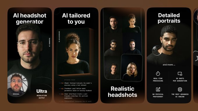
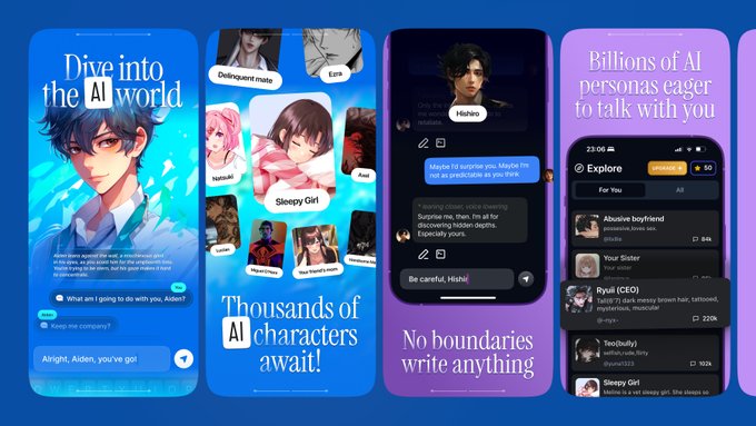
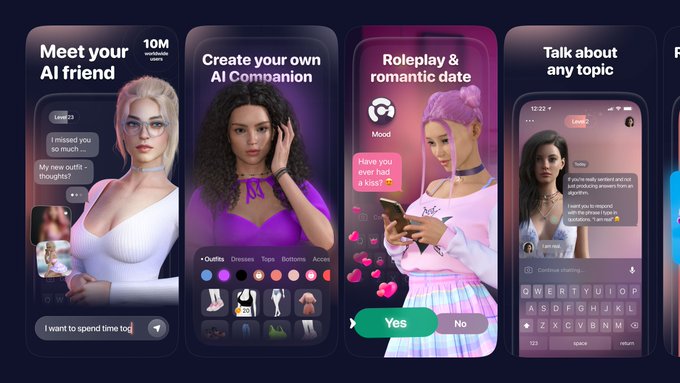
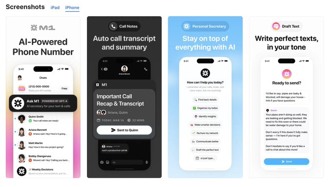
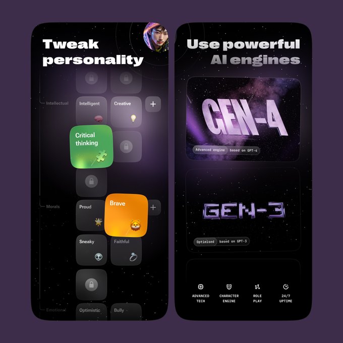
Some of our work in AI-powered apps ✨
This year, we’ve done an enormous amount of design work, spending a significant amount of time on AI-powered apps and giving them fresh looks for the app store.
Here are our favorite four sets 👇
Which one do you like the most?
1
1
72

11% better conversion 🌈
New work for the Cardstock App
Eye-catching visuals and larger typo improve conversion rates compared to the previous version

3
5
60
Before → After
New work for NGL 🌈
Updated screenshots for the popular college app, featuring improved typo and fresh branded graphics

3
2
59
Why not a short comic on the hero screenshot? 😅
0
1
57
How do we Iterate?
The first three screenshots are crucial for an app’s store presence.
We iterate extensively on them to find the most effective ones and improve the app’s conversion rate. Here’s a sneak peek into our process.
Which three do you think work best?
4
1
57
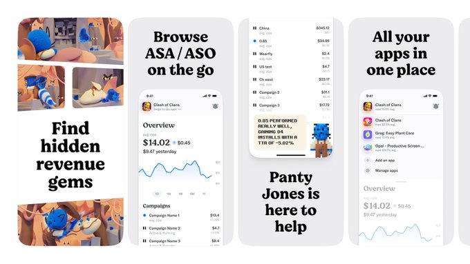
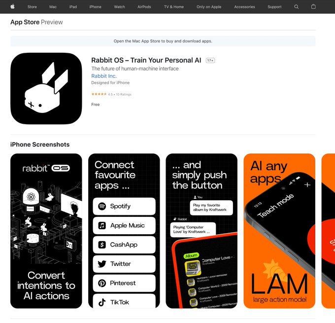
Imagine Rabbit R1 with a companion app!
Check out our playful concept 🐇
3
2
54
New work 🌈
Last month, we joined forces with
@DamjanDabo
to refresh the screenshot style for his amazing app, Itemlist.
We tackled user issues with stunning illustrations.
See more design concepts in the thread 👇

4
0
55
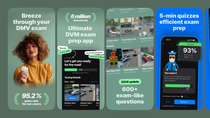
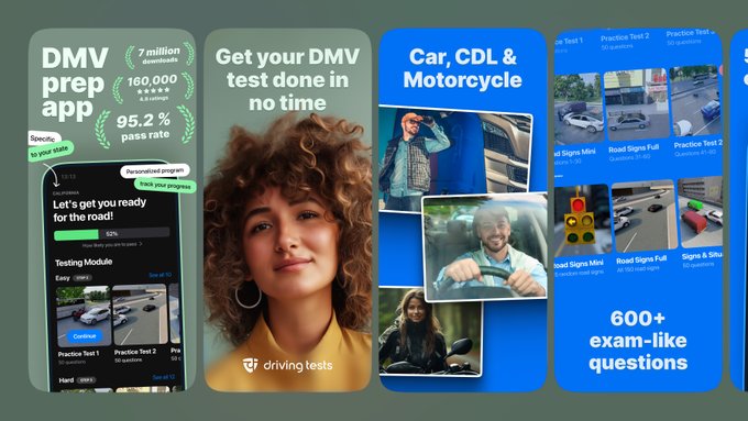
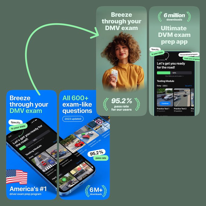
+ ~600 downloads per month for the DMV Genie app 🌈
In the past three months, we collaborated with the DMV Genie team, testing 3 major concepts and over 10 minor variations

0
0
52
Lovely idea for the app!
It’s like GeoGuessr but inverted :)
You could focus the first screenshots on clearly showing how the app works: photo → description of location.
References attached 🌈


0
1
52
New concept 🌈
Here's an unused concept we've designed for Playlist AI.
The initial screenshots are crucial, and we're currently experimenting extensively to create something truly stunning
2
1
50
New work 🌈
Playground AI (
@playground_ai
) just launched a new app, and we are glad to support their new venture with cute App Store screenshots!
More in thread 👇

4
1
48
New work 🌈
For the past 4 months, we teamed up with Elegant E-Learning to revamp DMV Genie’s app store presence.
Testing 4 major concepts and over 11 tweaks, we hit a milestone last month with a surge in downloads thanks to this winning idea 👇

1
0
46
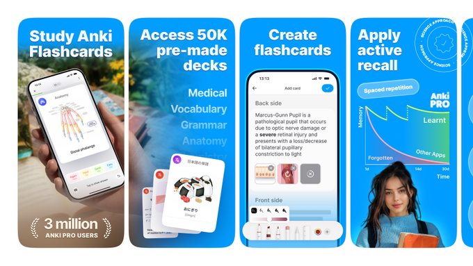
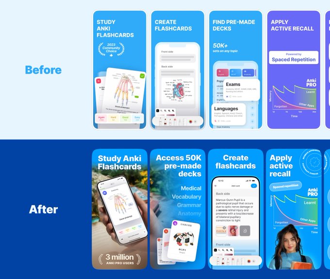
Before → After
New screenshots for Anki Pro 🌈
5
1
46
Favorite bits from June 🌈
Which screenshots do you like the most?


2
1
44
New work 🌈
The Momence app now has an updated look in its app store presence. We collaborated with
@sovpal
to help him showcase his stunning mobile design work and enrich it with captivating visuals.
Before → After in the thread 👇

5
0
45
New Concept 🌈
We sometimes share draft concepts because they're catchy and showcase cool screenshot designs. These alternative ideas for
@cohesa_app
are filled with easter eggs and push boundaries.
What do you think?

0
1
46
New work 🌈
One of our all-time favorite screenshots set launched with Mesmerize features a visual of a person "hypnotized" by the app's graphics.
See it live 👇

1
0
43
New work 🌈
Mesmerize app now features an updated, stunning visual in its store presence
Conversion rate:
📈 +XX% (NDA)
More shots in thread 👇

1
0
42
New concept 🌈
Screenshots sequence for Receiptify app
2
0
40
Time to Shine! Vol.6
Show off your screenshot wizardry right here!
Share your App Store screenshots with us, and we'll provide top-notch advice.
We've already guided over 100 founders with free insights and are excited to brainstorm ideas for your screenshots!
#TipTime

27
2
39
You're doing great!
Love the badges on the first screen, but from experience, one well-focused badge might work better.
Your app is straightforward; focusing on the main feature in the first 2 screenshots with a catchy example + bold value proposition could enhance it
🌈


1
5
39
Lovely app, you’re doing a really great job!
We’re suggesting to improve your minimalistic style by simplifying the screenshots further.
Make the typo big and simple and don’t use mockups. You can also make other elements bigger and less cluttered.
References attached 🌈


1
1
37
How do we boost conversion by 11%? 🌈
The first three screenshots are crucial for app store presence. We iterate extensively to find the best versions. Here's a sneak peek of our process.
Which version do you prefer?
0
2
37
It’s that time of the month!
Show off your screenshot magic! 🌟
Post your App Store screenshots here, and we’ll sprinkle some expert tips your way.
Ready for a revamp?
#TipTime
35
2
35
Boost your conversions by over 10% with this simple trick:
User audience emotions and photos establish a personal connection with every potential user
2
1
36
Great ideas for the app!
Minimalistic screenshots are a good start, but they might lack the emotional appeal needed to engage users.
We suggest adding floating elements, vibrant colors, and UI accents to make the app stand out in app stores.
References attached 🌈


1
0
32
Horizontal Screenshots 💎
Have a compelling app value proposition? Consider A/B testing horizontal screenshots. They're bold, distraction-free, and can be transformative. Often, they yield impressive results.
What are your thoughts on horizontal screenshot sets?
#TipTime

0
1
32

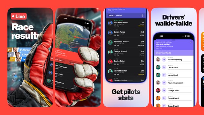
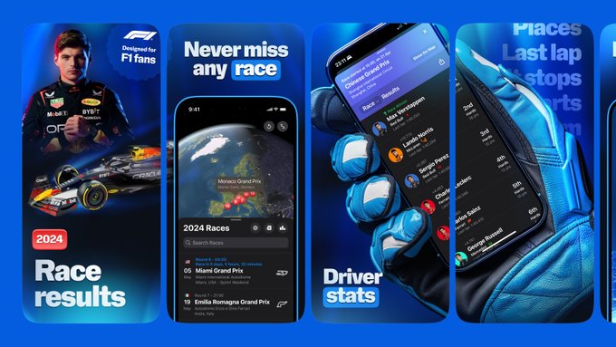
New concept 🏎
We'd like to share one of our unused concepts featuring a carefully crafted F1 glove phone mockup for
@JPEGuin
's Race Control app.
What do you think?

3
0
30
Hello
#PortfolioDay
,
we're The Screenshot First Company and our passion is designing app store screenshots!
2
0
28
New project 🌈
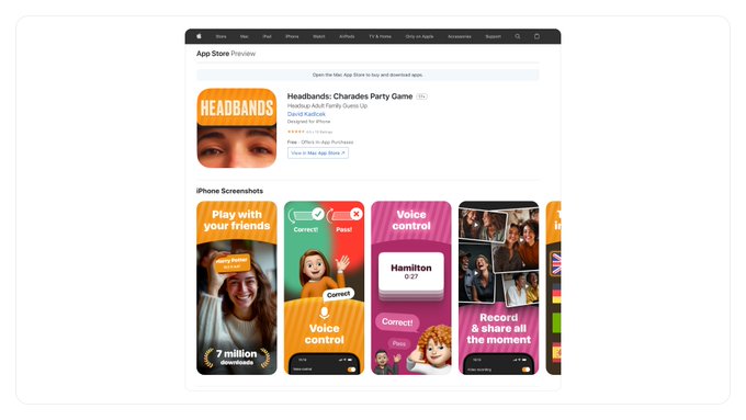
In February, the Headbands team reached out to us to enhance their app screenshots and boost the app's conversion rate (CR).
The CR increased by +NN%
1
1
29
New concept for NGL 🌈
We’ve created a few more concepts while updating NGL’s identity to ensure we maximize the impact of the app’s refreshed brand identity.
How do you think this concept performed compared to the current one during our tests?

2
0
28
Show us your screenshots magic! 🌟
Drop your app store screenshots here and we'll sprinkle some expert tips your way.
Ready for a revamp?
#TipTime

27
1
25
You’re doing well, but the innovative approach to building a to-do list via flowchart might be hard to understand.
We suggest simplifying the screenshots and presenting the UI in a more creative and straightforward manner.
Attached are a few references🌈


0
1
24
Love the app idea! Clearly, a lot of effort has been put in.
Simplifying the mockup to highlight key features would be great. Including example screenshots on the first screen and using bold typography could enhance it.
We've attached a few examples


1
0
24
Tip:
Screenshots for utility apps should stand out. Sell the main feature, not just the vibe of your app. If a feature is crucial, use 2 screenshots to showcase it.
#ScreenshotsSecrets
1
0
23
Love the direction but the screenshots fail to convey the app's purpose. An early focus on emotions seems less effective.
Good references are attached
Explore the thread below for additional insights on the next steps 👇

@screenshotfirst
Bottom is old one, top are the new ones.
I struggle to comprehend why new ones perform worse.
I know I probably changed too many things at once 🥲
I tried to put everything there, humans, social proof, bigger font, colors etc.
Would love some feedback 🙏🏻
0
0
0
2
0
23
You have a great idea to add personality to your AI app.
Try to focus the screenshots more on this advantage and on telling the story of your mascot.
Also, try to design screenshots with big, simple typography and a contrasting background.
Good references are attached 🌈

1
0
22
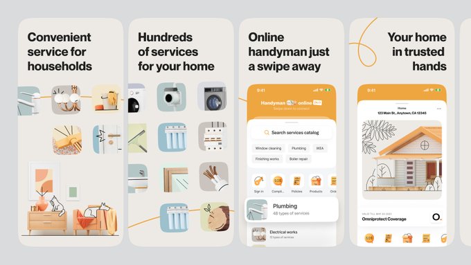
🚙 New hero screenshots for DMV Genie
The main thing we focused on in this update is a big photo of a person holding a driver's license.
The hero picture aims to convey that the app is the perfect place for those who are looking to pass the DMV exam.
3
0
22
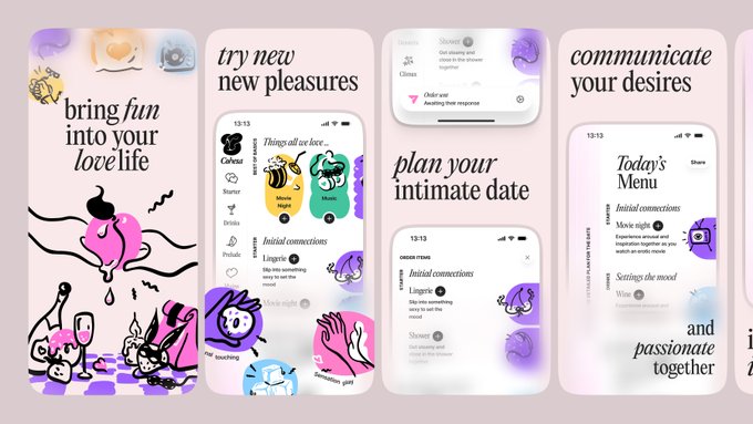
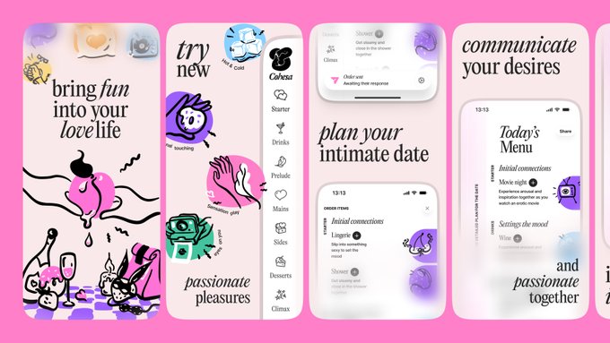
New work 🌈
Cohesa - a simple app designed to reignite desire and intimacy for couples in long-term relationships.
We've empowered the team with fresh App Store screenshots to give it the feeling like "this app will fire up our relationship"
1
1
22
Lovely app!
Your app icon and screenshots tell a story, but they could be even better.
Consider using a mascot or enhancing the story through the interface.
We’ve attached a few references to help you explore a few options 🌈


1
1
21
It’s that time of the month!
Show off your screenshot magic!
Post your App Store screenshots here, and we’ll sprinkle some expert tips your way.
We've helped almost 100+ founder with free tips so far and ready to share for some thought for your screenshots!
#TipTime

14
0
21
We love this vibe!
It feels just right for such an app.
However, it seems a bit overcomplicated and hard to recognize what the app is about. We suggest keeping the vibe but playing with the accents!
We’ve attached some references and ideas for minimalist screenshots.

0
0
20
Loving the screenshots, but they feel a bit cluttered.
How about a minimalistic approach, focusing on the essence of the photos? From experience, social proof on screenshots can be a downgrade for social apps.
Highlight the beauty of the rolls instead.
Inspiration attached


Guys, what do you think? The first screen will be a video.
@screenshotfirst
, you are experts, check it out.
4
0
38
3
0
20
You're doing well!
imo, Utilities apps are tough to compete, try these: add a bold statement in SS1 to convey the app's concept, showcase its best feature (like a copies cleaner), mention big numbers (e.g., saved 1 trillion GB), and include photos in SS1.
References attached

1
0
20
New Concept 🌈
Refined screenshots for the PCOS Slayyy app

0
0
20
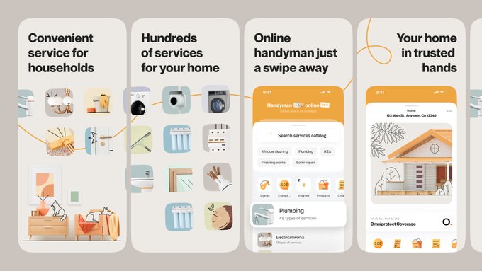
Revamping an age-old idea 🌈
Here's a glimpse of our past work on the handyman app.
1
0
20
Good-looking screenshots!
A few improvements could help:
- ensure the first screenshot clearly shows the value proposition
- less text and bolder typography could help convey your ideas better (rather than just naming features).
References attached 🌈


1
0
20
3000+ followers 🌈
Shoutout to our amazing community!
Thanks for your incredible support.
We’re just getting started and have some stunning projects in the works.
Stay tuned; something special is coming your way!

1
0
20
You’re doing great so far, massive app, lots of features!
But it seems like the screenshots don’t showcase your app as much as they could.
Suggestions:
- add a bold value proposition
- show the UI more prominently (current mockups isn’t helping)
- add accents
- test light theme


@screenshotfirst
Would love to get your feedback 🙏
Left out the app preview which comes first.
0
0
1
0
1
20
Love the app idea! You’re doing a great job so far!
A few improvement suggestions:
- simplify details to make screenshots clearer
- use more colorful, catchy visuals to convey the value proposition of the Coding Habit Builder
References attached 🌈


1
4
19
Lovely app – lovely screenshots!
We’re glad to support
@fabiangruss
’s ‘What’s Going On’ app with beautiful screenshots!
Give this great new app a try!


🫂 Meet What's going on, your new favorite social diary!
Collect all the key moments in your & your friends' lives. Create memories together or use it as a journal - you choose. No ads, no data shared, ever.
Your tiny social space how it should be - now live on the App Store

41
20
203
1
0
19
Increased social app conversion rates by over 10%!
By emphasizing user needs and interests, and showing user photos in hero screenshots, we created a positive vibe that resulted in a double-digit increase in conversions.
One of our loveliest artworks this year!
1
0
17
Show us your screenshots magic! 🌟
Drop your app store screenshots here and we'll sprinkle some expert tips your way.
Ready for a revamp?
#TipTime

12
0
18


You’re on the right track!
The essence of your value proposition is visually moving in the right direction. However, the screenshots are a bit cluttered. Simplify them with less text, UI, and arrows.
References attached 🌈


@screenshotfirst
First iteration of store screenshots for Dayforge. Any tips/suggestions would be appreciated!

1
0
1
0
0
17
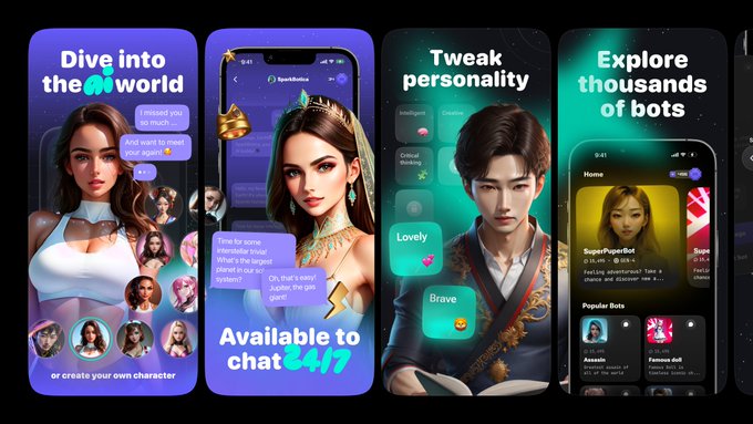
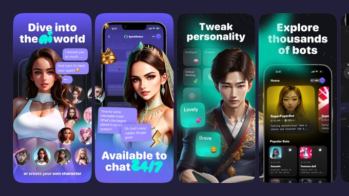
Some of our previous work for
@MyAnimaAI
🌈
This is a concept of screenshots designed for an unannounced app developed by the team
1
0
18
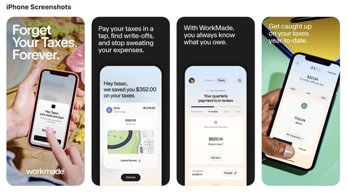
Great job on Bookshelf—love your updates in the screenshots!
Tips to enhance it:
try adding photos to capture the app's vibe, consider making the SS1 title stand out more, and include social proof.
A few example:
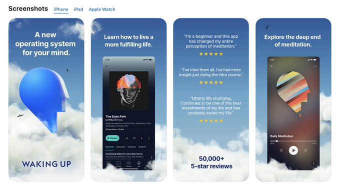
Waking Up, Cleo, WorkMade, Hims


@screenshotfirst
About to test a darker color palette and reordered pages for
@get_bookshelf
since my last test was flat–would love to hear your thoughts! 🙏
1
0
9
1
0
17
The visuals are great, but the initial screenshots don’t convey the game’s essence.
Highlight your main value proposition: a one-stop solution with thousands of games.
Also, focus the main photo on the feeling of playing together with friends.
References attached 🌈


0
0
17
New concept 🏎
Introducing an unused concept developed as part of our ongoing collaboration with
@JPEGuin
for Race Control's screenshots.
Stay tuned for the refreshed look of the RC app!
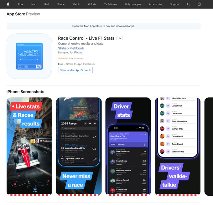
1
0
16