Information is Beautiful Profile Banner
Information is Beautiful Profile
Information is Beautiful

@infobeautiful

Followers
124,459
Following
482
Media
2,557
Statuses
4,654

Data-visualizations & infographics made by David McCandless @mccandelish - app @vizsweet - new project @beautiful__news -

London
Joined July 2009
Don't wanna be here? Send us removal request.
Explore trending content on Musk Viewer
Pinned Tweet
@infobeautiful
Information is Beautiful
14 days
Learn how to turn ideas, stories, numbers into impactful #infographics & data-visuals with Information is Beautiful. Details: Next sessions: New 2x half day format Thu 17th / Fri 18th Oct 🇺🇸 USA Full day: Mon 18th Nov 🇬🇧 LDN in-person Reviews:
Tweet media one
0
0
4
@infobeautiful
Information is Beautiful
6 months
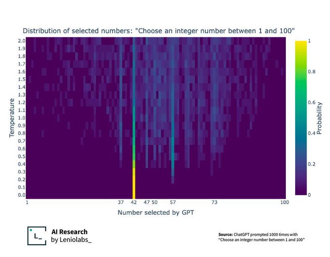
Ask ChatGPT to pick a number between 1 and 100 - which does it pick? (by @Leniolabs_ )
Tweet media one
423
854
10K
@infobeautiful
Information is Beautiful
6 months
Beautiful alternative to the periodic table created in 1975 by James Franklin Hyde.
Tweet media one
Tweet media two
32
1K
7K
@infobeautiful
Information is Beautiful
6 years
How true are Hollywood 'Based on a True Story' films? interactive, Code by @omidpyc Research: @dr_s_tomasevic Data:
Tweet media one
47
860
2K
@infobeautiful
Information is Beautiful
5 years
Our #coronavirus #infographic data pack gathers the best charts in one place & adds some of our own. More:
Tweet media one
Tweet media two
Tweet media three
Tweet media four
88
1K
2K
@infobeautiful
Information is Beautiful
2 months
Beautiful alternative to the periodic table created in 1975 by James Franklin Hyde
Tweet media one
Tweet media two
5
206
1K
@infobeautiful
Information is Beautiful
2 years
Love this toothpaste label - let's roll it out across all products
Tweet media one
7
188
1K
@infobeautiful
Information is Beautiful
5 months
Most common 4-digit PIN numbers - from an analysis of 3.4m leaked from several #databreaches by the late great @DataGenetics
Tweet media one
8
222
807
@infobeautiful
Information is Beautiful
4 years
As #coronavirus lockdowns relax worldwide, what activities might be riskier than others? Visualized advice & professional opinions from over 500 epidemiologists & health experts as quoted in various media articles ( @NYTimes , @Reuters , @NPR )
Tweet media one
13
534
769
@infobeautiful
Information is Beautiful
4 years
Our #Coronavirus datapack is updated daily with the latest global #COVID19 stats. Take a closer look:
Tweet media one
27
467
753
@infobeautiful
Information is Beautiful
4 months
If the whole history of the Earth was squeezed into one day... #dataviz (via: )
Tweet media one
10
244
753
@infobeautiful
Information is Beautiful
5 years
True
Tweet media one
6
333
680
@infobeautiful
Information is Beautiful
10 months
Lovers beware! Today is "Peak Breakup Day"
Tweet media one
4
90
550
@infobeautiful
Information is Beautiful
8 months
Love this toothpaste label - let's roll it out across all products
Tweet media one
4
90
536
@infobeautiful
Information is Beautiful
2 years
Big Big tech acquisitions
Tweet media one
6
259
508
@infobeautiful
Information is Beautiful
7 months
US 🇺🇸 Join David McCandless of Information is Beautiful in a #DataStorytelling workshop. Wrap your data and information in a graphical story! Develop new techniques! Go beyond the bar chart! Online intensive: Tue 26th Mar 🇺🇸 USA timezone Enroll now:
Tweet media one
29
1
6
@infobeautiful
Information is Beautiful
4 years
Love this toothpaste label - let's roll it out across all products (via )
Tweet media one
4
88
431
@infobeautiful
Information is Beautiful
4 months
Truthpaste
Tweet media one
4
38
432
@infobeautiful
Information is Beautiful
6 years
Living, breathing city. Population of Manhattan hour-by-hour.
4
227
407
@infobeautiful
Information is Beautiful
23 days
One of my favourite graphics from my book Knowledge is Beautiful. The distribution of all the water in the world… data: book:
Tweet media one
7
117
413
@infobeautiful
Information is Beautiful
5 months
Evolution of the Alphabet (by @usefulcharts )
Tweet media one
1
98
392
@infobeautiful
Information is Beautiful
8 months
Guess what % of plastics have ever been #recycled ? No prizes :( And guess who knew about it all the time?
Tweet media one
8
208
394
@infobeautiful
Information is Beautiful
4 months
Nice use of a streamgraph
Tweet media one
0
53
342
@infobeautiful
Information is Beautiful
5 years
Access the raw datasets behind every dataviz we've ever released. The IIB Data Room.
4
94
330
@infobeautiful
Information is Beautiful
2 months
If you are aged 30 or more, then 50% of all human fossil fuel emissions happened during your lifetime. (by @‌neilrkaye)
Tweet media one
11
98
283
@infobeautiful
Information is Beautiful
6 years
We've got $40K to give away to the best visualisations & designs of these datasets for the #WorldGovSummit . Plus, you don't need to be a designer to enter). Get to it! Closing date: 15th Jan.
Tweet media one
4
103
266
@infobeautiful
Information is Beautiful
24 days
Who lived when? Some surprises here
Tweet media one
7
59
269
@infobeautiful
Information is Beautiful
2 years
🏆 World Dataviz Prize 2023 - Grand Prize Winner of $25,000! How do we compare by Lindsey Poulter ( @datavizlinds )
Tweet media one
8
51
260
@infobeautiful
Information is Beautiful
2 years
What is the most successful Hollywood movie of recent times? Everyone says and thinks Avatar right? But, as ever, it depends how you look at it. We took a deep data dive and found some surprising, nay *horrifying* answers…(1/18)
7
83
259
@infobeautiful
Information is Beautiful
6 years
Found it!
Tweet media one
9
110
250
@infobeautiful
Information is Beautiful
3 years
Going to update our Dataviz-Books-Everyone-Should-Read list. Any recommends / new books we should mention? @datavizsociety
Tweet media one
7
41
252
@infobeautiful
Information is Beautiful
1 year
Exploring some new methods for creating photoviz. What do you think?
Tweet media one
7
69
244
@infobeautiful
Information is Beautiful
5 months
Curve fitting methods @xkcd
Tweet media one
2
56
245
@infobeautiful
Information is Beautiful
6 years
Latest version of the useful, controversial Media Bias Chart (created by @vlotero )
Tweet media one
9
150
234
@infobeautiful
Information is Beautiful
6 years
Antarctica centered worldview
Tweet media one
2
136
235
@infobeautiful
Information is Beautiful
6 months
World's favourite cuisines. 25,000 people in 24 countries were asked which nation's food they preferred. Interesting results. (via @YouGov )
Tweet media one
17
54
230
@infobeautiful
Information is Beautiful
5 years
The global response to the 2009 H1N1 Swine Flu pandemic was the fastest ever. Between 150-575,000 people died worldwide. It's day 71 of #coronavirus BTW. via @beautiful__news
Tweet media one
7
113
216
@infobeautiful
Information is Beautiful
1 year
Guess what % of plastics have been #recycled ? No prizes :( #PlasticFreeJuly
Tweet media one
5
105
216
@infobeautiful
Information is Beautiful
7 years
As #Brexit negotiations lull for the summer, here's what's on the table (UPDATED)
Tweet media one
10
171
206
@infobeautiful
Information is Beautiful
6 months
Wait, who is my third cousin twice removed? (via Reddit)
Tweet media one
3
29
216
@infobeautiful
Information is Beautiful
8 years
The key bands of punk, grunge & indie: #infographic traced over early transistor radio circuit board by @dorothy_uk
Tweet media one
1
159
204
@infobeautiful
Information is Beautiful
5 years
. @juliagalef 's map of the San Francisco "Bay Area Memespace" reworked and redesigned:
Tweet media one
4
67
205
@infobeautiful
Information is Beautiful
6 years
The results are in. After combing through hundreds of impressive, insightful and creative entries, we’ve decided on the winners of the World Data Visualization Prize 2019:
Tweet media one
9
96
208
@infobeautiful
Information is Beautiful
10 years
Phew - we just passed Peak Break-Up Time, according to data extracted from Facebook. http://t.co/ph3O2zKbA5 http://t.co/3TejrVHxzj
Tweet media one
8
191
196
@infobeautiful
Information is Beautiful
7 months
How the concept of marriage has changed across centuries 💘
Tweet media one
6
48
192
@infobeautiful
Information is Beautiful
6 years
Because the image was heavily Reddited without credits. How true are Hollywood 'Based on a True Story' films? interactive, Code by @omidpyc Data:
Tweet media one
5
89
186
@infobeautiful
Information is Beautiful
5 years
Access the raw datasets behind every dataviz we've ever released. The IIB Data Room:
0
47
183
@infobeautiful
Information is Beautiful
4 years
Our @beautiful__news project is complete. 365 charts visualizing positive stats, unseen trends & creative solutions. With companion data natch!
2
65
186
@infobeautiful
Information is Beautiful
5 months
#EarthDay Planet vs. Plastics :((
Tweet media one
4
74
187
@infobeautiful
Information is Beautiful
9 years
Haunting interactive from @Slate traces the paths of 20,000 slave ships in 2 minutes. http://t.co/uZ80rwdmB1 http://t.co/UrgqDC86tl
5
232
179
@infobeautiful
Information is Beautiful
2 months
Africa is Big
Tweet media one
5
51
183
@infobeautiful
Information is Beautiful
4 years
this one is also quite wild
Tweet media one
7
62
176
@infobeautiful
Information is Beautiful
6 months
Just a plot of all objects in the universe... (by @JournalPhysics )
Tweet media one
5
33
179
@infobeautiful
Information is Beautiful
10 months
Oil
Tweet media one
Tweet media two
3
67
180
@infobeautiful
Information is Beautiful
4 years
New @EdwardTufte book "Seeing with Fresh Eyes"
Tweet media one
1
48
177
@infobeautiful
Information is Beautiful
5 months
I found this useful
Tweet media one
4
19
173
@infobeautiful
Information is Beautiful
4 months
Beautiful vintage #infographic on the ceiling & range of different aircraft (via Reddit )
Tweet media one
5
26
167
@infobeautiful
Information is Beautiful
2 years
Announcing the longlists for the World Dataviz Prize #wdvp . Interactive Static/Poster Thank you to everyone who entered. So many great pieces. Sorry we couldn't feature you all!
Tweet media one
1
33
166
@infobeautiful
Information is Beautiful
6 months
Going round in the circle. The very cool Amsterdam tube map. (creator: Eric Hammink, source: )
Tweet media one
2
31
166
@infobeautiful
Information is Beautiful
7 years
We scraped data like genetic disorders and temperament to unleash our chart of the best dogs.
Tweet media one
10
59
157
@infobeautiful
Information is Beautiful
4 months
This old classic #infographic by Jack Hagley
Tweet media one
2
36
163
@infobeautiful
Information is Beautiful
4 years
Hey does anyone know who created this #covid conspiracy matrix #infographic ? Can't find the original.
Tweet media one
Tweet media two
22
21
155
@infobeautiful
Information is Beautiful
10 months
#Dataviz Books Everyone Should Read
Tweet media one
2
30
128
@infobeautiful
Information is Beautiful
8 months
If the whole history of the Earth was squeezed into one day... #dataviz Source:
Tweet media one
2
37
134
@infobeautiful
Information is Beautiful
4 months
Great films fact-checked and visualised scene by scene. Is there really such a thing as a “true” true story in Hollywood?
Tweet media one
4
34
158
@infobeautiful
Information is Beautiful
5 months
What's the best #dog breed, according to the data? The #dataviz dog-lovers have been waiting for:
Tweet media one
5
29
129
@infobeautiful
Information is Beautiful
2 months
Uppers, downers, trips & tranqs 💊 All the world's major drugs, in one easy-to-swallow #dataviz
Tweet media one
4
45
149
@infobeautiful
Information is Beautiful
5 years
The ideal “flatten the curve” response to the #coronavirus pandemic. Switching from stopping infections to slowing & postponing them. That way, healthcare systems can handle new cases and treat patients more effectively, meaning less deaths.
Tweet media one
6
107
147
@infobeautiful
Information is Beautiful
6 months
#Dataviz map shows fully booked airbnbs along the solar #eclipse path of totality
Tweet media one
3
26
146
@infobeautiful
Information is Beautiful
1 year
🔑 Here's the key to our Data Room. Access all the raw datasets behind every #dataviz we've ever released since 2009. 500+ sheets, 1200+ datasets #juicydata #datasets
2
35
150
@infobeautiful
Information is Beautiful
6 years
Our expert panel are calling it the golden age of #dataviz . YOU be the judge. Tuck in to 101 of the year's best interactives, #infographics & scrollytellings and help decide who shares $25k+ cash in #iibawards 2018. Closes today (Fri 19 Oct 11.59pm PST):
Tweet media one
0
21
139
@infobeautiful
Information is Beautiful
7 years
Do humans have mating seasons?
Tweet media one
4
80
140
@infobeautiful
Information is Beautiful
6 years
Just how true is the Oscar-winning Bohemian Rhapsody movie?
Tweet media one
3
57
145
@infobeautiful
Information is Beautiful
6 years
Because everybody's posting it... (via reddit)
Tweet media one
2
62
143
@infobeautiful
Information is Beautiful
6 years
Drive time from major UK cities as 3D coral geometry by @itoworld (via @UrbanDemog )
Tweet media one
Tweet media two
3
57
139
@infobeautiful
Information is Beautiful
9 months
An important one for Brits : The Great Scone Map
Tweet media one
10
34
140
@infobeautiful
Information is Beautiful
1 year
Just a plot of all the objects in the universe… 🤯 from:
Tweet media one
3
31
137
@infobeautiful
Information is Beautiful
4 years
Is there such a thing as a true story in Hollywood? 🎬 #factchecking #dataviz
Tweet media one
2
38
133
@infobeautiful
Information is Beautiful
9 days
Evolution of the Alphabet (by @usefulcharts )
Tweet media one
1
44
138
@infobeautiful
Information is Beautiful
2 years
Announcing the shortlist for the World Dataviz Prize #wdvp Agonising to judge. So many great entries! Here are the longlists too Interactive Static/Poster Winners announced next week!
Tweet media one
3
26
130
@infobeautiful
Information is Beautiful
1 month
Revealing cross section of a road in England (via )
Tweet media one
0
27
134
@infobeautiful
Information is Beautiful
7 years
Bread&d
Tweet media one
6
72
128
@infobeautiful
Information is Beautiful
8 years
Data analysis of Trump's twitter reveals which tweets he actually writes himself
Tweet media one
4
141
124
@infobeautiful
Information is Beautiful
4 months
Which country is across the ocean? Check the latitudes on this #map by @‌washingtonpost to look beyond the horizon.
Tweet media one
3
26
129
@infobeautiful
Information is Beautiful
8 years
Wow - a truly presidential suite of data-visualizations predicting the US election
Tweet media one
0
84
122
@infobeautiful
Information is Beautiful
4 months
Interesting. Safest and cleanest energy sources. Via:
Tweet media one
2
51
125
@infobeautiful
Information is Beautiful
6 years
A longlist of the most creative and interesting entries from the World Data Visualization Prize. Which is your favourite?
Tweet media one
2
46
124
@infobeautiful
Information is Beautiful
2 years
Announcing the $50,000 World #Dataviz Prize - a creative challenge in partnership with the @WorldGovSummit . We supply the datasets. You create intuitive, beautiful visualisations to tell a story or reveal something interesting about the numbers.
Tweet media one
3
38
121
@infobeautiful
Information is Beautiful
7 years
We believe this is probably, almost certainly, an accurate map of possible outcomes
Tweet media one
0
65
123
@infobeautiful
Information is Beautiful
3 years
Are #Ransomware attacks increasing? I think #Ransomware attacks are increasing... interactive:
Tweet media one
6
63
123
@infobeautiful
Information is Beautiful
7 years
60 of the world's most oft-repeated "alternative facts" as a playable, filterable #interactive
Tweet media one
3
89
119
@infobeautiful
Information is Beautiful
5 years
Updated our #coronavirus #infographic . Thanks for all your feedback (and flames :) We're continually updating, refining and correcting our charts with the latest data. Data:
Tweet media one
Tweet media two
Tweet media three
2
61
119
@infobeautiful
Information is Beautiful
8 years
The four necessary elements for an interesting #dataviz
Tweet media one
2
73
118
@infobeautiful
Information is Beautiful
7 months
UPDATED: Our #LLM #AI tracker adds 30 new & notables inc. @AnthropicAI Claude 3, @X Grok, all @MistralAI offerings, @Google Gemini Pro, @Apple MM1 (finally!) and of course @ChatGPT 5. #dataviz data
Tweet media one
1
34
78
@infobeautiful
Information is Beautiful
3 years
We’ve updated our Dataviz Books Everyone Should Read charticle with latest releases, reader recommends & suggests from the @DataVizSociety
Tweet media one
1
15
115
@infobeautiful
Information is Beautiful
5 years
Most common relationship breakup times, according to data:
Tweet media one
2
39
113
@infobeautiful
Information is Beautiful
4 years
In case you were wondering... Tattoo Pain Chart
Tweet media one
4
34
115
@infobeautiful
Information is Beautiful
8 months
Great films fact-checked and visualised scene by scene. Is there really such a thing as a "true" true story in Hollywood? Explore:
Tweet media one
3
30
115
@infobeautiful
Information is Beautiful
1 year
Quick! What's 6✖️8? This heatmap shows the trickiest multiplications for kids aged 5-8. Love to see a similar study on adults to see how they compare! #dataviz #maths
Tweet media one
4
34
113