

Python Maps
@PythonMaps
Followers
75K
Following
6K
Media
722
Statuses
2K
Mapping the world with Python. Contact [email protected] Buy my book here - https://t.co/ppekETmILk
Planet Earth
Joined January 2021
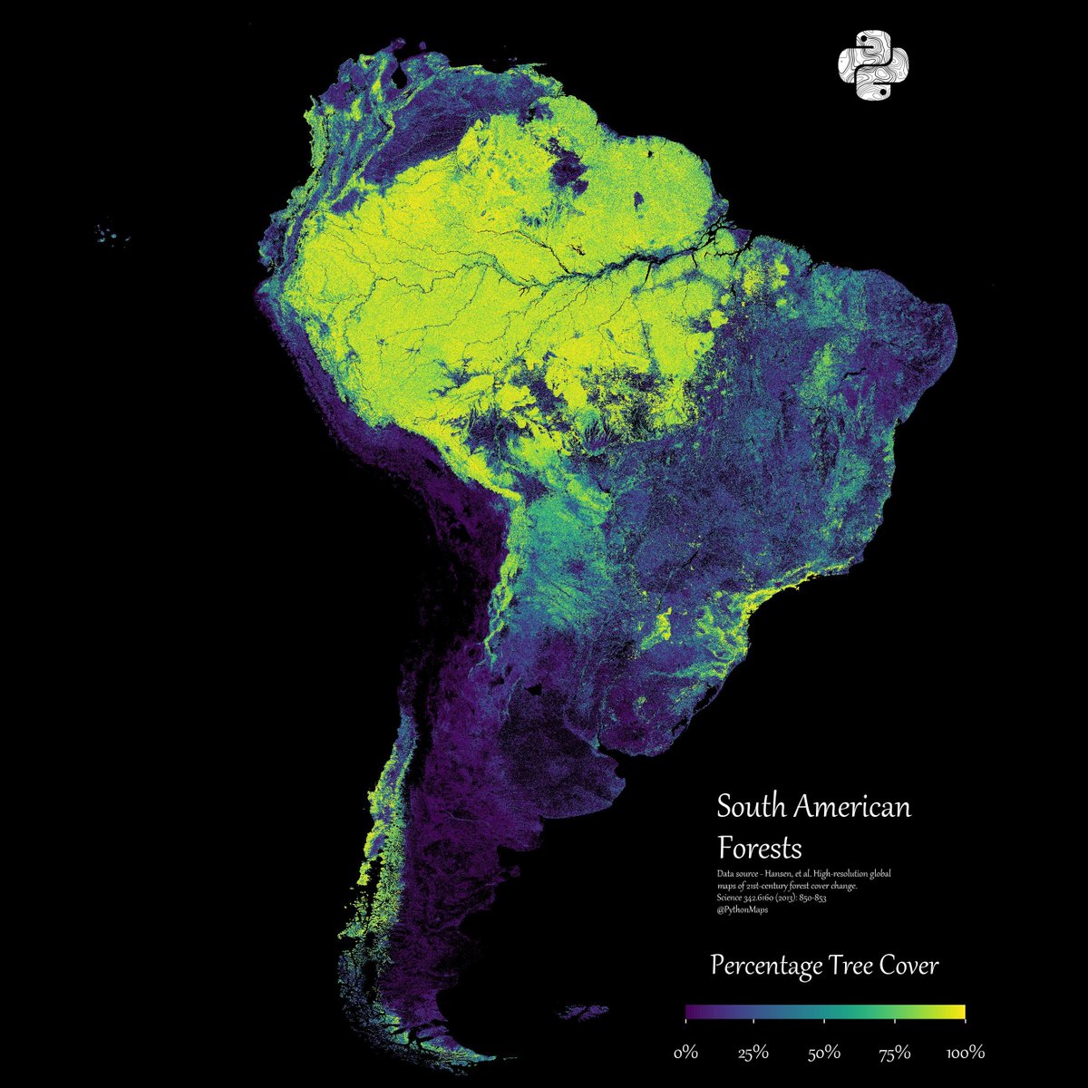
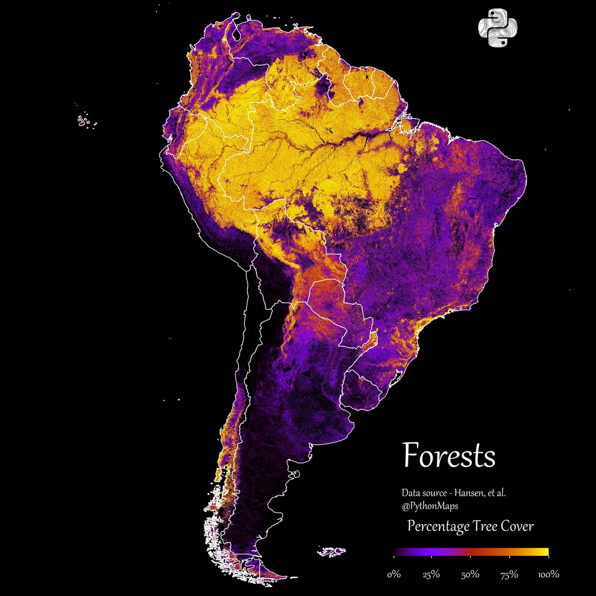
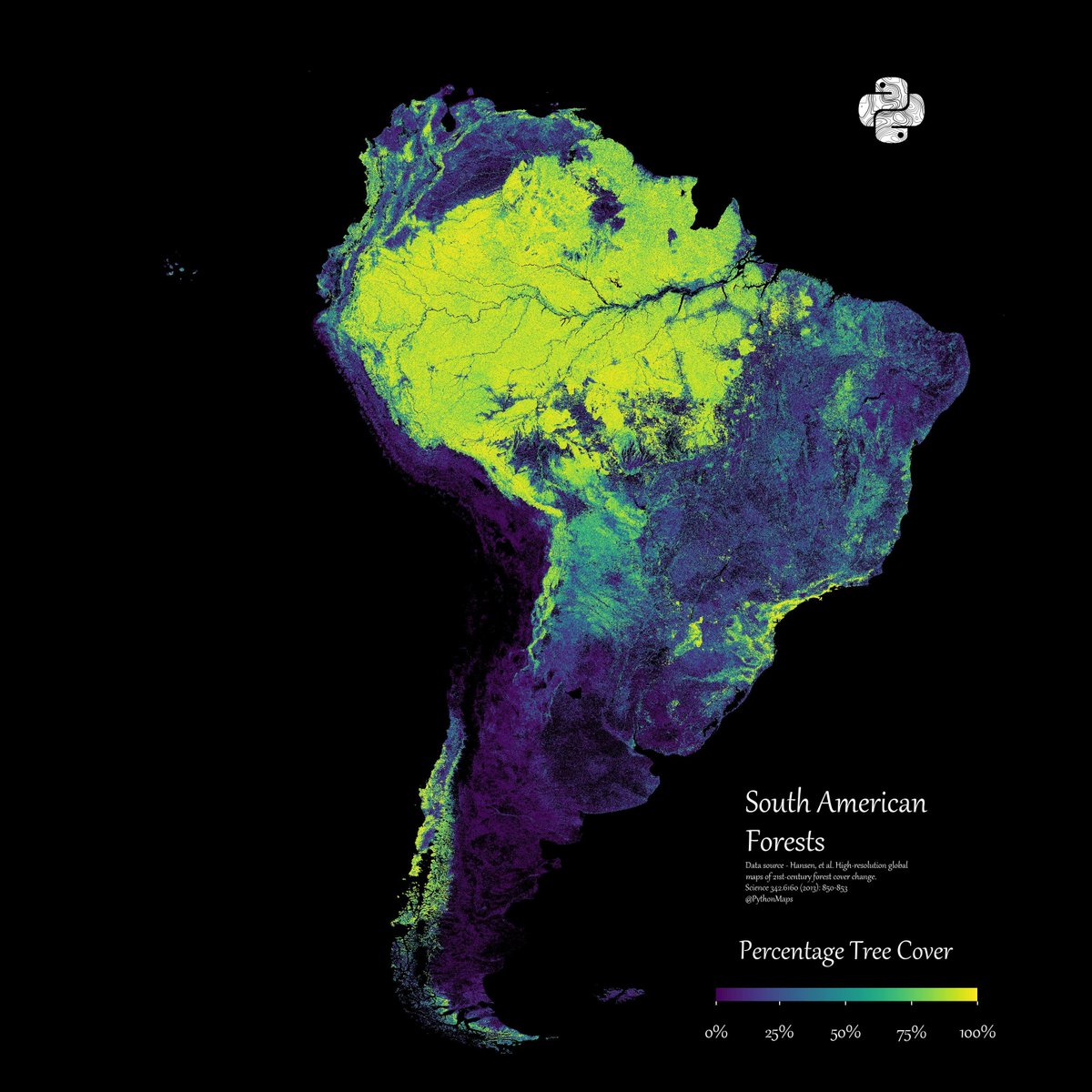
Ending 2023 with my favourite map. South American forests. See you next year!
16
439
3K
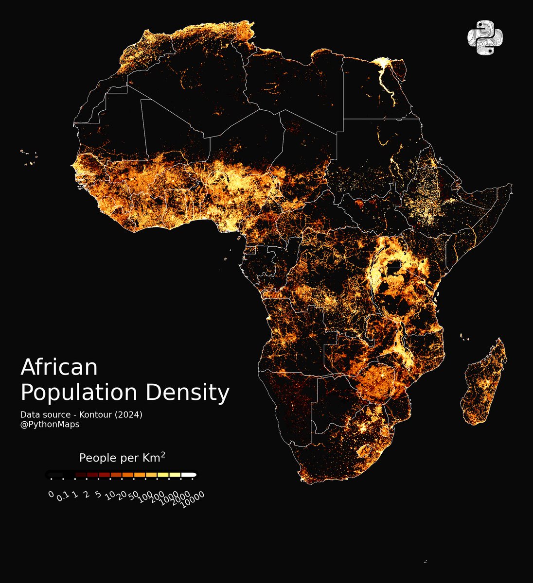
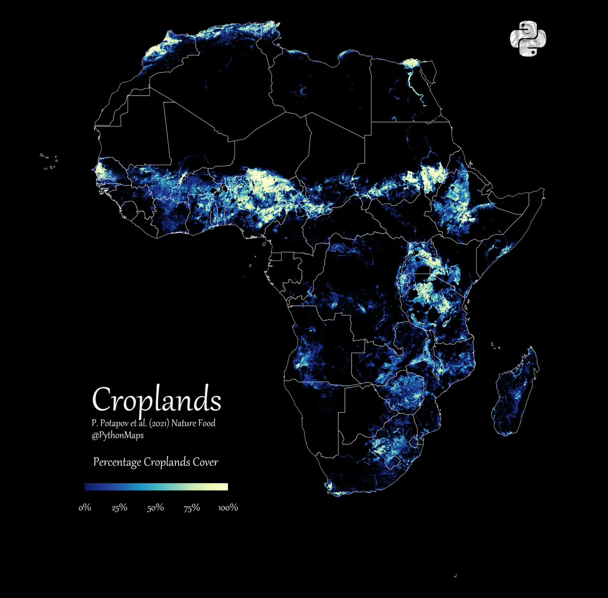
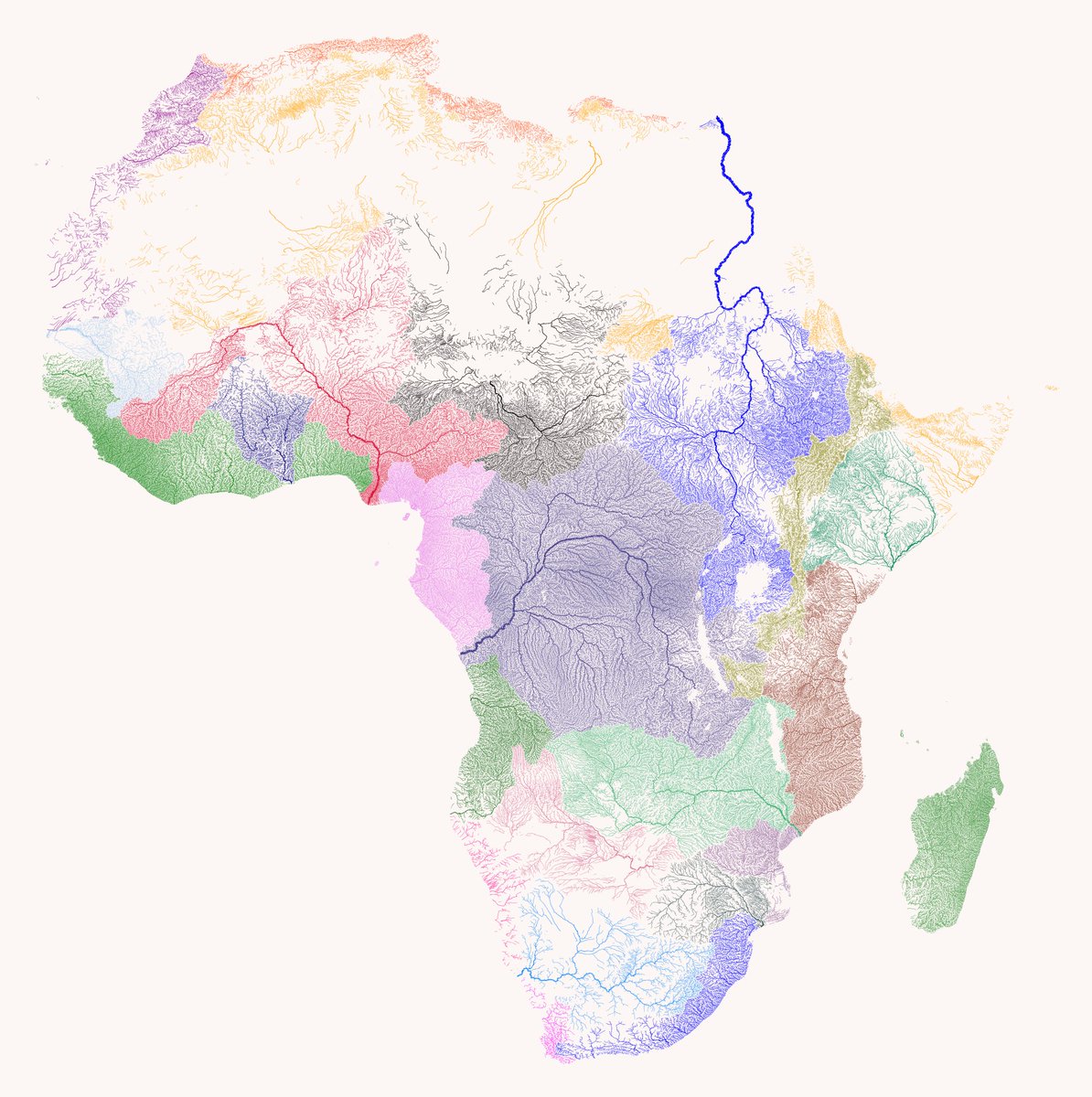
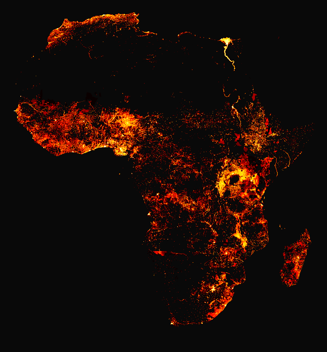
Here is a thread of my favourite maps of Africa. Let me know which you like most and give me your best theories for how thel all fit together. Starting with population. 1/10

122
2K
12K
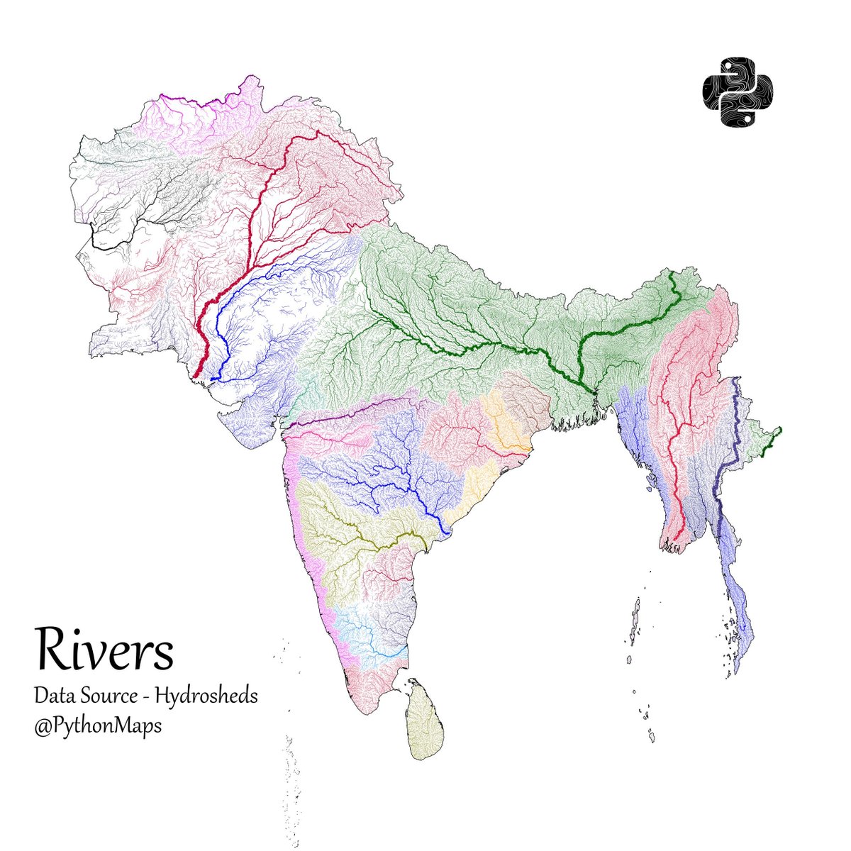
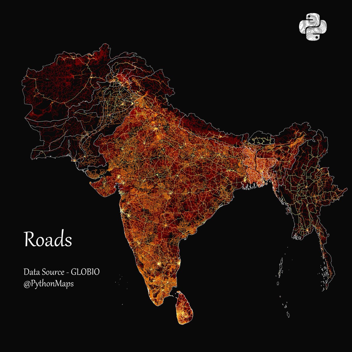
Another thread of maps I like. This time we are looking loosely at the Indian sub continent. Included are India, Pakistan, Afghanistan, Nepal, Bhutan, Bangladesh, Sri Lanka and Myanmar. First up, Rivers! 1/13
151
1K
11K
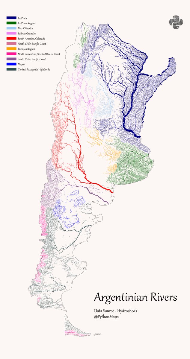
Argentinian Rivers - This map shows the rivers of Argentina broken down by their major hydrological basin and scaled by their discharge. #DataVisualization #Geography #Python #Data #SouthAmerica #Argentina #Colombia
147
1K
7K

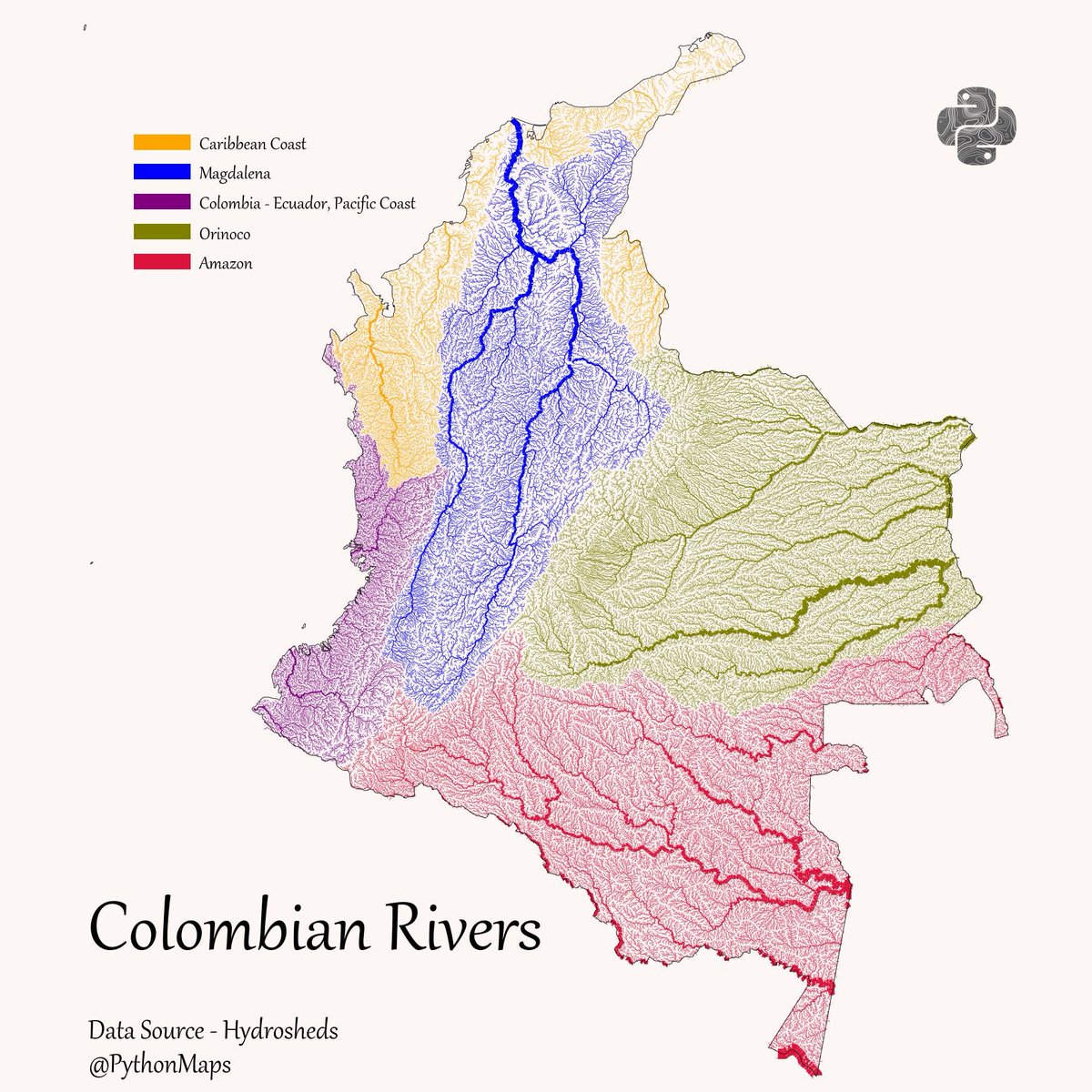
Colombian rivers! Coloured according to their drainage basin, and scaled by discharge. #SouthAmerica #Colombia #Rivers #DrainageBasin #Python #Geography #DataViz
36
1K
6K
This is one of mine. Sadly they’ve started stripping the logo and description from the maps they steal. Data source for this is GHSL.
22
170
5K
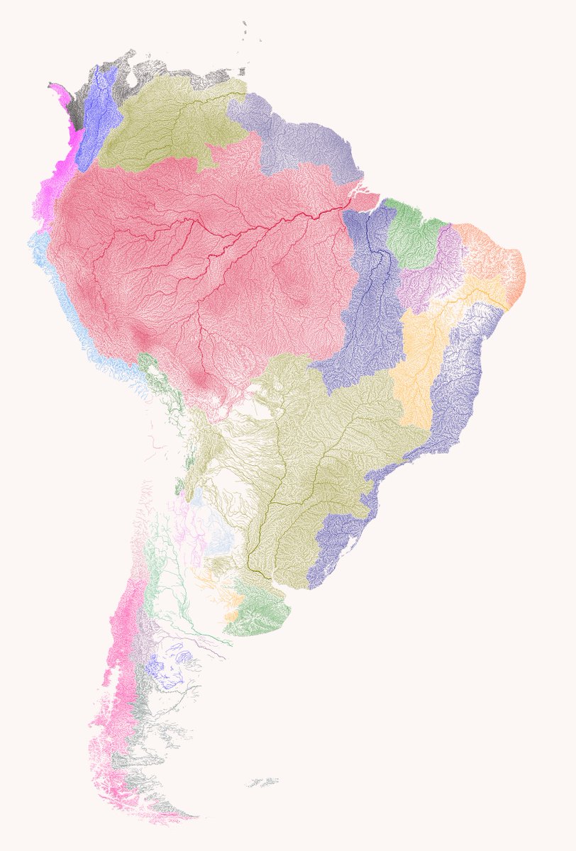
Here is a thread of my favourite maps of South America. Let me know which you like most and give me your best theories for how thel all fit together. Starting with Forests. 1/13

149
630
4K
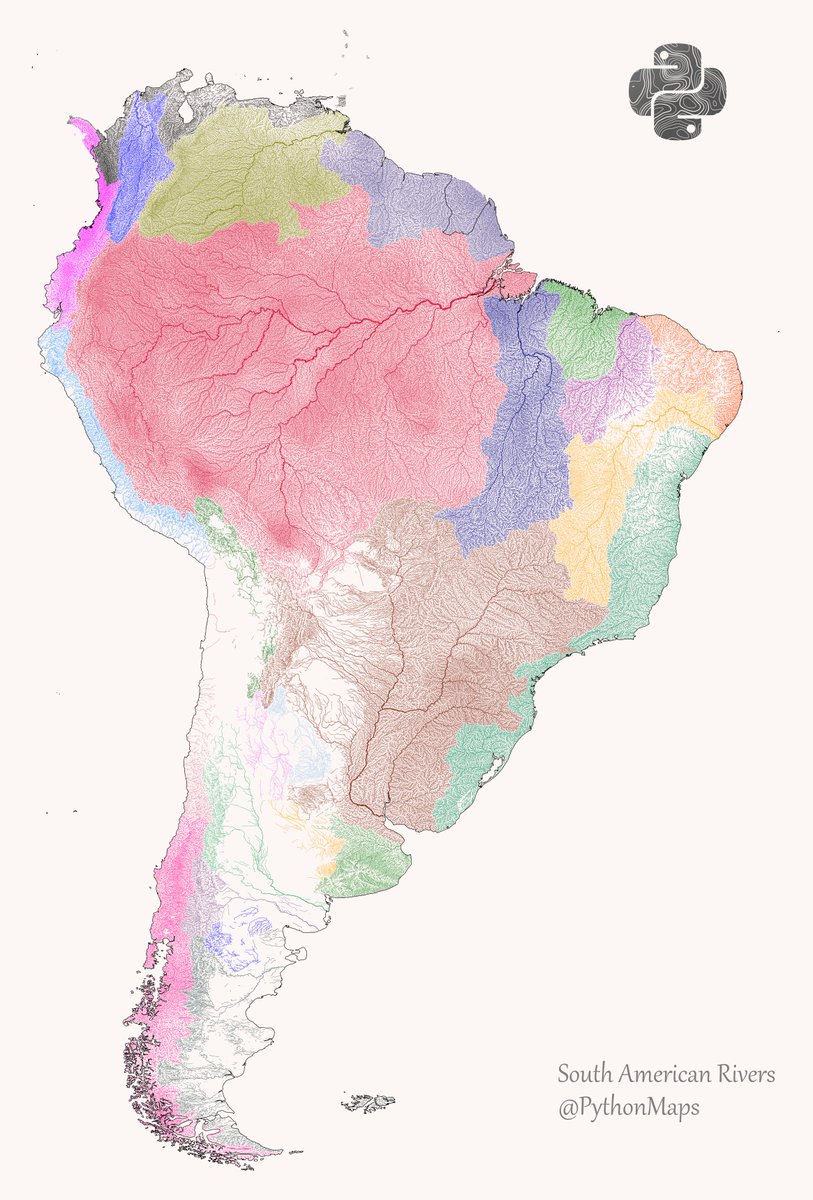
Here are all of the rivers and waterways in South America, with coastlines, coloured according to the major hydrological basins they are part of and scaled by their size. This map was generated using #Matplotlib. #DataVisualization #Python #DataScience #Data #SouthAmerica

44
861
4K
Here are all of the rivers and waterways in South America, coloured according to the major hydrological basins they are part of and scaled by their size. This map was generated using #Matplotlib #Numpy #Geopandas. #Python #DataScience #Data #DataVisualization #SouthAmerica.

24
556
2K
Pervian Rivers - This map shows the rivers of Peru broken down by their major hydrological basin and scaled by their discharge. #DataVisualization #Geography #Python #Data #SouthAmerica #Peru #Colombia

15
478
2K
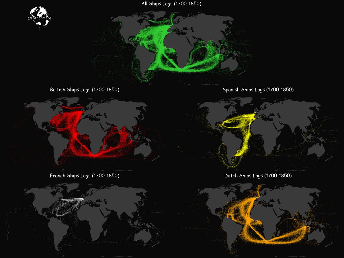
Step back in time with this map of 1800's shipping lanes created using Python and data from old ship log books. #historynerd #maritimemap #Python #datavisualization

38
345
2K
Here are all of the rivers and waterways in Colombia, coloured according to the major hydrological basins they are part of and scaled by their size. #Matplotlib #Python #DataScience #Data #DataVisualization #Colombia

9
416
2K
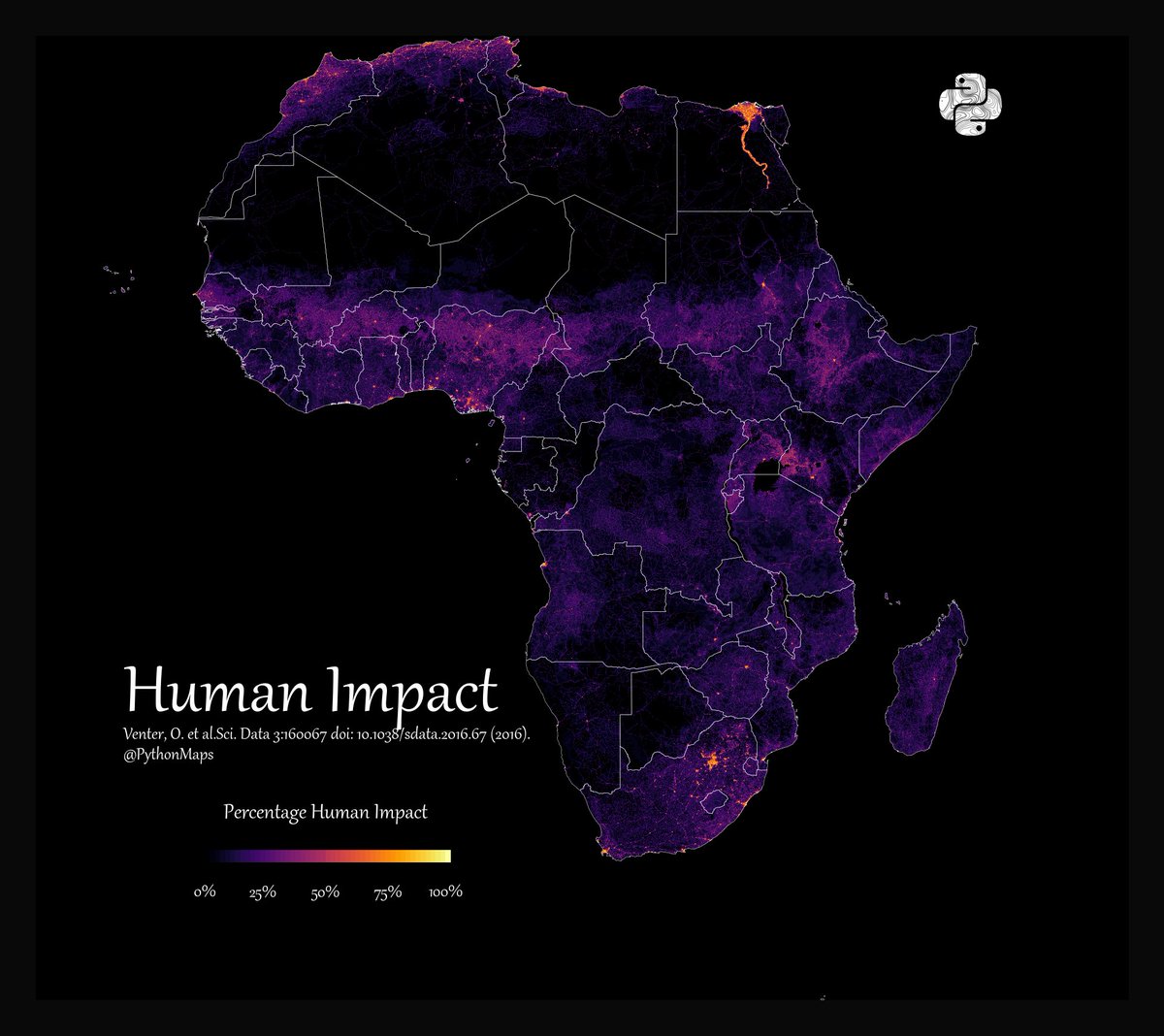
As it continually gets shared without attribution. Here is the population density of Africa!
34
309
2K
All roads lead to Rome. This map is visualises the famous roads built by the Roman empire. I never get bored of looking at this map!.#Python #Data #DataScience #Geopython #mapsandmapping #Rome #DataVisualization #EU

18
352
2K
Roads of South America! Shows all roads from highways down to dirt tracks. This map was generated using #Matplotlib #Numpy #Geopandas. #Python #DataScience #Data #DataVisualization #SouthAmerica #infastructure.

21
317
2K
Roads of Colombia! Shows all roads from highways down to dirt tracks. This map was generated using #Matplotlib #Numpy #Geopandas. #Python #DataScience #Data #DataVisualization #Africa #infastructure.

15
428
2K
Population density of Africa. You may have seen this map shared elsewhere, without appropriate attribution so here you go again.

13
191
1K
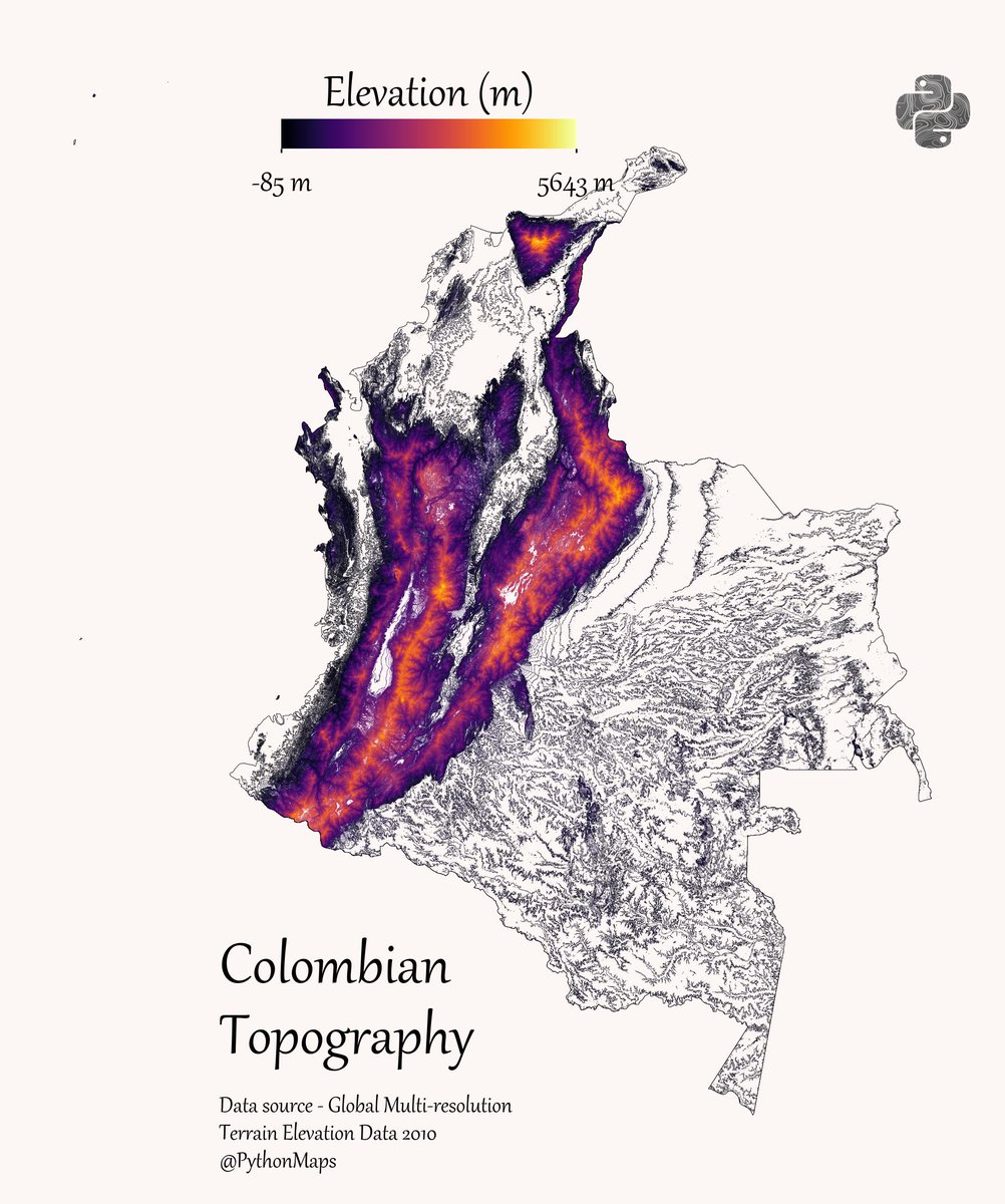
Contour line map showing the topography of Colombia. This map was made with #Python. Comment and let me know which country I should make next! #Data #DataScience #Datavisualization #DataScientist #Colombia #Geography

43
234
1K
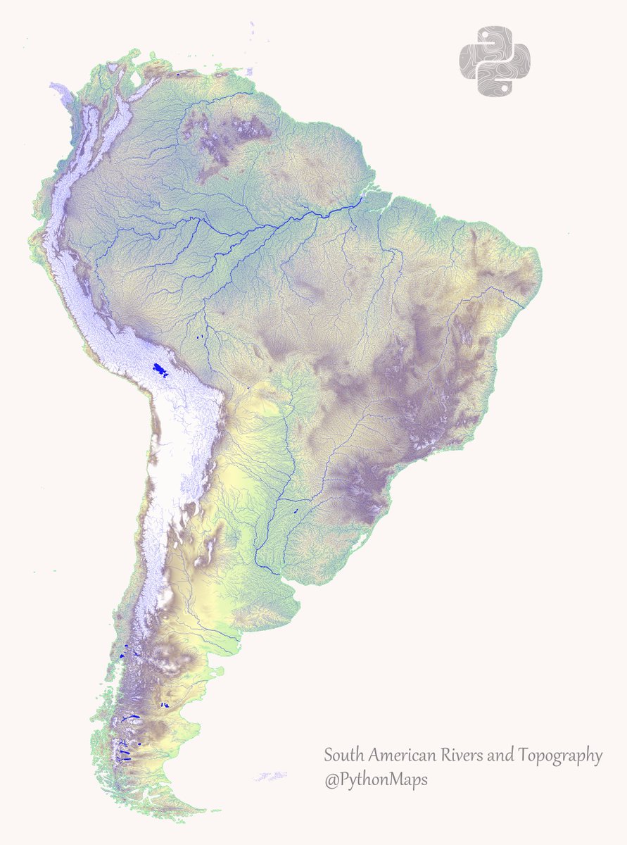
This is a map combining rivers and topography in the South America. Hopefully it shows the cool link between mountain ranges and waterways. This map was made with #Python using #geopandas and #matplotlib. #DataScience #Data #DataVisualization #SouthAmerica.
14
280
1K
South American Forests!.This map shows the percentage tree cover at a 30 × 30 meter resolution. This dataset is from 2008, how much do you think this map has changed since?.#Python, #Matplotlib, #Numpy. #Data #DataScience #geography

19
251
1K

Roads of Colombia! Shows all roads from highways down to dirt tracks. #DataVisualization #SouthAmerica #infastructure.

8
264
1K
Yet another thread of maps I like. This time we are looking loosely at Europe. Yes, I know Turkey isn't in Europe but who really cares. First up, Population! 1/13

16
140
1K
9
462
1K
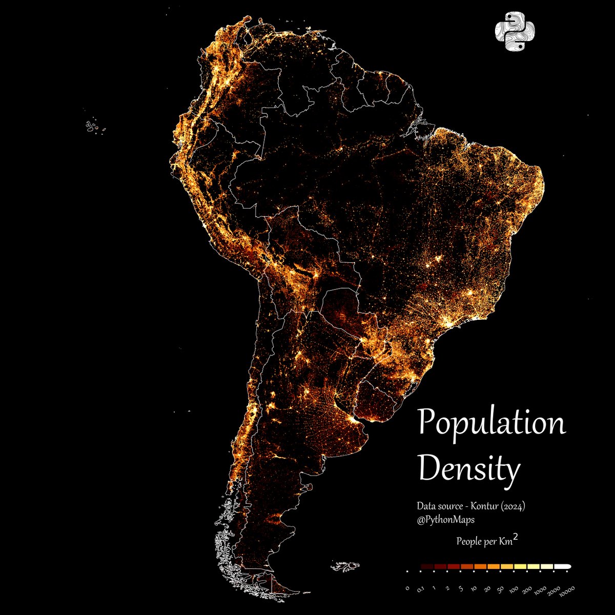
South American Population Density!. This is being posted a lot around the internet so I have remade it with more recent data and added a few extra things like the country outlines and a colourbar.

14
229
1K
Guys relax. I fixed it. No green, no problem. I just hope the keyboard warriors can interpret this one.
41
61
1K
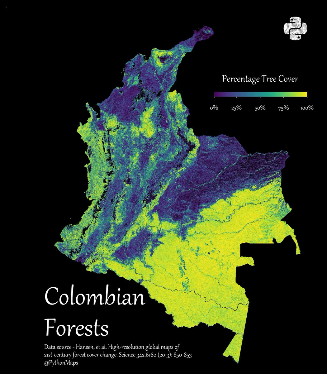
Colombian Forests!.This map shows the percentage tree cover at a 30 × 30 meter resolution. This dataset is from 2008, how much do you think this map has changed since?.#Python, #Matplotlib, #Numpy. #Data #DataScience #geography #Colombia
12
229
1K
Roads of South America! Shows all roads from highways down to dirt tracks. This map was generated using #Matplotlib #Numpy #Geopandas. #Python #DataScience #Data #DataVisualization #SouthAmerica #infastructure.

17
184
1K
Roads of South America! Shows all roads from highways down to dirt tracks. This map was generated using #Matplotlib #Numpy #Geopandas. #Python #DataScience #Data #DataVisualization #SouthAmerica #infastructure.

11
195
1K
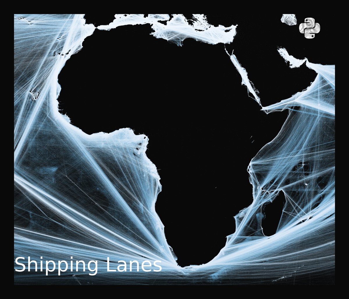
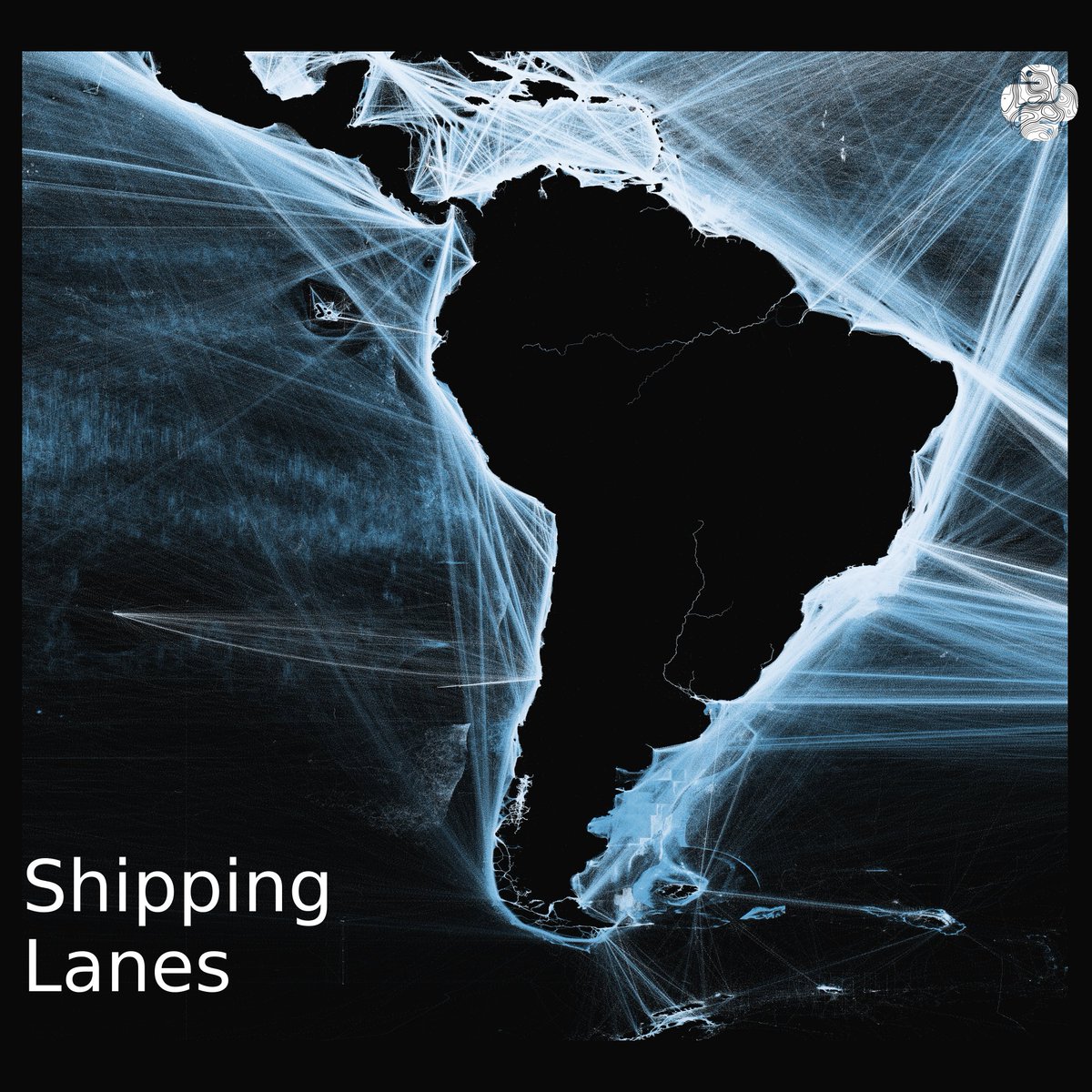
Mapping the world's shipping lanes. This map shows shipping lanes between 2015 and 2021 and was derived from AIS data. Made with #Python using #matplotlib and #Numpy. #DataScience #DataVisualization #Map #shipping #Geography #dataviz #data #DataScientist

20
267
1K
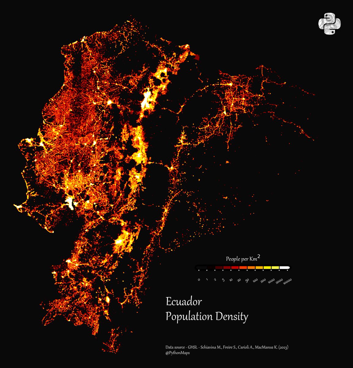
Contour line map showing the topography of Ecuador. This map was made with #Python. Comment and let me know which country I should make next! #Data #DataScience #Datavisualization #DataScientist #Ecuador #Geography

31
221
1K
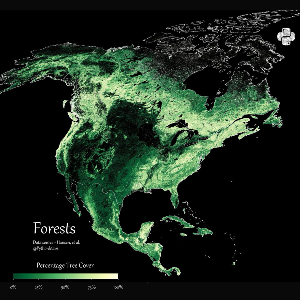
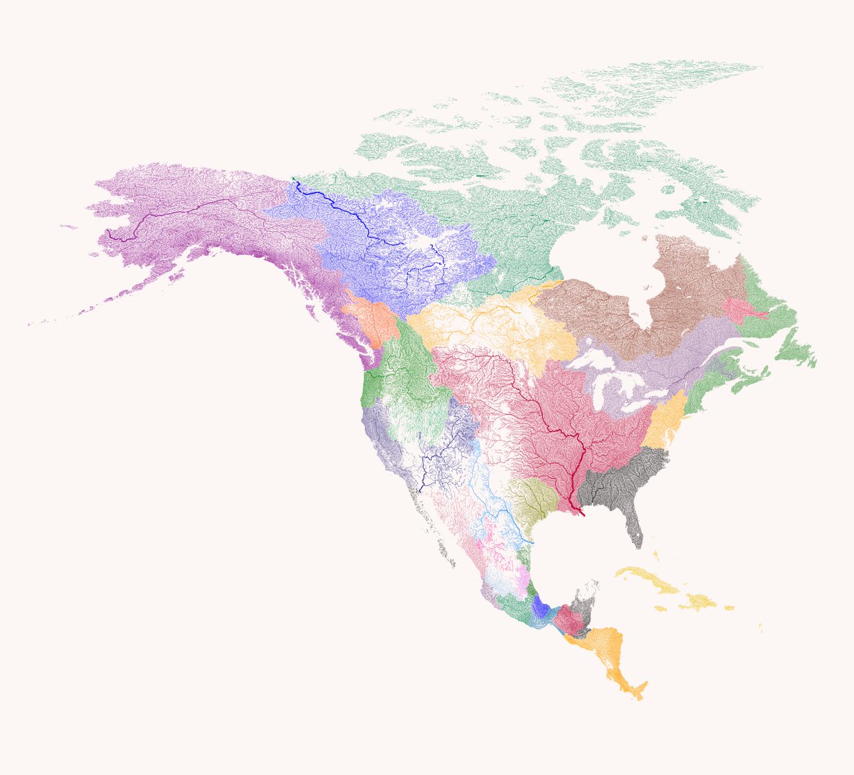
Here is a thread of my favourite maps of North America. Let me know which you like most and give me your best theories for how thel all fit together. Starting with Forests. 1/13
19
118
1K
Population density of South America with data coming from GHSL. It’s quite an old one so I’ll have to make an updated version

6
111
961


All roads lead to Rome. This map is visualises the famous roads built by the Roman empire. I have removed the land to highlight how far this empire spread its infrastructure. #Python #Data #DataScience #Geopython #mapsandmapping #Rome #DataVisualization #EU

16
241
891
"Explore the subcontinent's rivers like never before with this Python-made map! Coloured according to their drainage basin, it provides a unique perspective on the region's water systems. A must-see for geography enthusiasts! #SubContinent #Rivers #DrainageBasin #Python

15
155
881

Contour line map showing the topography of Colombia. This map was made with #Python. #Data #DataScience #Datavisualization #DataScientist #Colombia #Geography

7
172
843
Population density of South America. This map was generated with #Python using #Matplotlib, #Numpy and #Pandas. #Data #DataScience #dataviz #geography #Humanity

12
210
804
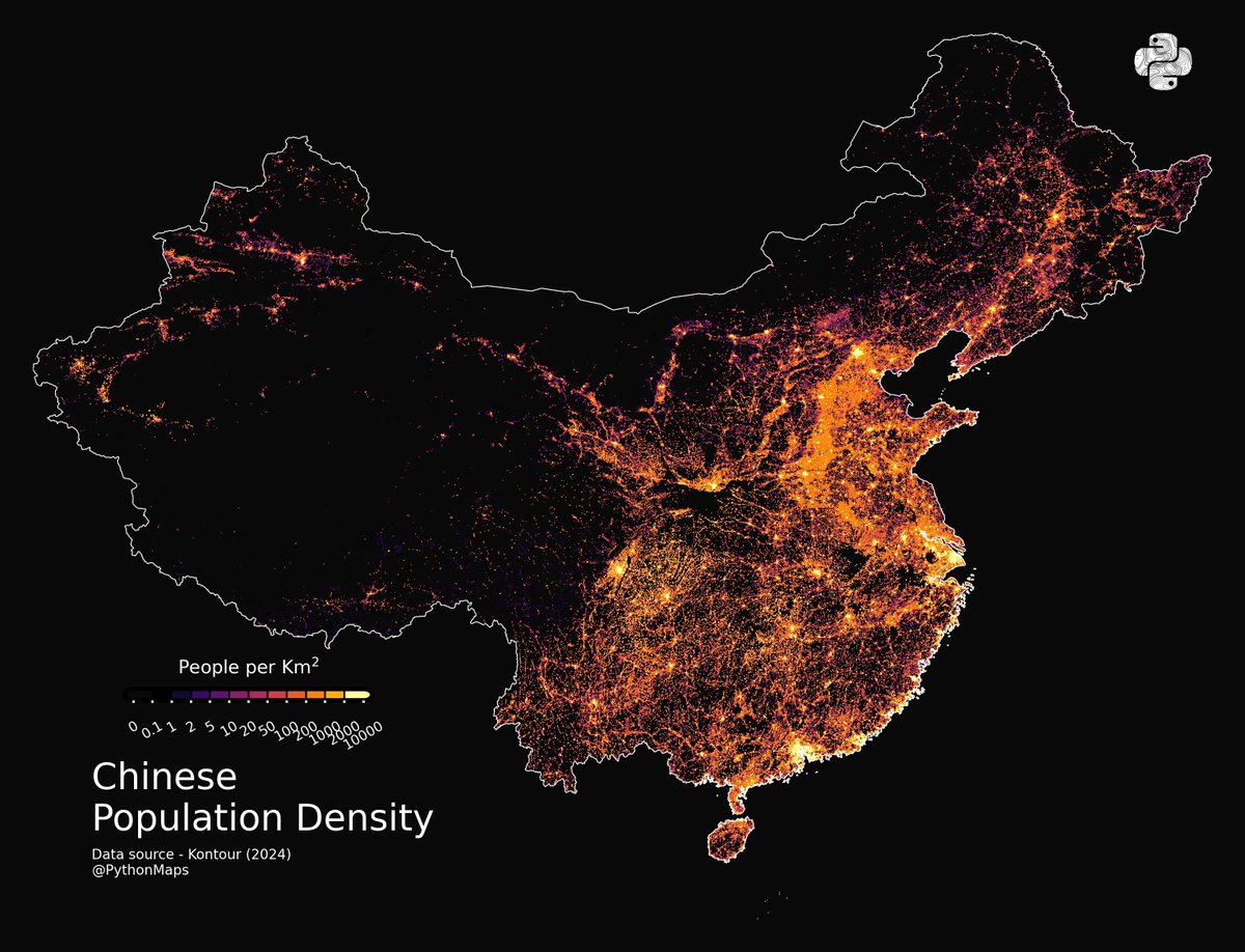
Here is a thread of my favourite maps of China. Let me know which you like most and give me your best theories for how thel all fit together. 1/16
10
96
825
Forests of South America! This map shows the percentage tree cover at a 30 × 30 meter resolution. #Python, #Matplotlib, #Numpy. #Data #DataScience #geography #SouthAmerica
10
204
810
Failing to provide credit again I see.
Rivers of Argentina broken down by their major hydrological basin and scaled by their discharge.

5
23
795

Day 12 of the #30DayMapChallenge - Scale. The rivers and waterways in South America, coloured according to the major hydrological basins they are part of and scaled by their size.This map was generated using #Matplotlib. #DataVisualization #Python #DataScience #Data #SouthAmerica
7
145
747
Look at that. Another one of mine.

4
31
744
Day 5 of the #30DayMapChallenge - Journey. This map shows bird migration across North / Central America. Data comes from several hundred studies, stored on movebank. The colours represent different birds. It has not come out as I would have liked but I will re-work the visual

11
170
758
All roads lead to Rome. This map is visualises the famous roads built by the Roman empire. I have removed the land to highlight how far this empire spread its infrastructure. #Python #Data #DataScience #Geopython #mapsandmapping #Rome #DataVisualization #EU

9
242
722

This map was stolen without credit from the brillaint @researchremora - Please give them a follow instead of this pretender.

6
43
727
Here is my South American forests map with country borders overlaid to show the distribution of the Amazon rainforest across each nation. #Python #Brazil #Rainforest #SouthAmerica #Colombia

8
128
722
Here are the world's tropical storms over the last 100 years, plotted with a fun projection. #Hurricane #Python #DataVisualization
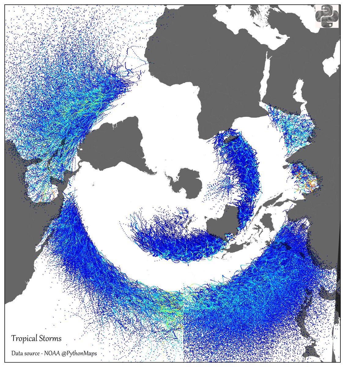
10
154
702
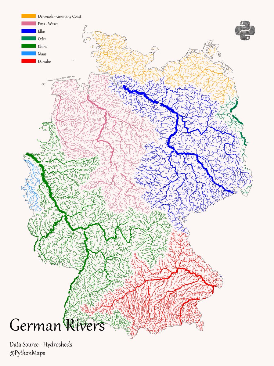
German Rivers - This map shows the rivers of Germany broken down by their major hydrological basin and scaled by their discharge. #DataVisualization #Geography #Python #Data #Europe #Germany
7
68
696
River Temperatures! This map shows the minimum water temperature in South Americas rivers. The temperature is in Celcius (I got bored trying to add a label) #Python #Data #DataVisualisation #SouthAmerica #Brazil #Amazon #Rivers

13
134
697
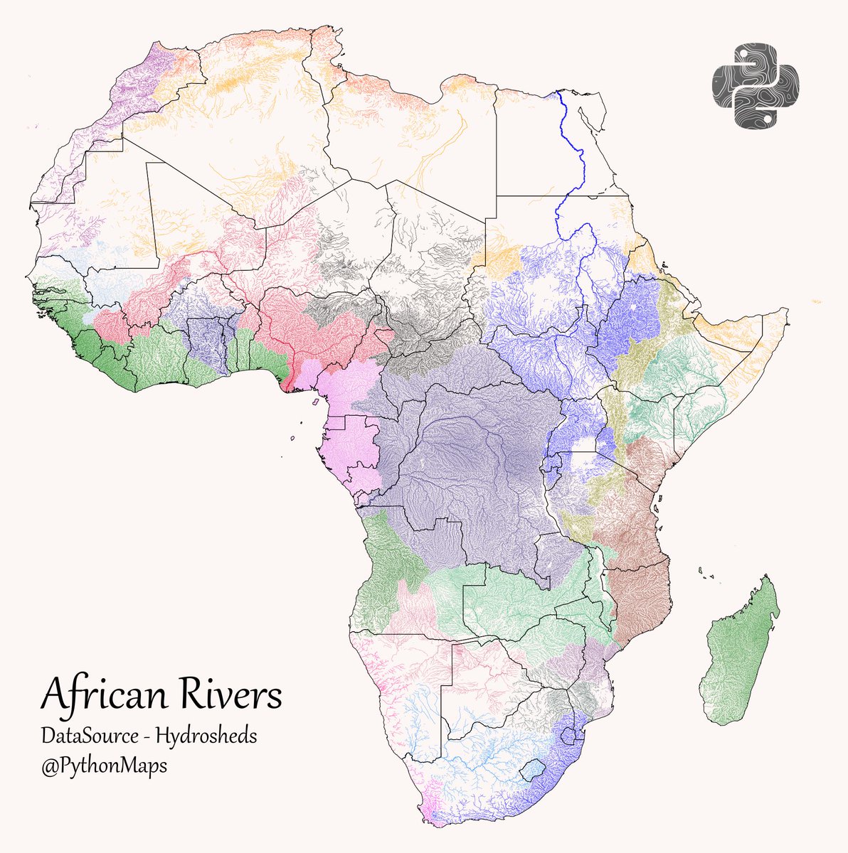
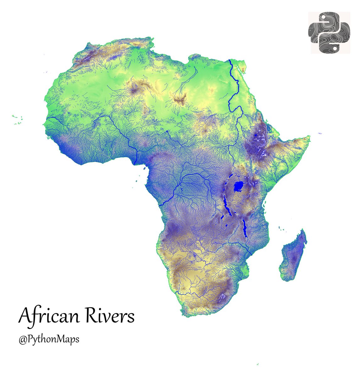
Here are all of the rivers and waterways in Africa, coloured according to the major hydrological basins they are part of and scaled by their size. This map was generated using #Matplotlib #Numpy #Geopandas. #Python #DataScience #Data #DataVisualization #Africa.

10
141
692
Here are all of the rivers and waterways in the Peru, coloured according to the major hydrological basins they are part of and scaled by their size. #Matplotlib #Python #DataScience #Data #DataVisualization #Peru

9
159
682
Forests of Peru! This map shows the percentage tree cover at a 30 × 30 meter resolution. #Python, #Matplotlib, #Numpy. #Data #DataScience #geography #Peru

4
146
656

Actually, one more. Why are there no ducks in the Northwest of India?

28
32
631
French Rivers - This map shows the rivers of France broken down by their major hydrological basin and scaled by their discharge. #DataVisualization #Geography #Python #Data #Europe #France

7
102
617
Here are all of the rivers and waterways in North America, coloured according to the major hydrological basins they are part of and scaled by their size. This map was generated using #Matplotlib #Numpy #Geopandas. #Python #DataScience #Data #DataVisualization #NorthAmerica #USA.

10
148
609
Here are all of the rivers and waterways in Europe, coloured according to the major hydrological basins they are part of and scaled by their size. #Matplotlib #Python #DataScience #Data #DataVisualization #EU #Europe.

17
123
611
We are finally selling prints of our maps! Initially we are offering our spectacular river maps and a really pretty topography plot of the UK. This is a trial run and we only have 40 of each so get yours before we (hopefully) sell out.

23
96
622
Brazilian Forests!.This map shows the percentage tree cover at a 30 × 30 meter resolution. This dataset is from 2008, how much do you think this map has changed since?.#Python, #Matplotlib, #Numpy. #Data #DataScience #geography #Brazil

11
92
603

This map shows all of the earthquakes with a magnitude greater than 4.0 over the last 20 years, coloured according to their magnitude (blue (smallest) - red (largest). #Matplotlib #Numpy #Geopandas. #Python #DataScience #Data #DataVisualization #earthquake

6
133
578
Today we present regions of the world coloured by majority religious affiliation. Deeper colours denote greater percentage of people practicing the corresponding religion. #DataScience #DataVisualization #Religion #WorldMaps

11
101
574
Contour line map of Colombia. I used 50m contours and created the dataset with GDAL. #Datavisualization #Geography #Colombia
2
124
563
Forests of Europe! This map shows the percentage tree cover at a 30 × 30 meter resolution. #Python, #Matplotlib, #Numpy. #Data #DataScience #geography #Europe

3
98
551
Shipping lanes of yore! These maps show the locations of ships log book entries between 1700-1850. I have broken the data down into the ships nationality. Made with #Python using #matplotlib and #Numpy. #DataScience #DataVisualization #Map #shipping #Geography #dataviz #data
19
174
532
Grasslands. Data comes from Global Land Cover-SHARE (GLC-SHARE) database. 4/13

5
24
536
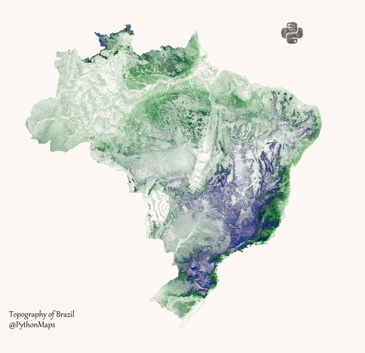
Contour line map showing the topography of Brazil. This map was made with #Python. Comment and let me know which country I should make next! #Data #DataScience #Datavisualization #DataScientist #Brazil #Geography
27
76
532
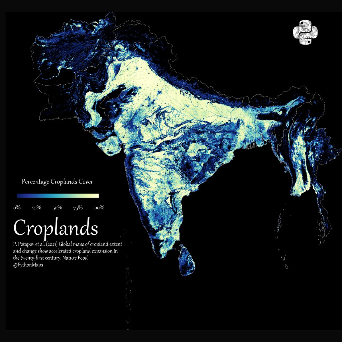
Croplands. This map shows the croplands of South America. I have tried out a new colourmap. What do you think?

11
57
538
Peruvian Forests!.This map shows the percentage tree cover at a 30 × 30 meter resolution. This dataset is from 2008, how much do you think this map has changed since?.#Python, #Matplotlib, #Numpy. #Data #DataScience #geography #Peru

4
104
518
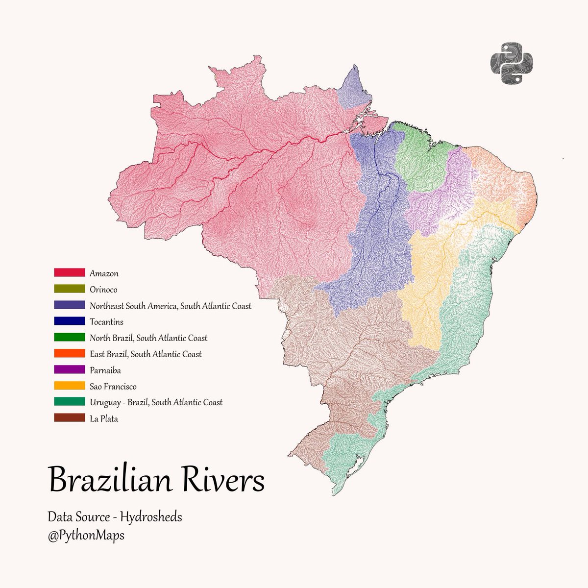
Brazilian Rivers - This map shows the rivers of Brazil broken down by their major hydrological basin and scaled by their discharge. I caved to requests and added a legend, names correspond to those defined in the hydrosheds dataset. #DataVisualization #Geography #Python #Data
8
84
505

Epic maps is basically pythonmaps these days. Logo and description seem to be missing again.
8
26
496
@Locati0ns Stop stripping the logo and caption from the map. You have built an account using the work of other creators. You are not a creator, you are a charlatan.

5
15
496
This map shows all of the earthquakes with a magnitude greater than 4.0 over the last 20 years, coloured according to their magnitude (blue (smallest) - red (largest). #Matplotlib #Numpy #Geopandas. #Python #DataScience #Data #DataVisualization #earthquake

3
129
500

Here is a map comparing the forest cover of Colombia and the population density. A tale of two maps. #maps

6
116
480
This map shows all of the earthquakes with a magnitude greater than 5.0 over the last 20 years. This map was generated using #Matplotlib #Numpy #Geopandas. #Python #DataScience #Data #DataVisualization #earthquake

11
139
438
Day 2 of the #30DayMapChallenge - Lines. Contour line map showing the topography of Great Britain. This map was made with #Python using #Numpy, #matplotlib and #earthpy. #data #DataScience #data #dataviz #DataScientist #uk #gb #eu #geography

9
81
458
