

Joachim Schork
@JoachimSchork
Followers
15K
Following
2K
Statuses
7K
Data Science Education & Consulting
Germany
Joined August 2018
After 3 years, 4 months & 2 days of hard work, I have just hit a very big milestone: I have just published the 1000th tutorial on the Statistics Globe website!!! Thank you for being part on the way to this achievement! #RStats #Statistics #DataScience
22
63
304
5 Signs You’re Becoming a More Efficient Data Wrangler in R: 1️⃣ You handle NA values like a pro. Missing values used to cause panic, but now you know exactly how to deal with them—whether it’s using na.omit(), tidyr::fill(), or writing your own imputation function based on the context of your data. 2️⃣ You know the power of regular expressions. When it comes to text manipulation, you no longer fear stringr. Instead of manually cleaning strings, you use regex patterns to find, replace, or extract text efficiently, saving time and reducing errors. 3️⃣ You think about memory efficiency. You’ve started considering the size of your data frames and how to optimize them. Converting character vectors to factors, using data.table for large data sets, and clearing memory when it’s no longer needed are part of your workflow. 4️⃣ You work with date and time effortlessly. Instead of struggling with date formats, you’re comfortable using the lubridate package. Parsing, formatting, and performing calculations on date and time data have become second nature to you. 5️⃣ You understand the importance of reproducibility. You no longer write code that only works on your machine. Using R Markdown to document your work, organizing your project folders, and creating scripts that can be run by others without hassle are now part of your habits. For more data science tips, join my free email newsletter. Take a look here for more details: #tidyverse #DataAnalytics #database
0
1
11
Mode imputation is a common method for handling missing values in categorical data. It replaces missing values with the most frequent category (the mode), ensuring the data set remains complete and usable. However, is it truly a good option? Why choose mode imputation: ✔️ It’s easy to implement and computationally efficient. ✔️ Maintains the size of the data set, avoiding the loss of valuable rows. ✔️ Works well when the mode is a meaningful representation of the missing values. What to be cautious about: ❌ Inflating the most frequent category can distort the balance of the data, impacting analyses and models. ❌ Assumes the mode is the best replacement, which might not always be true. ❌ For data sets with evenly distributed categories, this method can introduce bias. Are There Better Alternatives? Multinomial logistic regression imputation is an effective method for categorical target variables, as it captures relationships between variables and produces contextually informed imputations. However, this method can be computationally intensive, especially when applied to variables with a large number of categories. To enhance reliability and robustness, it is advisable to impute the data multiple times. This approach addresses the uncertainty inherent in the imputation process and ensures a more comprehensive and dependable basis for subsequent analyses. The image below illustrates the impact of mode imputation. Green bars represent the original category distribution without missing values, while orange bars show the data after imputation. Notice the substantial increase in the most frequent category ("Category 2") after imputation, which could skew the results of any analysis relying on this variable. If preserving the original distribution is critical, alternative methods may be more suitable. I have created a tutorial which explains the advantages and drawbacks of mode imputation in more detail: I’ll be hosting an online workshop on Missing Data Imputation in R, starting February 20, limited to a maximum of 15 participants. Take a look here for more details: #Python #datastructure #DataScientist #Statistical

0
5
34
When performing multiple imputation of missing data, it is essential to evaluate how the imputed values compare to the observed data. The bwplot() function of the mice package in R offers a straightforward way to visualize and assess these relationships using boxplots. The attached image, created with the bwplot() function, showcases how the distributions of observed and imputed values vary across different imputations for multiple variables. Here's what the plot reveals! 🔹 Plot Explained: The plot compares the distributions of observed (blue boxplots, labeled "0") and imputed values (pink boxplots, labeled "1" to "5") for each variable across five imputations. 🔹 Observed vs. Imputed Data: For variables such as wgt and bmi, the imputed values closely align with the observed data, indicating that the imputation model effectively captures the underlying structure of the data. However, differences between observed and imputed distributions do not necessarily signify an issue. They may reflect systematic patterns in the missing data that are accurately modeled by the imputation algorithm. 🔹 Imputation Consistency: Stable distributions across imputations demonstrate consistency and reliability in the imputation process. If variability persists between imputations, it may indicate the need for further iterations or adjustments to the imputation model. To generate this plot using the mice package in R: library(mice) my_imp <- mice(boys) bwplot(my_imp) I’ll be hosting an 8-week online workshop on Missing Data Imputation in R, kicking off on February 20. It’s designed for a small group of only 15 participants. Take a look here for more details: #DataVisualization #Python3 #Python #datavis #Rpackage #DataScience #datastructure #DataAnalytics #Statistics

0
15
87
Errors and warnings in R programming can be challenging, but I've got you covered! I've created a list of common errors and warnings in R, including examples and step-by-step instructions on how to fix them. The list already contains 112 tutorials and is regularly updated: Want to avoid making errors in R? Check out my course, "Introduction to R Programming for Absolute Beginners." This course will help you build a solid foundation in R programming from scratch. For more information, visit this link: #statisticsclass #Python3 #Python #statisticians

0
9
69
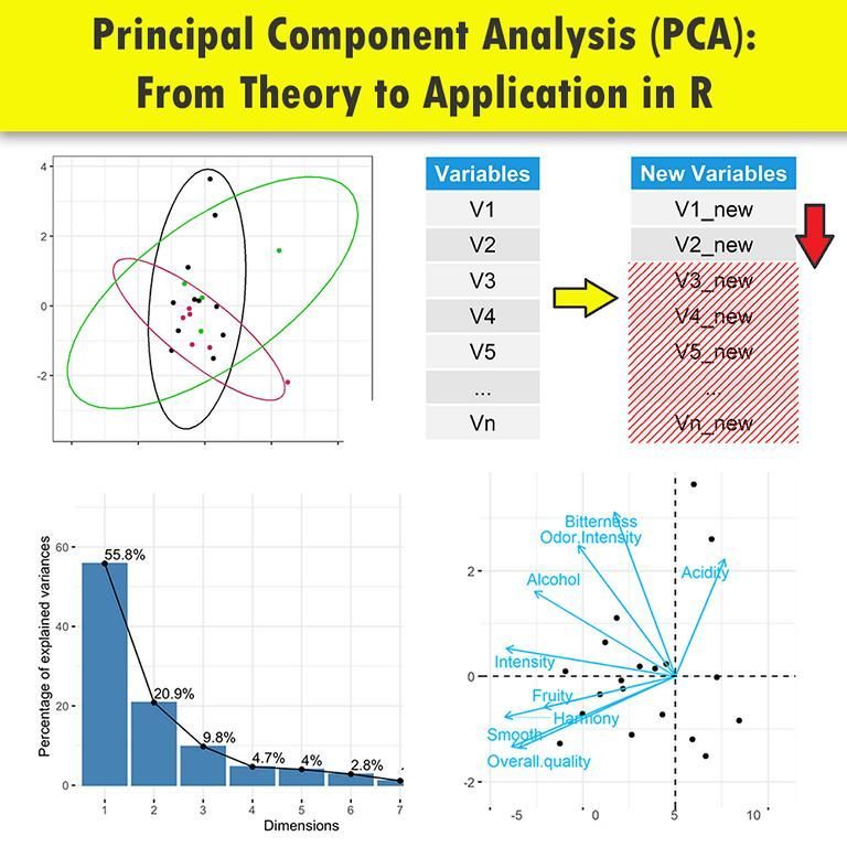
Principal Component Analysis (PCA) is a powerful statistical technique used to simplify complex data sets. By reducing the number of variables, PCA helps in identifying patterns and makes data easier to explore and visualize. Here’s how you can implement PCA in R, step-by-step: 1️⃣ Prepare Your Data: Load your data into R. Ensure it's scaled or normalized if the variables are on different scales. data <- read.csv("your_data.csv") data_scaled <- scale(data) 2️⃣ Apply PCA: Use the prcomp() function to perform PCA. Setting center and scale. to TRUE ensures data is centered and scaled. pca_result <- prcomp(data_scaled, center=TRUE, scale.=TRUE) 3️⃣ Examine the Summary: Check the summary of the PCA results to understand the proportion of variance each principal component accounts for. summary(pca_result) 4️⃣ Visualize PCA: Plotting your PCA can help visualize the distribution of the data along the principal components. plot(pca_result$x[, 1:2], col=as.factor(data$YourTargetVariable)) 5️⃣ Interpret Results: Analyze the loadings of the principal components to determine which variables contribute most to each component. loadings <- pca_result$rotation Discover the power of PCA with our R programming course at Statistics Globe! Further details: #DataAnalytics #Statistics #Data
1
49
281
Would you like to learn more about logistic regression? In a recent article, Adrian Olszewski, sheds light on a widespread misconception: logistic regression is much more than just a classification tool. It's a powerful regression technique used to predict numerical outcomes like probabilities, demonstrating its pivotal role in fields like clinical trials for assessing treatment efficacy and safety. Essential Insights: 🔹 Core Functionality: Contrary to popular belief, logistic regression predicts numerical values, challenging the notion that it's limited to binary outcomes. 🔹 Versatile Applications: Its utility spans beyond machine learning, serving as a fundamental tool in clinical research and other experimental studies. 🔹 The development and recognition of logistic regression, including its Nobel Prize-highlighted history, signify its critical role in statistical analysis. 🔹 Being part of the Generalized Linear Model (GLM) framework, logistic regression demonstrates flexibility across different data types and analysis scenarios. Conclusion: The article calls for a more nuanced understanding of logistic regression, promoting its recognition as a robust regression tool. This effort seeks to rectify misconceptions and ensure its accurate application in statistical analysis and beyond. Would you like to read the entire article? Please take a look here: Furthermore, you might join my free newsletter for frequent updates and expert tips on statistics, data science, and programming in R and Python. Check out this link for more details: #coding #database #datastructure

0
33
171
5 Signs You're Becoming a Better R Programmer: 1️⃣ You think in functions. You’ve moved from writing repetitive code to creating reusable functions. You no longer see long scripts but opportunities to create clean, modular code that you can use across multiple projects. 2️⃣ You choose dplyr over base R. Instead of sticking to loops and apply functions, you are embracing the power of the tidyverse. Chaining operations with the %>% pipe feels natural, and you love how much cleaner and readable your code has become. 3️⃣ You’ve become an ggplot2 wizard. Instead of sticking to default visuals, you understand the power of customizing your plots. Tweaking colors, themes, and adding custom annotations make your plots tell a story, and you enjoy making data beautiful and easy to understand. 4️⃣ Debugging is your superpower. You’re no longer frustrated by cryptic error messages or bugs. Instead, you welcome them as challenges and use tools like browser(), traceback(), or even debug() to solve problems step by step. Errors are no longer your enemy—they're a learning opportunity. 5️⃣ You comment your code as if explaining to your past self. You’ve been in situations where you can’t understand your own code from a month ago, and you’ve learned from it. Now, you write clear comments and document your functions, making it easy for anyone (including your future self) to follow along. Looking for more data science insights? Check out my free email newsletter. Check out this link for more details: #programmer #database #VisualAnalytics #statisticsclass #ggplot2 #Rpackage #DataVisualization #DataAnalytics
3
4
46
In the realm of data analysis, adjusted R-squared stands as a vital tool, helping us navigate the complexity of statistical models. But what exactly is it, and how can it guide our decisions? 🔍 Understanding Adjusted R-squared: - It's a statistical measure that evaluates the goodness of fit of a regression model. - Unlike plain R-squared, adjusted R-squared considers the number of predictors in the model, offering a more accurate reflection of model performance. ✅ Pros: - Takes Complexity into Account: Adjusted R-squared adjusts for the number of predictors, guarding against overfitting. - Better Model Comparison: It facilitates fair comparisons between models with different numbers of predictors. - Reflects Model Fit: Provides insights into how well the model fits the data, aiding in interpretation. ❌ Cons: - Can't Detect Overfitting Completely: While it helps mitigate overfitting, it doesn't eradicate the risk entirely. - May Penalize Complexity: In some cases, overly penalizing complex models may lead to overly simplistic conclusions. 🤔 When to Use Adjusted R-squared to Determine Variable Removal: - When assessing whether additional variables significantly improve model fit. - When aiming to strike a balance between model complexity and explanatory power. - When comparing models with different numbers of predictors. Consider the graph below, illustrating two different regression models. Based on the adjusted R-squared and model complexity, I would choose the second model, which excludes the 'life' and 'generosity' predictors. This model has a slightly lower adjusted R-squared but maintains a good fit while being less complex, striking a better balance between explanatory power and model simplicity. Note: Adjusted R-squared isn't considered state-of-the-art due to the emergence of more advanced statistical techniques and machine learning algorithms that offer greater complexity and flexibility in model evaluation and prediction. However, it remains valuable due to its simplicity, quick insights, and historical context. Its ease of interpretation and ability to aid in fair model comparison make it a practical choice for initial model evaluation and decision-making. Explore my webinar titled "Data Analysis & Visualization in R," where I delve into regression model comparison and explain the nuances of adjusted R-squared. Take a look here for more details: #Data #coding #datastructure #datascienceeducation

2
33
140
Missing data is a common challenge in data analysis and can significantly impact the accuracy and reliability of results if not handled properly. It introduces uncertainty, biases estimations, and reduces statistical power. Effectively addressing missing data is essential to ensure robust analyses and valid conclusions. ✔️ Proper handling of missing data improves accuracy by minimizing bias and ensuring results align with the true structure of the data. Advanced methods like multiple imputation also preserve variability and statistical power, making analyses more reliable. ❌ Failing to address missing data can lead to underestimation or overestimation of key metrics. Using inappropriate methods, such as listwise deletion, risks introducing significant bias or discarding valuable information. Additionally, methods that fail to account for the missingness mechanism (e.g., MCAR, MAR, or MNAR) may produce misleading results. It is crucial to evaluate the nature of missing data to choose the most suitable imputation strategy. The attached visualization illustrates how missing data affects results, particularly under the MNAR (Missing Not At Random) mechanism. The graph shows that as more data is missing, the estimated intensity of depression increasingly underestimates the true population distribution (black line). This highlights the critical need for methods that account for systematic missingness. Image credit to Wikipedia: 🔹 In R: The mice package provides powerful tools for multiple imputation using chained equations, while packages like VIM and missForest support advanced exploratory and imputation techniques. Consider using mice diagnostics to ensure convergence and model adequacy when imputing missing data. 🔹 In Python: Use pandas for basic missing data handling, sklearn.impute for standard methods like mean or median imputation, and fancyimpute for advanced methods like matrix completion or iterative imputations. Ensure to visualize imputed values using libraries like matplotlib or seaborn to validate the imputation quality. Learn about Missing Data Imputation in R in my 8-week workshop, beginning February 20. The workshop is limited to 15 participants for an engaging and interactive experience. For more information, visit this link: #Data #datastructure #DataScience #rstudioglobal #Rpackage #VisualAnalytics #RStats #datavis

0
6
31
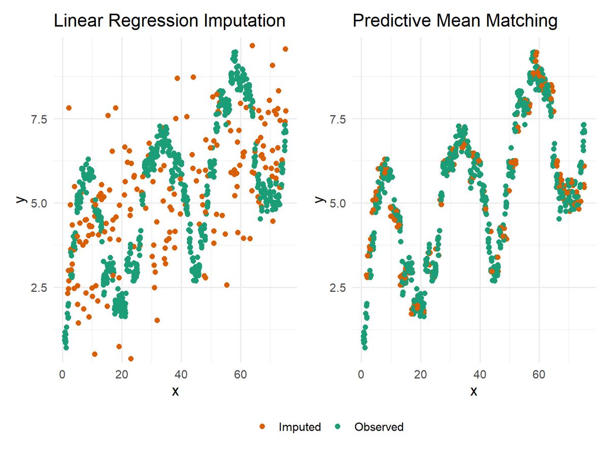
When dealing with missing data, selecting an imputation method that aligns with the data's underlying structure is critical. The attached plot compares Linear Regression Imputation (left) and Predictive Mean Matching (PMM) (right) for handling missing values in non-linear data. Key Observations: 🔹 Linear Regression Imputation relies on a linear model to predict missing values. As seen in the left panel, imputed values (orange points) align with the regression model but fail to capture the non-linear patterns present in the observed data (green points). This limitation can distort relationships and reduce the accuracy of the imputed data. 🔹 Predictive Mean Matching addresses this issue by selecting observed values closest to the predicted ones. The right panel demonstrates how PMM preserves the natural variability and non-linear patterns of the data, ensuring the imputed values integrate seamlessly with the observed values. For a detailed explanation of Predictive Mean Matching and how to apply it in R programming, check out my tutorial here: Discover Missing Data Imputation in R in my 8-week interactive workshop, starting February 20, limited to 15 participants. Further details: #Statistical #DataVisualization #Data #Python #datavis #pythonprogramming #DataAnalytics #DataScientist
0
21
174
When working with missing data, understanding the patterns and relationships of missing values across variables is essential for accurate and effective data analysis. The VIM R Package offers powerful tools like the mosaicMiss function, which generates mosaic plots to visualize missing or imputed values across different categorical combinations. This allows analysts to uncover the structure of missing data and identify meaningful patterns. The attached mosaic plot, created using the mosaicMiss function, provides a clear depiction of missing values within a data set. Blue tiles represent observed (non-missing) values in our variable of interest, while red tiles indicate missing values for specific category combinations. The size of each rectangle corresponds to the frequency of the respective combination. For example, in the row where Pred = 5, a significant proportion of missing values (red) is observed in certain combinations with the variable Exp. The following R syntax was used to create this plot: library("VIM") mosaicMiss(sleep, highlight = 4, plotvars = 8:9, miss.labels = FALSE) For more information on the VIM package, visit the official vignette here: I’m excited to announce my 8-week interactive workshop on Missing Data Imputation in R, starting February 20, for a small group of 15 participants. More info: #DataVisualization #datavis #statisticians

0
7
29
I recently came across this Data Science roadmap, and it’s an incredible resource for anyone looking to enhance their skills in this field. Here are five key areas from the roadmap that every aspiring Data Scientist should prioritize: ✔️ Statistics: Build a strong foundation in probability, distributions, and hypothesis testing to analyze and interpret data effectively. ✔️ Data Visualization: Master tools like Matplotlib, Seaborn, and ggplot2 to turn raw data into clear and compelling visual insights. ✔️ Machine Learning: Learn algorithms, feature engineering, and model evaluation techniques to create predictive and intelligent systems. ✔️ Programming: Strengthen your Python and R skills for data analysis, visualization, and machine learning workflows. ✔️ Business Intelligence (BI): Explore tools like PowerBI and Tableau to design dashboards that enable data-driven decisions. I discovered this roadmap on the AIGENTS website, and what makes it exceptional is its interactive design. You can click on each element to access AI-powered explanations and tailored learning resources, making it easy to explore each topic in depth. Further details: #datascienceeducation #Statistical #DataViz #ggplot2 #database #DataVisualization #tidyverse

0
5
34
Multiple imputation by chained equations (MICE) is a widely used method for handling missing data, offering flexibility and robustness across a variety of data sets. While much attention is given to topics like the number of imputed data sets and the differences between single and multiple imputation, another often neglected metric in MICE is convergence of the algorithm. Convergence ensures that the imputation process is stable and produces consistent results, making it a critical factor for reliable analysis. The attached plot is a diagnostic tool that visualizes the convergence of the MICE algorithm. It tracks the means and standard deviations of variables with missing data over multiple iterations: 🔹 Mean (left panel): Illustrates how the average imputed values for the variable change and stabilize across iterations. 🔹 Standard Deviation (right panel): Depicts the variability in the imputed values for the same variable throughout the iterative process. To generate this plot in R with the mice package, use the following syntax: library(mice) my_imp <- mice(boys, m=10, maxit=20) plot(my_imp, "phb" ) In early iterations, imputed values often vary widely as the MICE algorithm adjusts to the data's structure. Over time, these values should stabilize, signaling convergence. Convergence is essential for ensuring consistent and reliable imputations and reflects the iterative nature of the chained equations approach, where variables are imputed sequentially. Visualizing convergence helps detect issues, such as persistent trends, that may require more iterations or data adjustments. Ultimately, convergence ensures that imputations accurately represent the data’s underlying structure. Join me for an 8-week online workshop on Missing Data Imputation in R, beginning February 20. This workshop is capped at just 15 participants to ensure a personalized experience. Check out this link for more details: #Data #StatisticalAnalysis #datavis #Python #VisualAnalytics #datascienceeducation #database

0
9
41
I've recently discovered a really useful R package by Jan Broder Engler called tidyheatmaps. It's designed to make creating heatmaps from tidy data easy, especially for publication-quality visuals. The package uses pheatmap for detailed heatmaps with less coding. If you work with data like gene expression, you can get a heatmap set up quickly. The usage is straightforward, allowing for quick customization of your heatmaps. Check out the full guide for all options: Give it a try for your next data visualization task. It could be a game changer for presenting your data. If you're interested in statistics, data science, and programming, you might also enjoy my free newsletter where such topics are covered regularly. Take a look here for more details: #DataScience #Rpackage #Statistics #DataAnalytics #database

0
29
205
In missing data imputation, it is crucial to compare the distributions of imputed values against the observed data to to better understand the structure of the imputed values. The densityplot() function in the mice package provides an effective visualization for this purpose. The attached density plot illustrates the observed (blue lines) and imputed (pink lines) distributions for various multiply imputed variables in the boys data set. Each panel represents a specific variable, offering a detailed view of imputation performance across multiple variables. Here are some key takeaways! 🔹 Alignment Between Observed and Imputed Data: The blue curves represent the observed data's density, while the pink curves reflect the densities of the imputed values across multiple imputations. Variables such as hgt and bmi demonstrate strong alignment between observed and imputed distributions. 🔹 Spotting Differences in Densities: Discrepancies between observed and imputed distributions may indicate areas requiring further refinement. However, such differences could also reflect systematic missingness patterns accurately captured by the imputation algorithm. Expert domain knowledge is essential to interpret these differences and determine whether they signal an issue with the imputation process or correctly reflect the underlying data structure. 🔹 Variable-Specific Insights: By visualizing densities for each variable, the plot allows analysts to determine whether specific variables need additional scrutiny or adjustments to the imputation process. The visualization below can be generated using the following R code: library(mice) my_imp <- mice(boys) densityplot(my_imp) Starting February 20, I’m hosting an 8-week interactive workshop on Missing Data Imputation in R. The group size is limited to a maximum of 15 participants. Learn more by visiting this link: #datascienceenthusiast #DataViz #DataVisualization #statisticsclass #Python

0
9
33
Understanding missing data is essential for ensuring accurate and unbiased analyses, as the way missing values are distributed can significantly impact results and conclusions. The VIM R Package provides powerful tools for exploring and visualizing missing data, enabling analysts to identify patterns and relationships in missing values and make informed decisions about handling them. The VIM package excels at producing high-quality visualizations that highlight missing data patterns, such as the distribution of missing values across variables, combinations of missingness, and their potential impact on relationships between variables. These insights are essential for diagnosing missing data mechanisms and informing decisions about imputation or other handling methods. The attached plots, taken from the VIM package website, showcases a few of its visualization capabilities: 🔹 The top panel illustrates a scatter plot with boxplots, showing how missing values (red points) affect the relationship between variables "Dream" and "Sleep." This visualization helps detect any systematic patterns in missingness. 🔹 The bottom left panel shows the number of missing values for each variable, providing an overview of where data is missing the most. 🔹 The bottom right panel visualizes combinations of missing values across variables, helping to identify whether missing data tends to occur together. For more information on the VIM package, check out its official vignette and examples here: Starting February 20, I’ll be leading an 8-week interactive online workshop on Missing Data Imputation in R, designed for a small group of 15 participants. For more information, visit this link: #database #R #StatisticalAnalysis #DataVisualization #datastructure #RStats

0
9
57
Handling missing data is a critical step in data analysis, as failing to address it properly can lead to biased results and reduced analytical power. The mice package for R, short for Multivariate Imputation by Chained Equations, provides a robust and flexible framework for handling missing values through multiple imputation. The mice package stands out for its versatility and ease of use. It offers: 🔹 Comprehensive Imputation Methods: Includes a variety of imputation methods tailored to different types of variables (e.g., predictive mean matching, linear regression, logistic regression). 🔹 Iterative Chained Equations: Imputes missing values sequentially by cycling through each variable with missing data, refining the imputations with each iteration. 🔹 Multiple Imputation Framework: Creates multiple imputed data sets, allowing users to account for the uncertainty introduced by missing data in their analyses. 🔹 Diagnostic Tools: Provides visualization functions like densityplot(), bwplot(), and convergence diagnostics to evaluate the quality and reliability of the imputation process. The visualizations shown below originate from the package website: Discover the essentials of Missing Data Imputation in R in my 8-week online workshop, starting February 20. This exclusive workshop is open to just 15 participants. Check out this link for more details: #datascienceeducation #database #Statistics #RStats #Data #R

1
11
50
In R programming, understanding the scope of variables — global vs. local — is crucial for managing data and avoiding errors in your code. Here’s a quick breakdown: 🌐 Global Variables - Accessible from anywhere in your R script. - Defined in the main body of the script, outside of any functions. - Useful for values that need to be shared across multiple functions. 🔍 Local Variables - Exist only within the function they are defined in. - Not accessible outside their function, making your code more modular and less prone to errors due to variable name conflicts. - Automatically deleted once the function call is complete, which helps in managing memory efficiently. Understanding these differences helps in writing clearer, more efficient R code, and aids in debugging by limiting the scope of variables where necessary. I've created a tutorial explaining the difference between global and local variables in R. Click this link for detailed information: #R4DS #RStats #datasciencetraining #DataScientist

1
12
65
Familiarity with R unlocks countless possibilities for statistical analysis and visualization. Whether you're exploring trends, making predictions, or testing hypotheses, R provides powerful tools to transform data into meaningful insights. I have developed a comprehensive online course on statistical methods in R, covering a broad range of essential topics. To give you a glimpse of what the course entails, here are 10 key methods that will be taught: - ANOVA (Analysis of Variance): Tests if the means of three or more groups are significantly different. - Binary Logistic Regression: Predicts the probability of a binary outcome based on predictor variables. - Bootstrap Resampling: Estimates statistics by repeatedly sampling with replacement from the data. - Chi-Squared Test for Independence: Tests if there is an association between two categorical variables. - Confidence Intervals: A range that would contain the true population parameter in a certain percentage of repeated samples. - Correlation Analysis: Measures the strength and direction of a linear relationship between two variables. - Multiple Linear Regression: Models the relationship between a target variable and multiple predictor variables. - Random Forests: An ensemble of decision trees used for classification and regression. - Ridge Regression: A type of regression that adds a penalty to the size of coefficients to reduce overfitting. - T-Test (Two-Sample): Tests if the means of two independent groups are significantly different. Please note that this is just a selection of the methods we will cover; the course will discuss many more topics. Are you interested in learning more about these topics? Learn more by visiting this link: #Statistical #DataAnalytics #DataScience #datastructure #pythonprogramming #Python

0
28
163
Bringing R to mobile required persistence, innovation, and countless hours of problem-solving. The result? A powerful tool that makes data analysis more accessible, flexible, and mobile than ever before. This is a game-changer for analysts and developers alike. Thank you, @_ColinFay, for pushing the boundaries of what's possible! #DataScience #RStats #Innovation #MobileTech

"Bringing R to mobile wasn’t an easy feat. Like any innovative project, it involved countless hours of trial and error, learning, and refining. But the question remains: Why did we do it? What’s the real-world impact of having R in your pocket?" #RStats
2
8
32