

.
@CARATQUEX
Followers
5K
Following
5K
Statuses
454


😭😂😂

I notice some of you never know what the fuck I’m talking about. But most of your misunderstandings of me are more based on our “different upbringings” than anything else. so here is a guide to help “some of you” better understand my raps.
0
0
1
wanna learn this so bad damn

0
0
14
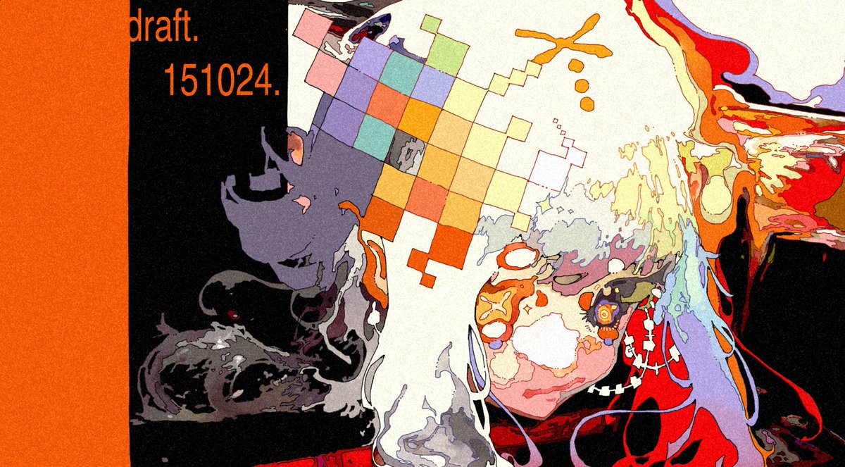
@88dude88 (normally POSTERIZE create a big color contrast, you can adjust based on your artstyle). hope this provide some insight for you!
1
0
3
@88dude88 use POSTERIZE adjustment layer (<= 12), then it will seperate the color in the pic. (you can also use LEVEL & TONE CURVE to create ideal color contrast) then observe & trace the shapes of the pic.
0
0
1
@88dude88 familiar with line art & shapes is the key. a good practice is to get a real life pic of anything (object, texture, lighting...)
0
0
1
@88dude88 hey ! these are based on my own learning experience: i focus on using brush to create SHAPES while drawing sketch (REGULAR & IRREGULAR shapes) basically the logic is doing composition of different shapes
0
0
7
