

Radix by WorkOS
@radix_ui
Followers
31,106
Following
2
Media
30
Statuses
598
React components, icons, and colors for building high-quality, accessible UI. Free and open-source. A project by @WorkOS .
Joined November 2020
Don't wanna be here?
Send us removal request.
Explore trending content on Musk Viewer
Kendrick
• 294191 Tweets
Super Bowl
• 253672 Tweets
Defense
• 232734 Tweets
Ronaldo
• 184954 Tweets
Drake
• 167583 Tweets
Patriots
• 137258 Tweets
Giants
• 114541 Tweets
Steelers
• 105468 Tweets
Bears
• 104848 Tweets
Wayne
• 102484 Tweets
Bengals
• 78959 Tweets
Cowboys
• 76589 Tweets
Dolphins
• 66848 Tweets
Panthers
• 65937 Tweets
Browns
• 62319 Tweets
Falcons
• 55273 Tweets
Titans
• 51436 Tweets
JISOO AT NYFW WITH TOMMY
• 49476 Tweets
Colts
• 43358 Tweets
Texans
• 39916 Tweets
Raiders
• 34095 Tweets
Seahawks
• 31408 Tweets
Daniel Jones
• 30369 Tweets
Broncos
• 29925 Tweets
Chargers
• 28036 Tweets
#Sinner
• 25817 Tweets
Caleb Williams
• 25593 Tweets
Josh Allen
• 24380 Tweets
Baker
• 20979 Tweets
#深澤辰哉
• 19973 Tweets
Cleveland
• 19906 Tweets
#わたしの宝物
• 19617 Tweets
Bryce Young
• 19332 Tweets
#GHDBT1
• 18912 Tweets
Tom Brady
• 18733 Tweets
Forbes
• 17502 Tweets
TJ Watt
• 16464 Tweets
Deshaun Watson
• 12923 Tweets
Kirk Cousins
• 11313 Tweets
Zeke
• 11277 Tweets
Aubrey
• 10915 Tweets
Will Levis
• 10439 Tweets


Pinned Tweet

Announcing Radix Themes 3.0 and a custom color palette generator 🎉
In this release:
• New layout engine
• 11 new components
• Zero config setup with Astro and Remix
• New docs with guidance on layout and styling
29
118
1K
🎉 Announcing Radix Themes—a beautiful, open source component library that’s built on top of the primitives so many developers love.
75
303
2K
Radix Themes 2.0 is out 🎉
This release comes with new, fully reworked color palettes, a wealth of improvements to the components themselves, and more advanced tools for customising your theme.

27
120
1K
Our 3 most highly-requested components are here. Select, NavigationMenu, and Toast 🚀

36
116
936
📢 Exciting new Radix release: after ~18 months of building and testing, Radix is now at v1. 🥳
This release is all about stability. Tons of bug fixes, perf enhancements, and a11y improvements.
Also, we're on ProductHunt, come and show us some ❤️
19
150
880
And just like that, every single Radix primitive now has its own
@tailwindcss
demo.
Incredible effort from
@joaom__00
,
@ryanleichty
,
@suliskh
and
@shadcn
. Thank you for contributing to those! 👏
🚀🚀🚀

19
58
620

We have shipped the first demo of Radix +
@tailwindcss
in our docs for the Accordion:
Special thanks to
@joaom__00
for creating the initial POC and being an all round legend in our community!

18
25
480
New Radix release 🚀
✅ A brand new `Menubar` primitive
✅ Position `Select` content below trigger
✅ Horizontal `Accordion`
9
31
412
Radix Primitives is now in beta 🥳📢
Unstyled UI components for building high-quality, accessible, React-based design systems and web apps.
• 23+ components.
• Fully-typed APIs.
• ~450k monthly downloads.
• Used by dozens of awesome companies.
5
59
401
New Radix release 🚀
New CSS custom properties for:
✅ ContextMenu
✅ DropdownMenu
✅ HoverCard
✅ Menubar
✅ Popover
✅ Tooltip
and a bunch of fixes/improvements.
4
26
359
We have been working on a couple of projects on which we would love to get your input!
The first one is a new Form primitive:
The second one is a brand new project: Radix Auth:
Please comment directly on the RFC PRs 🙏

13
36
349
Big Radix Docs update today: component code examples are now available in both
@stitchesjs
and vanilla CSS.
12
27
302
New Radix release 🚀
✅ Better ESM compatibility
✅ Latest version of
@floating_ui
✅ Lots of fixes/improvements
8
32
286
New case study:
@linear
"We’ve adopted several Radix primitives so far and we can see that it significantly improved our accessibility compliance, removed a lot of complexity from code, and allowed us to focus on what we do best: UI and UX."

4
23
285
Full React 19 and RSC support is out for Radix Primitives and Themes, along with other improvements 💫
8
25
284
New Radix release 🚀
✅ Brand new `Form` primitive in preview!
1
34
268
New 404 page built with Radix, featuring:
• dialog
• alert-dialog
• dropdown-menu
• scroll-area
• slider
👉
5
22
265
Radix Themes are featured on Product Hunt homepage! Cast your vote.

2
18
250
We updated the animation on Radix homepage so that it is user-activated. The performance is also dramatically improved across the board.
This is now live:

A few people mentioned how the animation on is a bit too much. It probably is!
Exploring a user-initiated interaction with a hint for what’s coming.
9
2
68
4
6
229
We've published a new guide around composition and the `asChild` prop:
3
14
226
React 19 support is coming to Radix Primitives and Themes ⭐️
Currently available under an RC version, with a stable release coming next week.
10
6
202
Check out the Navigation Menu primitive at its best and in the most capable hands as used by
@vercel

We've updated the navbar.
It's built on top of
@raunofreiberg
's initial work and is using Radix.
25
29
899
1
5
200
Now that Radix has more than 30 components and utilities, it's time to improve discoverability.
Check out our new search mechanism in the documentation:

3
13
199
Get Radix Themes here:

3
5
141
New Radix release 🚀
This one includes a bunch of requested enhancements alongside a host of fixes.
More importantly, this release contains the most community contributions to date! Shoutout to everyone who contributed 👏
0
11
138
Our brand new site is live, including case studies from some awesome companies.
3
18
134
More goodies coming!

Menubar is also coming to
@radix_ui
in the new year! 🎅🎁🎄. We had a great head-start thanks to contributions from
@luisorbai
, then
@Andy_Hook
did an awesome job of taking it over the line!
11
10
233
0
3
116
Huge Radix Primitives release 🚀
- Submenu support for DropdownMenu + ContextMenu.
- Brand new ScrollArea.
- Improved a11y across many primitives.
- Improved functionality across many primitives.
- Normalised prop naming.
- Improved polymorphic types.
3
10
116
We've just shipped a bunch of improvements to Primitives Docs. ✨
- Each component now has a fully styled example.
- CodeSandbox links.
- More relevant API code examples.
- Using Radix Colors throughout.
- Dark mode issues fixed.
- Improved visual design

5
13
109
We ❤️ beautiful typography. Here’s one of the tools that we provide in Radix Themes for professional-looking typesetting out of the box.
People are asking about our letter spacing scale in Radix Themes.
Well, here’s a pro tip—the larger the font size, the tighter you can set letter spacing and line height on most fonts.

2
5
42
0
5
106
We just released an update to Radix Themes which adds three new, beautiful colour options for your components—ruby, iris, and jade 🌈

1
3
104
🎅🎅🎅 You've asked for it, we heard you, it's coming…
3
4
101
Amazing new ⌘K component powered by Radix Dialog

After roughly 2 years and 3 iterations later, together with
@pacocoursey
we're finally shipping ⌘K — a fast, composable, unstyled command menu for React.
Try it out at
77
209
3K
0
4
94
Read about the highlights of 3.0 in the blog:

2
3
98

✨ Radix release ✨
• Improved composing multiple primitives.
• Improved animation support for Collapsible & Accordion.
• Bug fixes.
6
10
93
New Primitives release 🚀
This release focuses on ensuring React 18 support. It required some breaking changes (🔥), so please check the docs of each component for updates.
2
13
88
The wait is almost over.
4
4
87
✨ New Radix release ✨
• Dialog and Popover can now be modal or non-modal.
• Improved mobile support.
• Improved polymorphic types perf.
• Bug fixes.
3
8
86
🙏

Fellow Designers and Visual Developers 👋
Webstudio - an Open Source alternative to Webflow has now become much more accessible with powerful Radix UI components 🪄🦸🏽♂️
We JUST launched on Product Hunt!
6
39
193
1
5
64
That’s 45 components, 100’s of variants, a handful of simple, yet powerful primitives for layout, and an extensive token system provided via CSS variables.
We can’t wait to see what you will build with it.
1
0
55
New Primitives release 🚀
- SSR support.
- Accordion now supports multiple values.
- Tabs now supports RTL.
- Improved internal context handling.
- Better package/dependency split.
- Lots of bug fixes and enhancements.
1
6
55
In fact, we just shipped a huge update to our color system, which powers Radix Themes:
You automatically get beautiful light and dark mode palettes, a transparent version of any color, and accessible contrast ratios out of the box.
1
2
55

New case study:
"Radix Primitives allow us to focus on our product and client needs instead of minute implementation details and other concepts like component accessibility."
0
5
54
The color changes are also a part of Radix Colors update. New colors come with automatic P3 color space variants and dramatically improved alpha colors, especially on modern wide-gamut displays.

1
2
53
As usual, we obsessed over the developer experience.
It’s super easy to get started—just import the stylesheet, wrap your app in Theme provider, and go! No config is required.

3
3
51
Another great
@radix_ui
resource from
@samselikoff
! And more to come too! 😍😍😍

🎥 New YouTube video!
Excited to be kicking off a three-part series on "Building a Dialog with Radix UI" in collaboration with
@WorkOS
.
In Ep. 1 we style a Dialog component using Tailwind and see all the goodies Radix gives us along the way. Enjoy!

6
14
179
0
4
50
Contrast targets are now based on the more modern APCA algorithm, which accurately predicts how human vision perceives text.
You can check contrast info and suggested usage on each color swatch here:
1
1
50
Full changelog:
0
5
48
There’re many more changes and improvements. Read on the full change log here:
0
1
48

New case study:
@ComposerTrade
"Radix has made our product significantly more accessible and reduced code complexity while allowing us to focus on building complex trading software."
1
9
41


New release 🚀
- New ToggleGroup primitive.
- New Toolbar primitive.
- Custom Tooltip delays/timing.
- Fixes for Popover, DropdownMenu, and ContextMenu.
- Improved tree-shaking.
- New "Releases" page.
1
4
45
Radix release 🚀
- Improved touch support for ContextMenu
- Improved API consistency
- Bug fixes
1
4
45
New case study:
@liveblocks
"With Radix, we’re able to create a high-quality custom UI that behaves like native elements — without spending weeks on it. Instead, we can spend that time on our core product."
0
10
41
We also added a set of CSS variables to easily customise cursors on your interactive components.
It’s a contentious topic for some teams, but we recognise that stronger click affordance may be a no-brainer for many apps.

1
1
41


Borders of Text Fields and Cards now naturally blend with the background behind them.

1
0
40
😍


1
0
39
New release 🚀
- New HoverCard primitive.
- Improved polymorphic types performance.
- Bug fixes.
- Improved APIs.
0
8
38

Here’s a cool detail for design nerds—components that sit on a panel, like Card or Table, are a little translucent, which lets some of the background through.
Of course, you can turn it off if you are after a different look and feel.

1
0
36
Of course, you can customize your theme. Let’s start with colors.
There’s more than 20 hues to choose from. We even allow you to pair your accent color with a tinted gray.

2
1
36
Custom color palettes hit similar APCA ratios as Radix Colors scales when using reasonable backgrounds.
In fact, you will likely get almost exactly the same color palette if you use a color from Radix Colors.

3
0
34
Of course, we haven’t forgotten about the design details on some of the lesser typographic elements.
Here’s a Kbd, representing a computer key or a shortcut, and Em, set in an italic font.


2
2
35
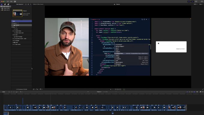
🔥 Fantastic video on using Radix + Framer Motion ♥️
0
2
33
Get the Figma version of Radix Themes components and tokens ❤️
2
1
33
Text Field autofill styles are much smoother now. When browser or password manager auto-fills a form for you, your theme accent color is used automatically.


2
1
33
♥️♥️♥️

I've been using Radix and I'm really impressed how capable it is and still it's easy to use! Well done team!
I'm currently working on this UI and it's working great!

22
12
312
0
0
30
What about fonts?
Out of the box, you get system fonts with no external dependencies. We value good typography, so there is a number of typographic components to choose from.
Your main ones are Text, Heading, and Code. Each comes with a type scale and a set of weights.

2
0
30
We are now featuring community-built projects on the Resources page in the docs:

0
1
29
Every component’s classic variant, like in Button, Card, Text Field, Select, Switch, among others, got a round of design improvements.

2
0
28
On the component side, we now guarantee that all Radix Themes classes play nicely with Tailwind. The CSS specificity is capped at 0,1,0 for classes and 0,1,1 for pseudo-elements.
3
0
29
👀

We're making it easier to connect with the creators behind your favorite projects on GitHub Mobile. After you star something, check out the people who make it and discover their other work. We've been loving this internally for the past few weeks, and it's finally live!
9
16
202
1
0
28
You can also customize the border radius and scaling of your components.
We built a playground with all components and theme options on a single page:

1
0
26
😍😍😍
2
0
25
Fancy joining us?

1
2
23
If you want to use your own brand colors, you can pop the hood and update the corresponding CSS variables in your app:
1
0
23
Naturally, there’s a ton of component improvements and a couple bug fixes.
Many components like Switches and Radio Buttons were reworked to harmonise better with common text sizes used in forms.
DX is also better with vertical alignment that Just Works™ with text labels.

1
0
22

Here’re the tools that Radix Themes provides:
➡️ Ready-made components with sensible APIs and dozens of variations
➡️ Layout primitives to keep the layout responsibilities contained
➡️ Design tokens to build your own custom components with a similar look and feel
1
1
21
The first round of feedback has been incorporated in the Radix Form RFC.
Let us know what you think!

1
2
20
New case study:
@getTeamflow
"Once we adopted Radix, we saw a noticeable performance improvement. We began by replacing modals and tooltips, and we saw big gains right away."

0
4
19
@outoilkka
Hey, Radix Themes is just a styled, opinionated component lib on top of the primitives. It’s made for when you want to kickstart a project with pre-designed, battle-tested components.
If you prefer styling the primitives yourself—keep using them, they are here to stay.
0
1
16
Let’s talk about styles.
1️⃣ Is Radix Themes a styling solution? – No.
2️⃣ Are you expected to write styles? – Sometimes, more if you feel adventurous.
3️⃣ I want to use Radix Themes with my favourite CSS tech. Will it work? – Yes!
2
1
16
You can also use Radix Themes with your own fonts.
Like with colors, there’s an extensive system of CSS variables that make it easy to swap the font, tweak the type scale, or even font metrics for a specific component:
1
1
15
Feeling the love in this thread! ♥️♥️♥️

Do we like Radix?
I need a solid component library for a side project and I like that it seems relatively unopinionated…
43
3
104
0
0
13
@nextjs
In Radix Themes, your basic building blocks like Text, Box, or Button are true server components.
The more complex, interactive components like Dropdown Menu or Popover naturally are client components as they require JavaScript to work.

0
0
12
@leandrorr
No you're not crazy! As priorities shift, we want to make sure we reflect what is the most up to date. Unfortunately working on Carousel has taken a backseat in favour on working on other primitives/features so we wanted to reflect that.
3
0
11
If you've tried Radix Primitives on a project at work, we'd love to hear your thoughts through this 2 min survey. 🙏

0
4
11
🤫
4
1
10

